UX/UI Design
Brand and Website design
My role: UI and Web Designer
Agency: City of Wind Design
Client: LivDao
My team: Mashiat Lamisa (Webflow developer)
Tools: Figma, Adobe Illustrator, Notion, Jira, Slack
Project overview
Problem Statement
Designing an MVP e-commerce website where university students can buy, sell, and donate their used furniture in the tri-state area. A space in which users would feel peace of mind, guidance, support, and ease of use.
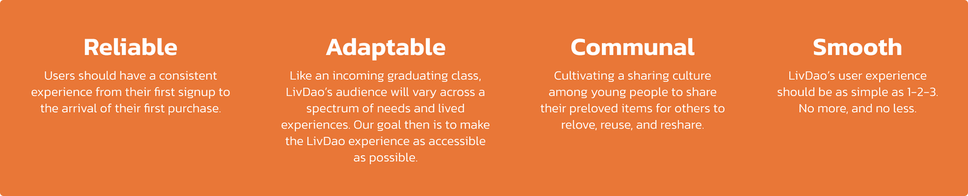
Design values
The process
How might we make buying and selling furniture as
seamless and common as Uber?
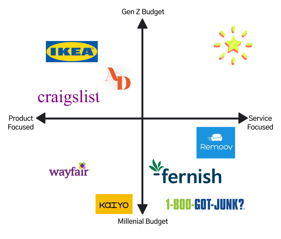
Market Research
Analysis of direct and indirect competitors.
We tried to understand how competitors in the same sector interact with users and where their values stand to better define what was gonna be our final objectives and design.
In conclusion, LivDao's focus will be on Services and a GenZ target group.
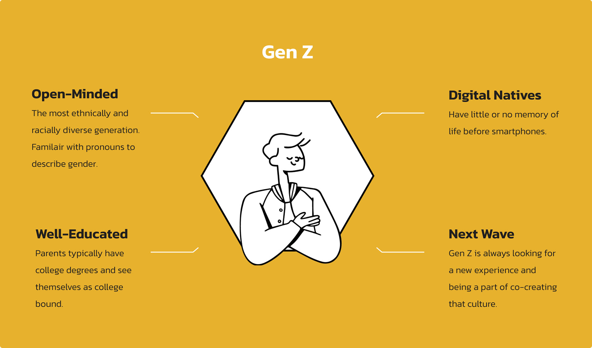
How's this Gen Z group?
Synthesis of market research and existing psychographics based on behavior.
Archetypes
These are the two main people who came up with the idea for LivDao. On the one hand, a graduate student who wants to sell her products as they won't help her and she has to go back home, and on the other hand, a second-year student who is moving into a flat and needs to save on his purchases while customizing his new flat.
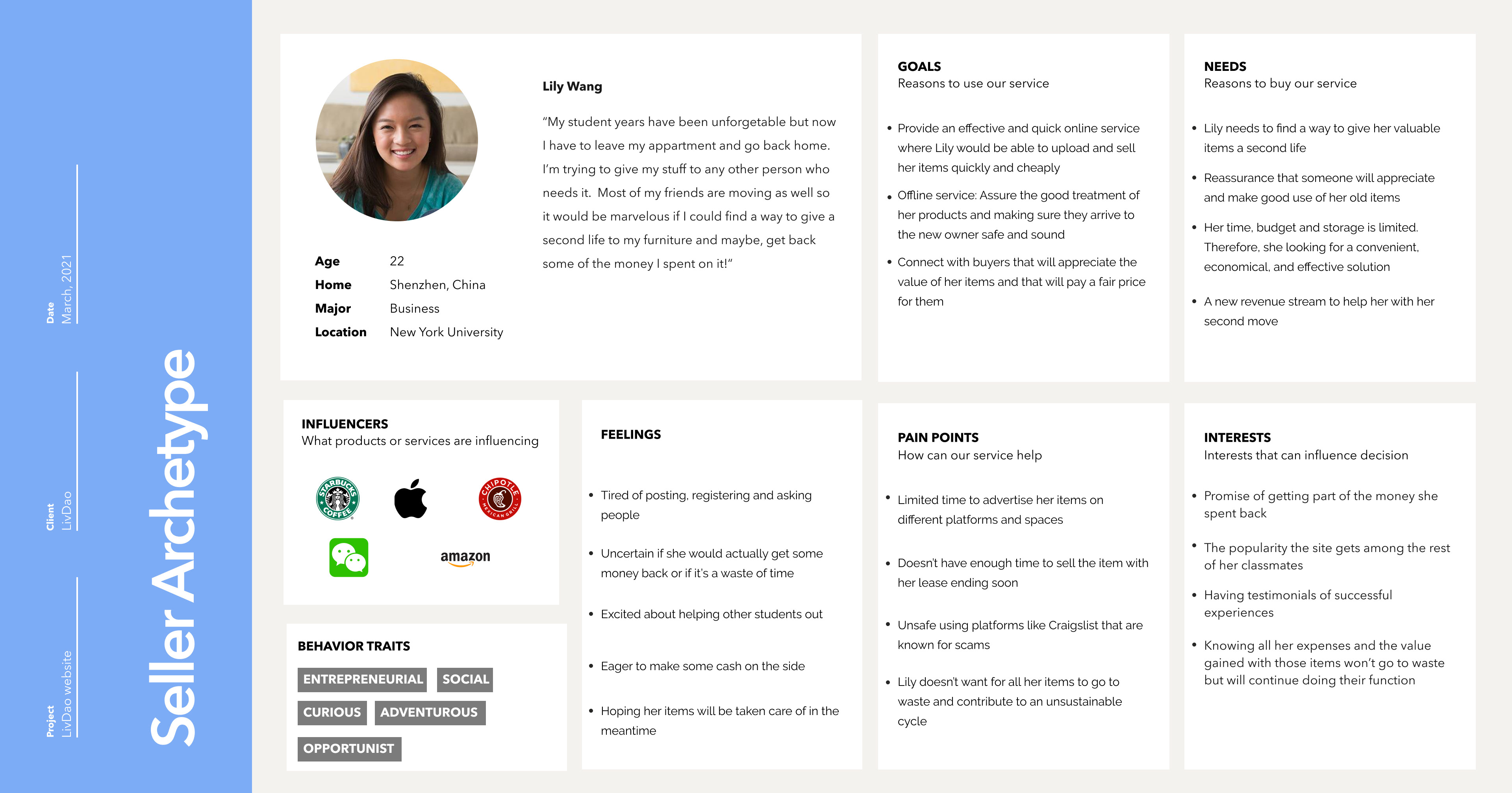
Seller
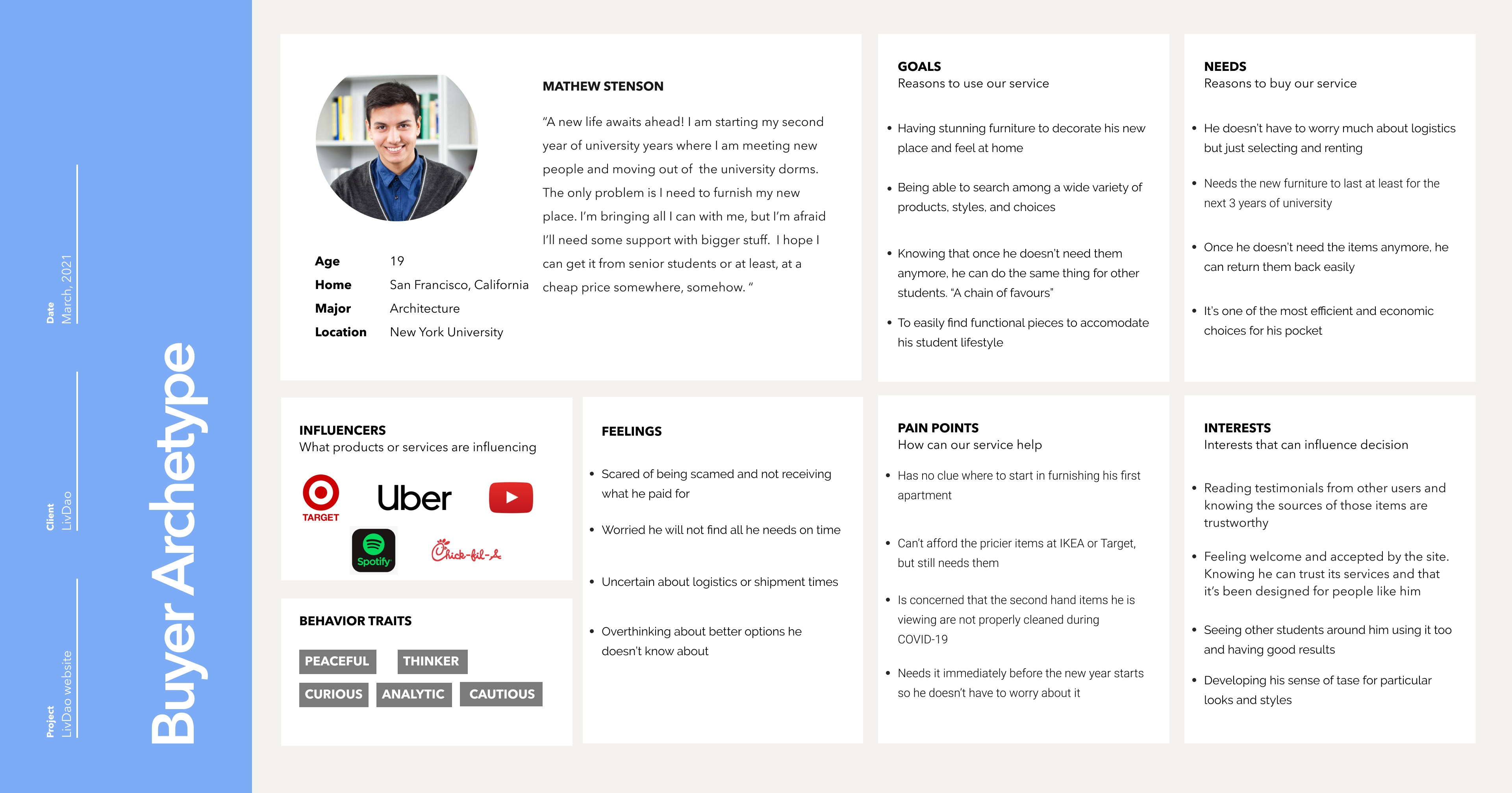
Buyer
The flow was divided into seller and buyer interactions:
Seller: Register, complete a form, and contact with LivDao
Buyer: Register, navigate the site, buy the product, and select pick-up/delivery
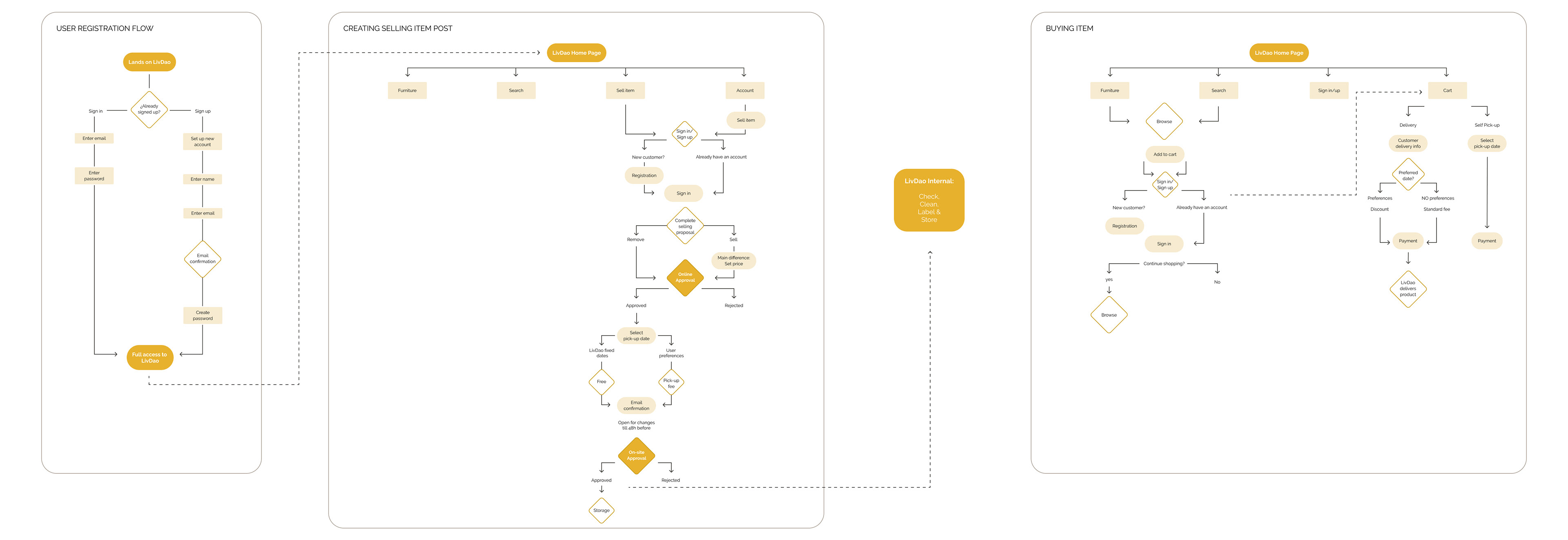
Final user flows
Concept
Second-Hand Objects - The website addresses University Students looking to sell items that are no longer useful to them. Therefore, this MVP should reflect that vintage, second-hand feeling with a touch of youth, energy, and responsible look & feel.
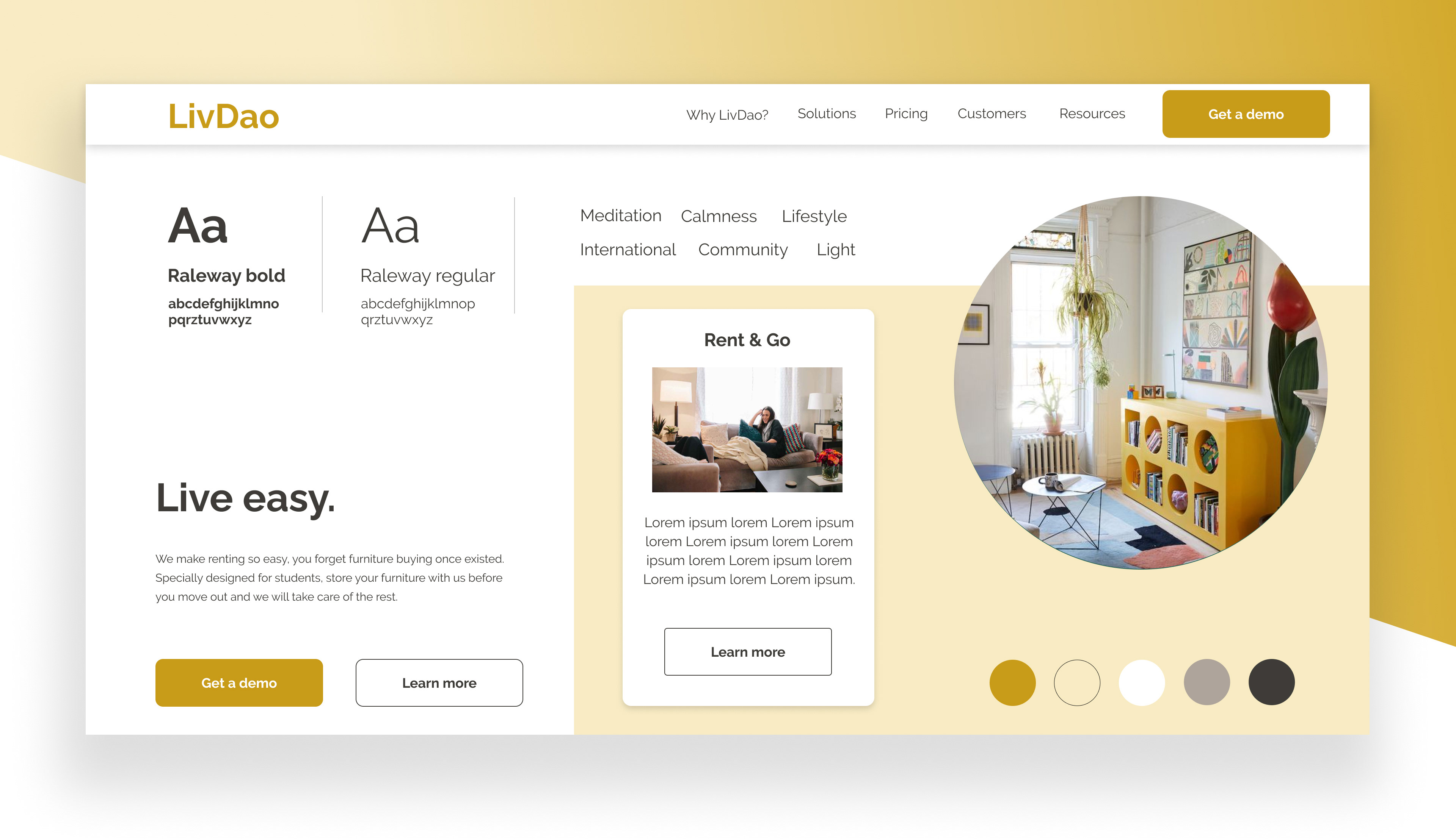
Final Style Tile
Outcome
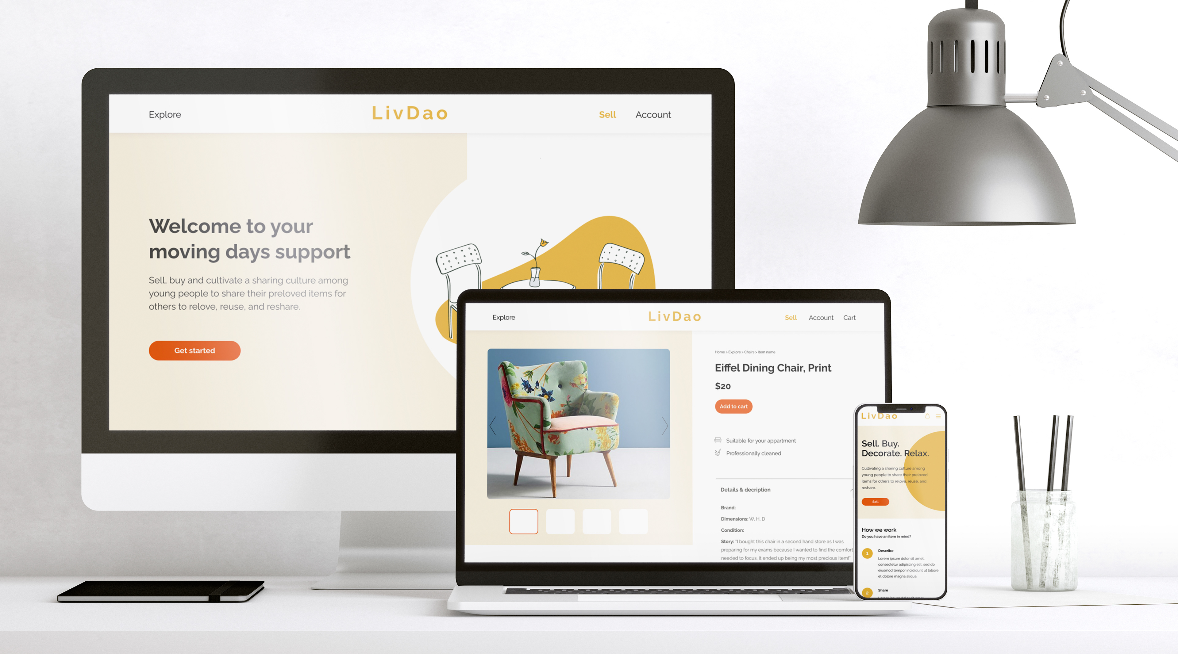
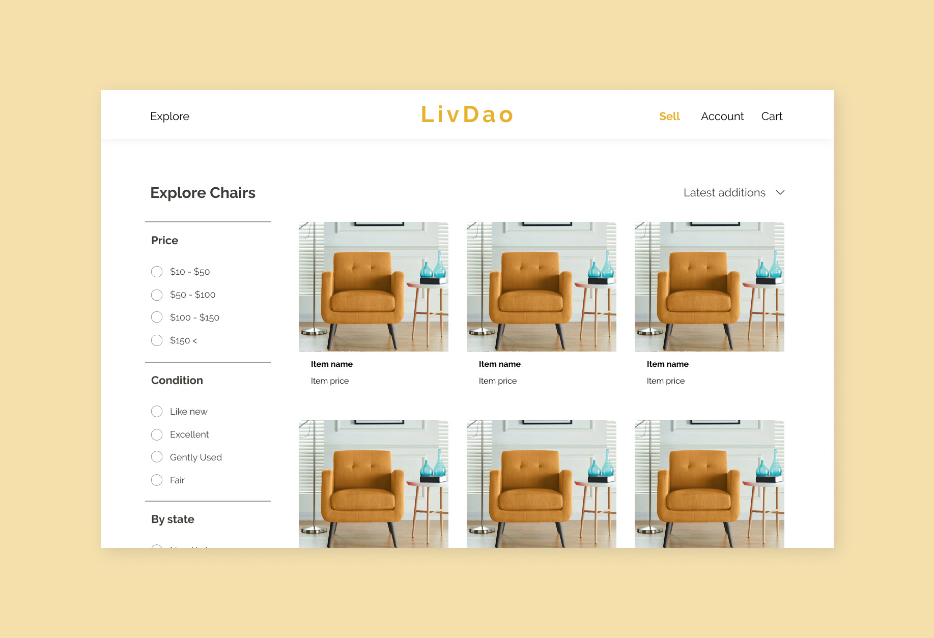
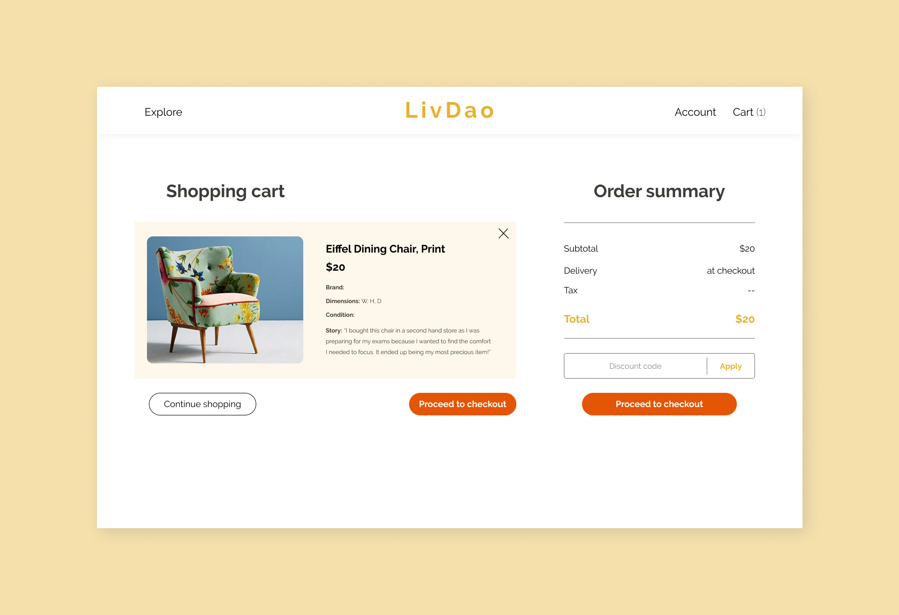
Final Landing page design
Mobile design mock-up
Branding
Following the Style Tile chosen for LivDao's look & feel, the branding consists of yellow as the principal color reflecting power, royalty, and prosperity in the Chinese culture so our client could have a representation of their culture while showing calmness and youth. This is followed by a strong orange as an accent and darker greys for texts and little elements.
On the other hand, a minimal logo that can be divided and used according to the different needs of the company (icon, whole logo, name differentiator)
Final Main screens

Takeaways
This was a two-month project with a continuous fluent conversation with the client. However, one of the main takeaways was the better team organization prior to its beginning. The communication and understanding of the tools and possibilities we had in our hands should have been clarified beforehand starting from the designer-developer side and later on with the client in order to make sure we don't design more than we can deliver. On the other hand, and due to the tight scope and budget of the client, we should have known how to manage our time and resources in order to adjust to the time frame.
Nevertheless, at the end of the project, our client LivDao was very happy with the outcome and for the updates we receive, their start-up is growing and in continuous development.