Service Designer - UX/UI - Web ReDesign - User Testing
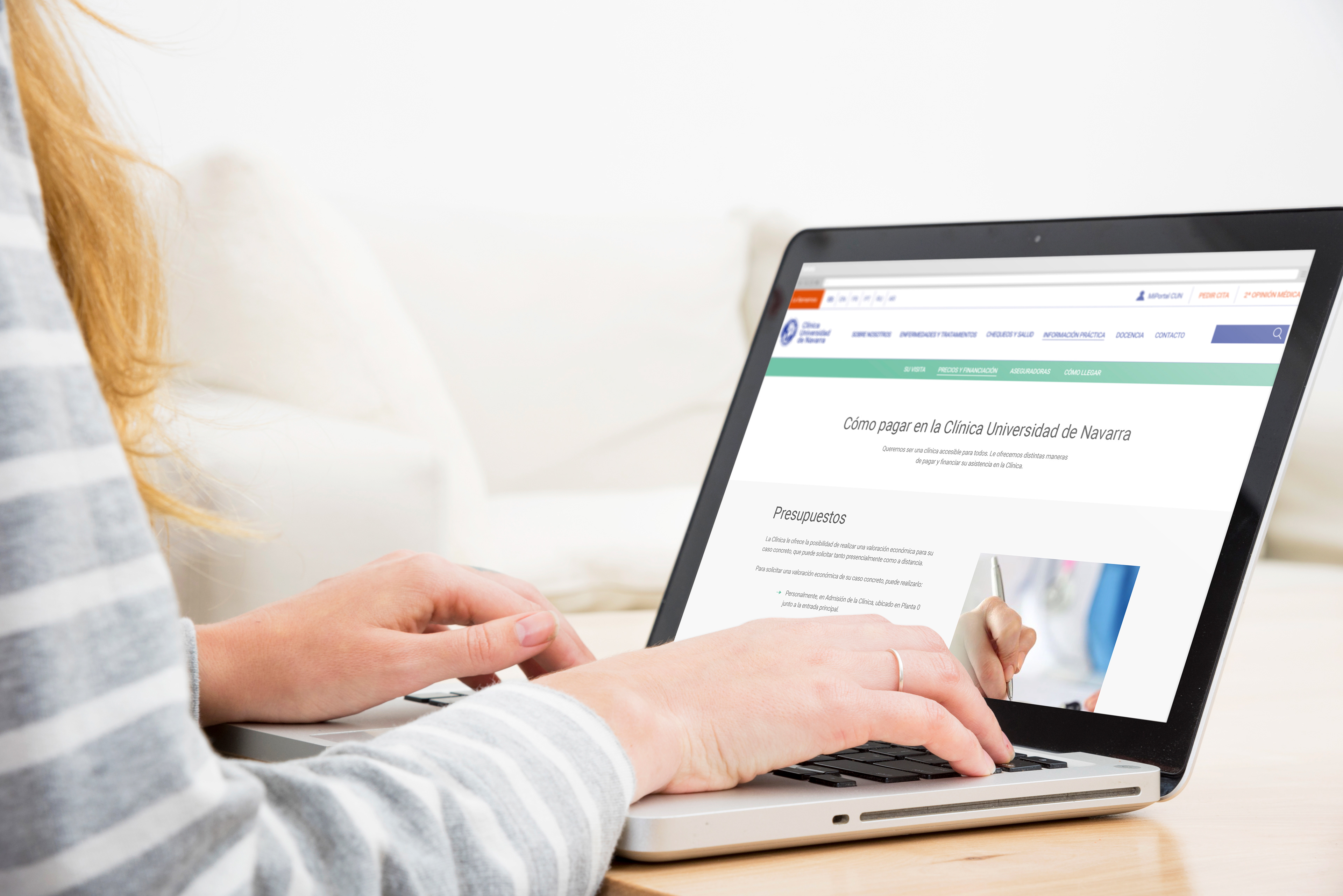
Redesigning the online communication channels and customer services to improve the international users' experience
Tools - Illustrator, Photoshop, Adobe XD, In Design, Double Diamond Methodology and Service Design Tools
Team - Just me
Research - Redesign
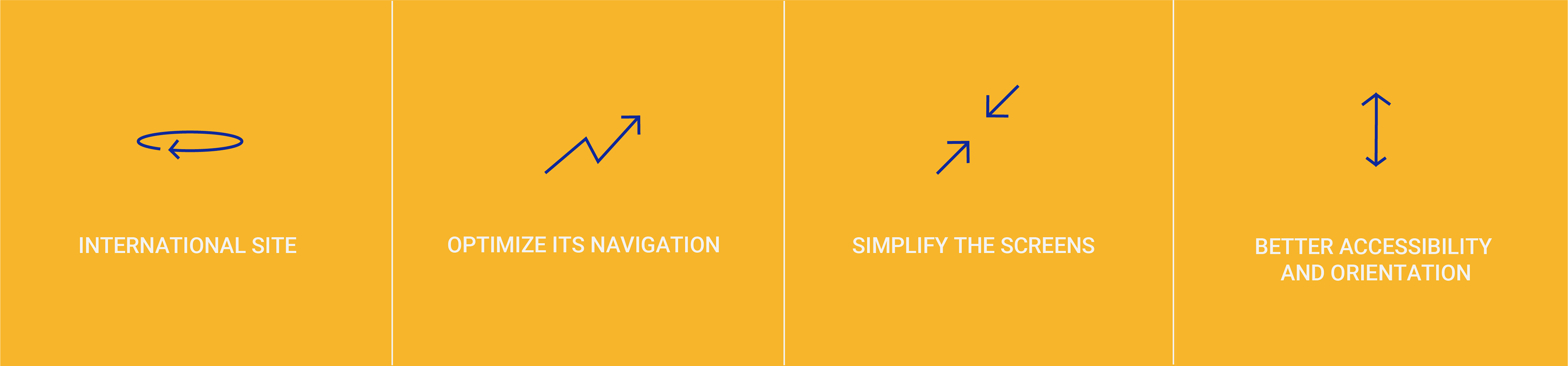
OBJECTIVES
The purpose of each of the pages of a website is to be seen both as a complementary to the previous one and as a bridge between one another. Not as isolated sections.
- My own conclusions & goals 🧠
Final Proposal & Design /
Screens designed, video and brief user testing
Analysis of the current website /
Understand its main screens, interactions and functions
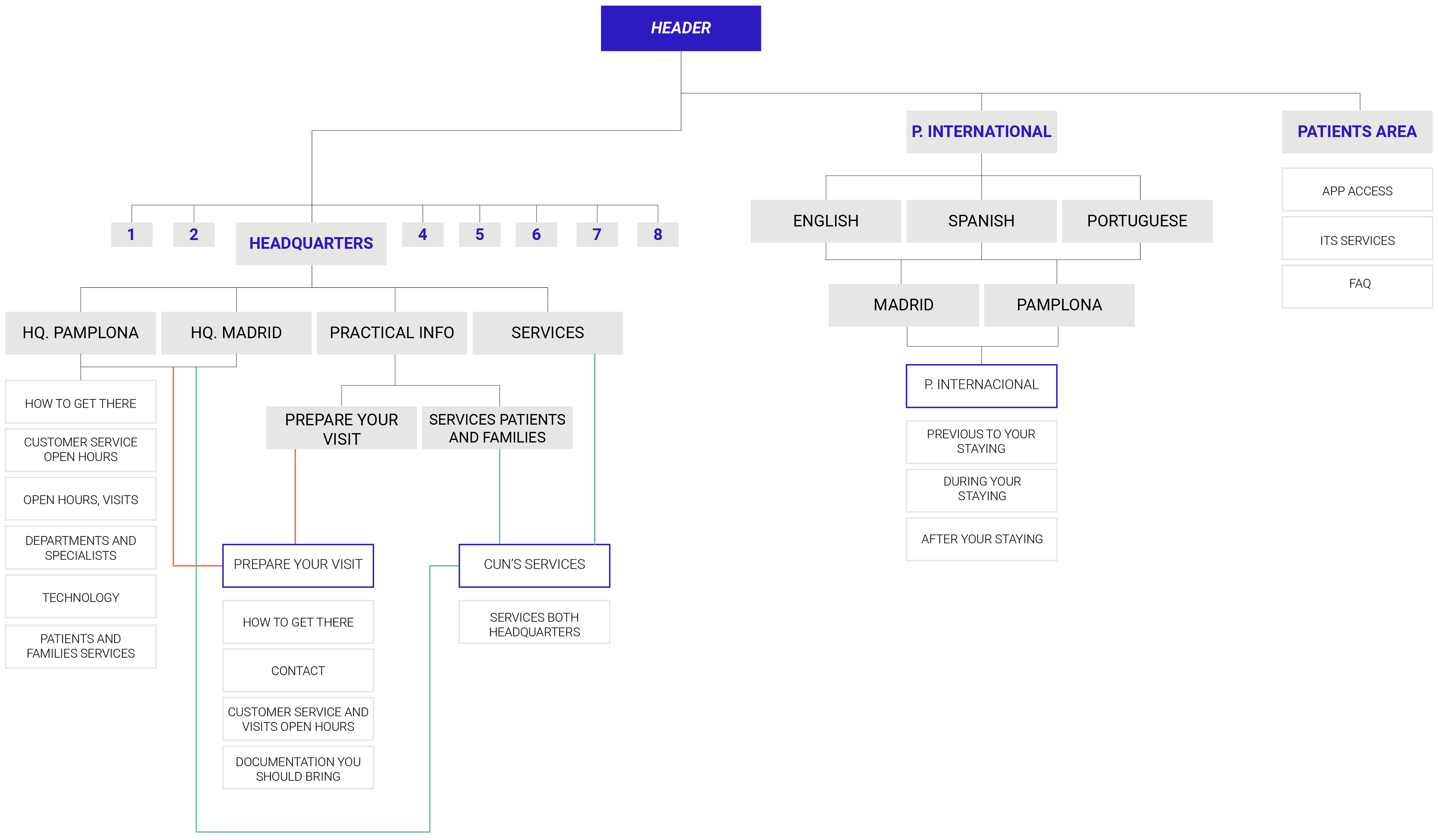
It all started by understanding what the POV were and work according to them. I focused on the main screens, which are: Home page, Patients Area, International Patients, Basic Information, Services and Second Opinion Services. This analysis and redesign will be based on three aspects:

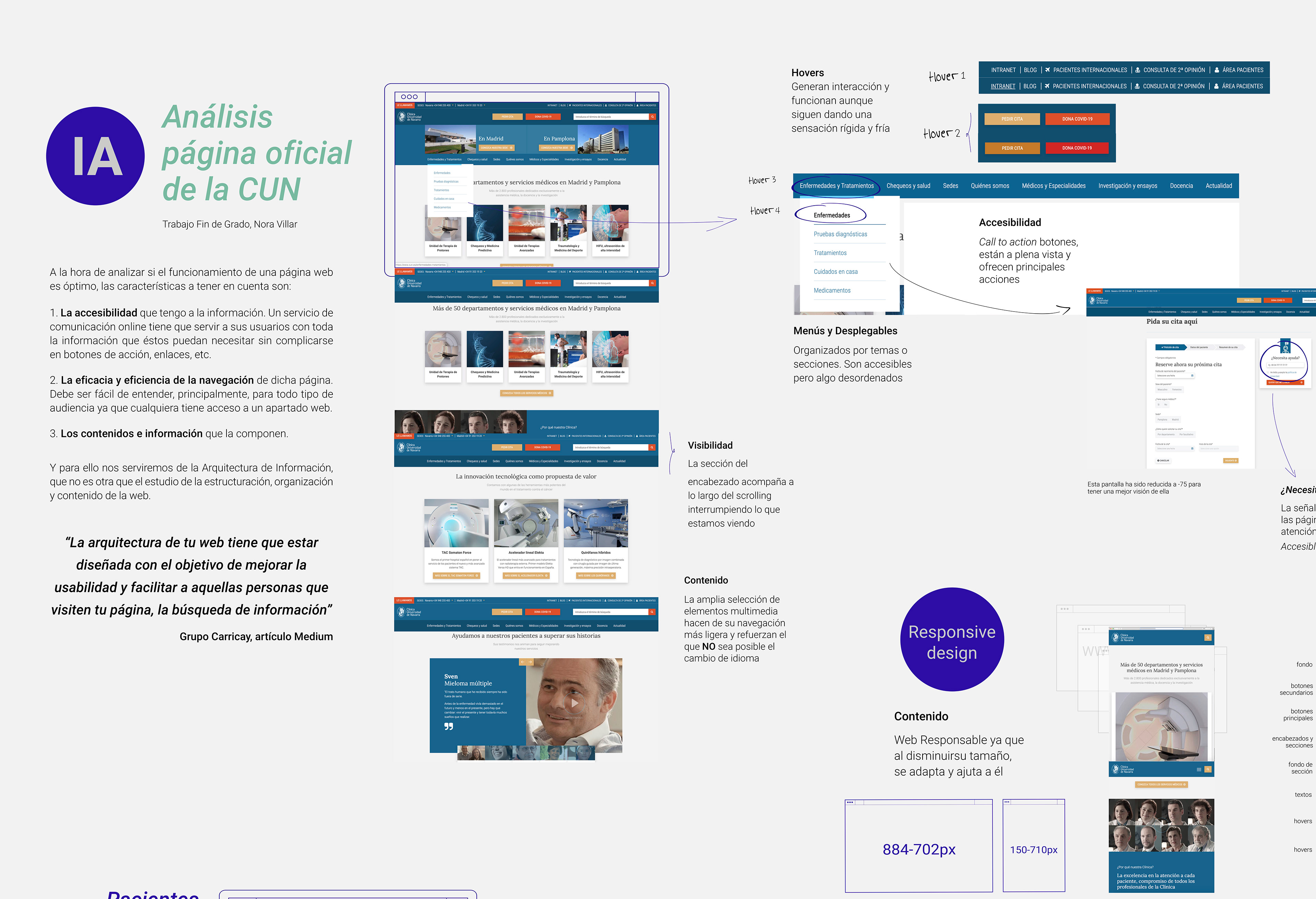
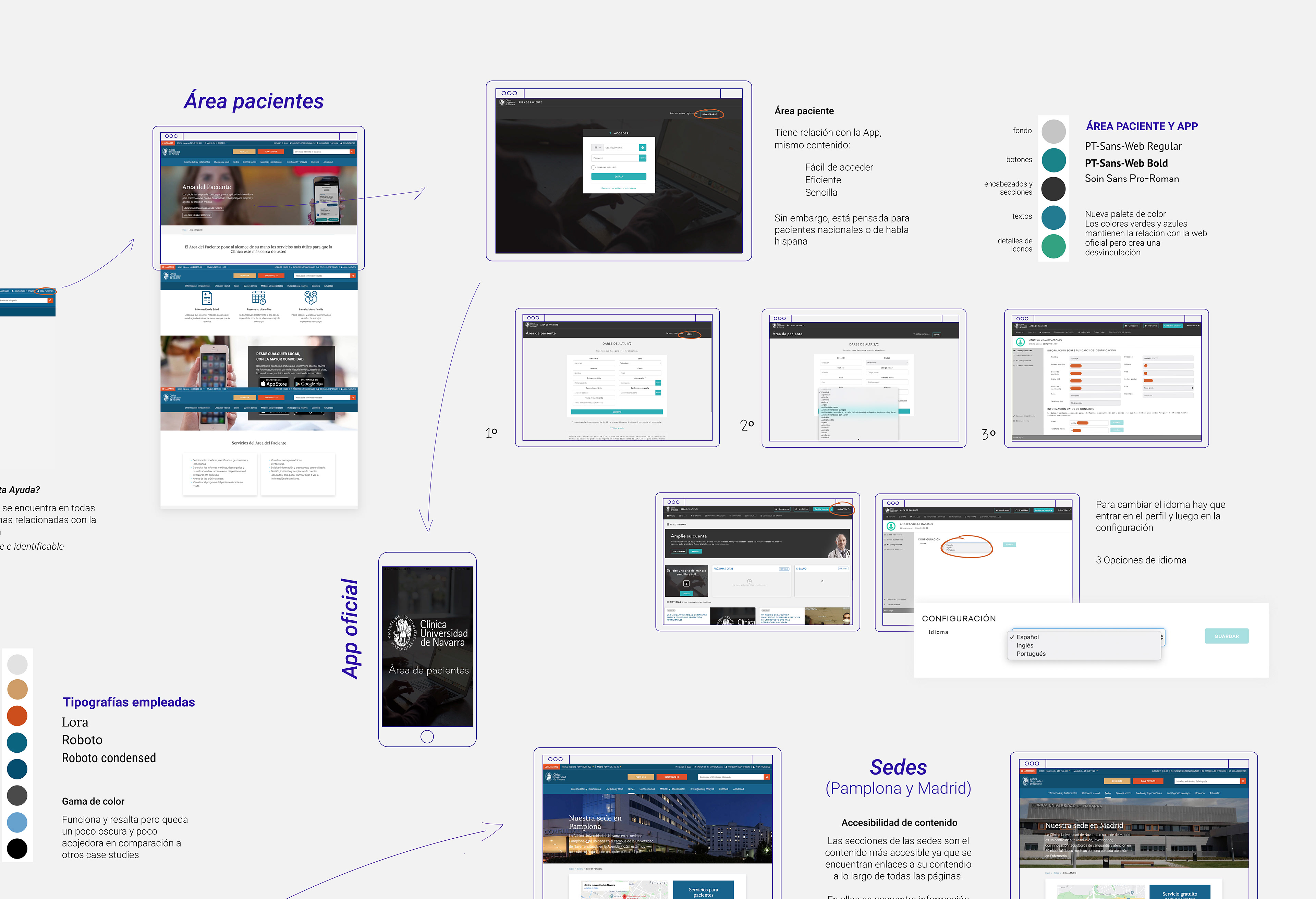
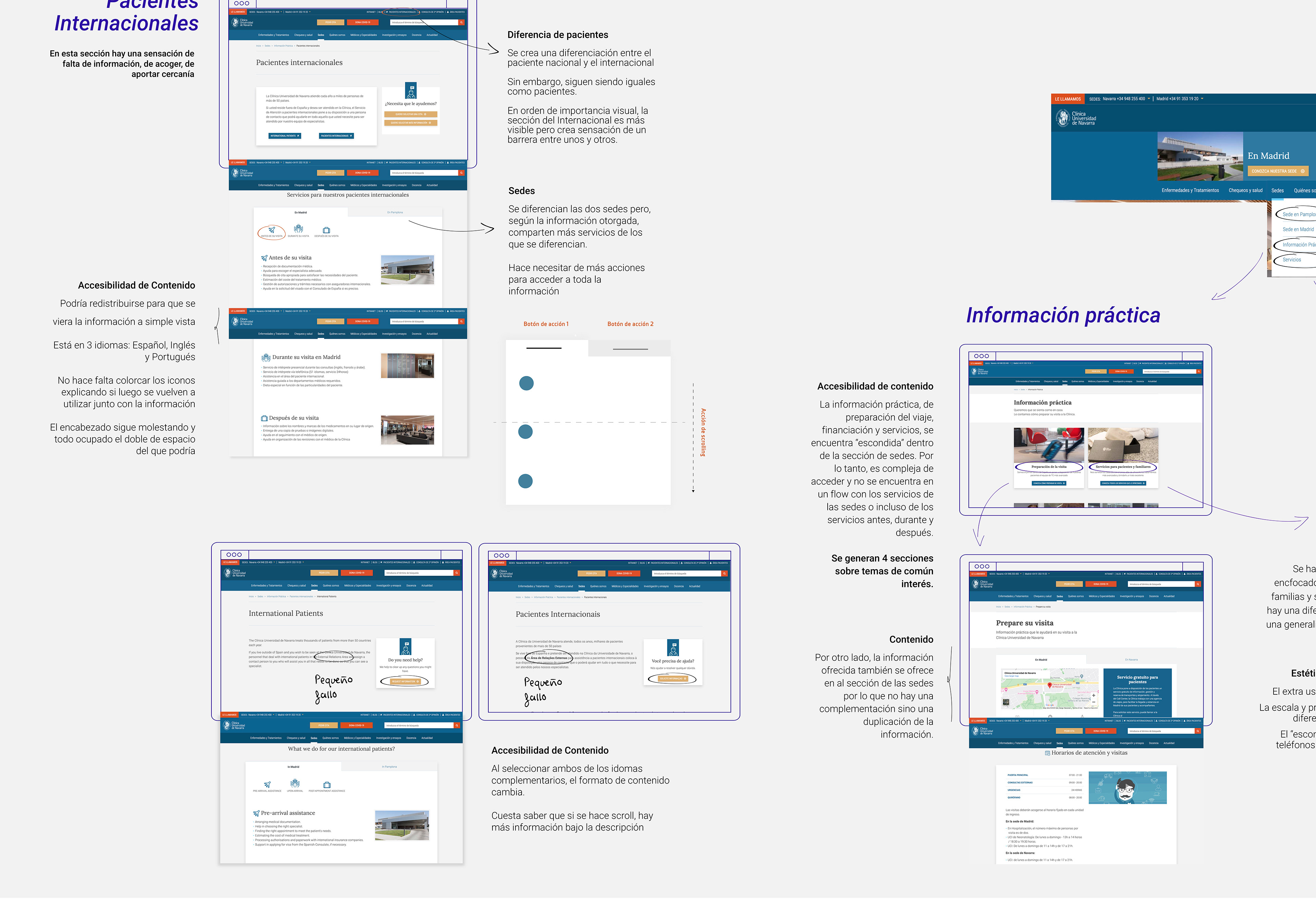
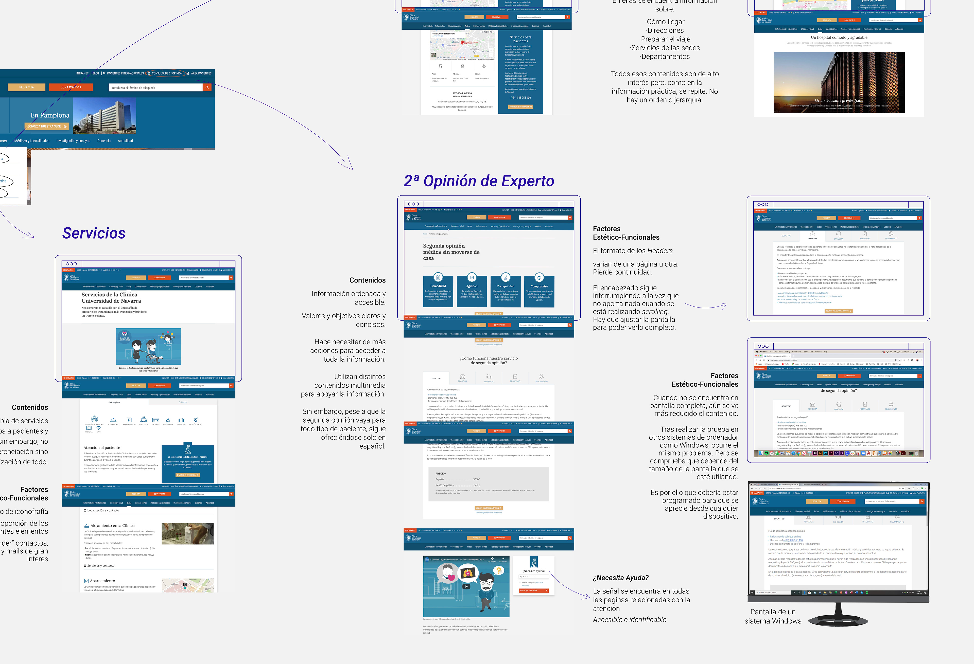
Diagram of the analysis generated
Header Redesign /
Information Architecture, wire frames and redesign
Current header

Current header and menu + Notes taken during ideation
Insights
1. Calls to action buttons are linked to the same pages. This generates an unnecessary amount of information that hinders the navigation.
2. There is not a human driven hierarchy. Which means, it is changing the behaviour of a user towards the page. Even within the unfold menus.
3. It is an international website, however, there is no accessibility for non-spanish speakers.

Some Lo-Fi ideation for new header
Final header proposal
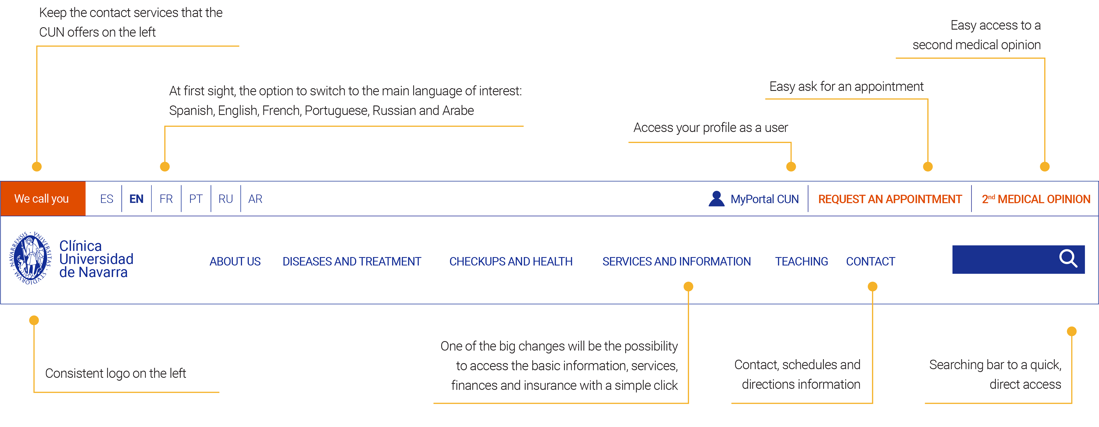
The interaction between the user and the website starts with the header. Thinking about a healthcare service, this might get overwhelming for the reader and it is why it is necessary to provide a clear and visual information. By doing this, they will be able to read the site in an instant.
Home page /
Information Architecture, wire frames and proposal
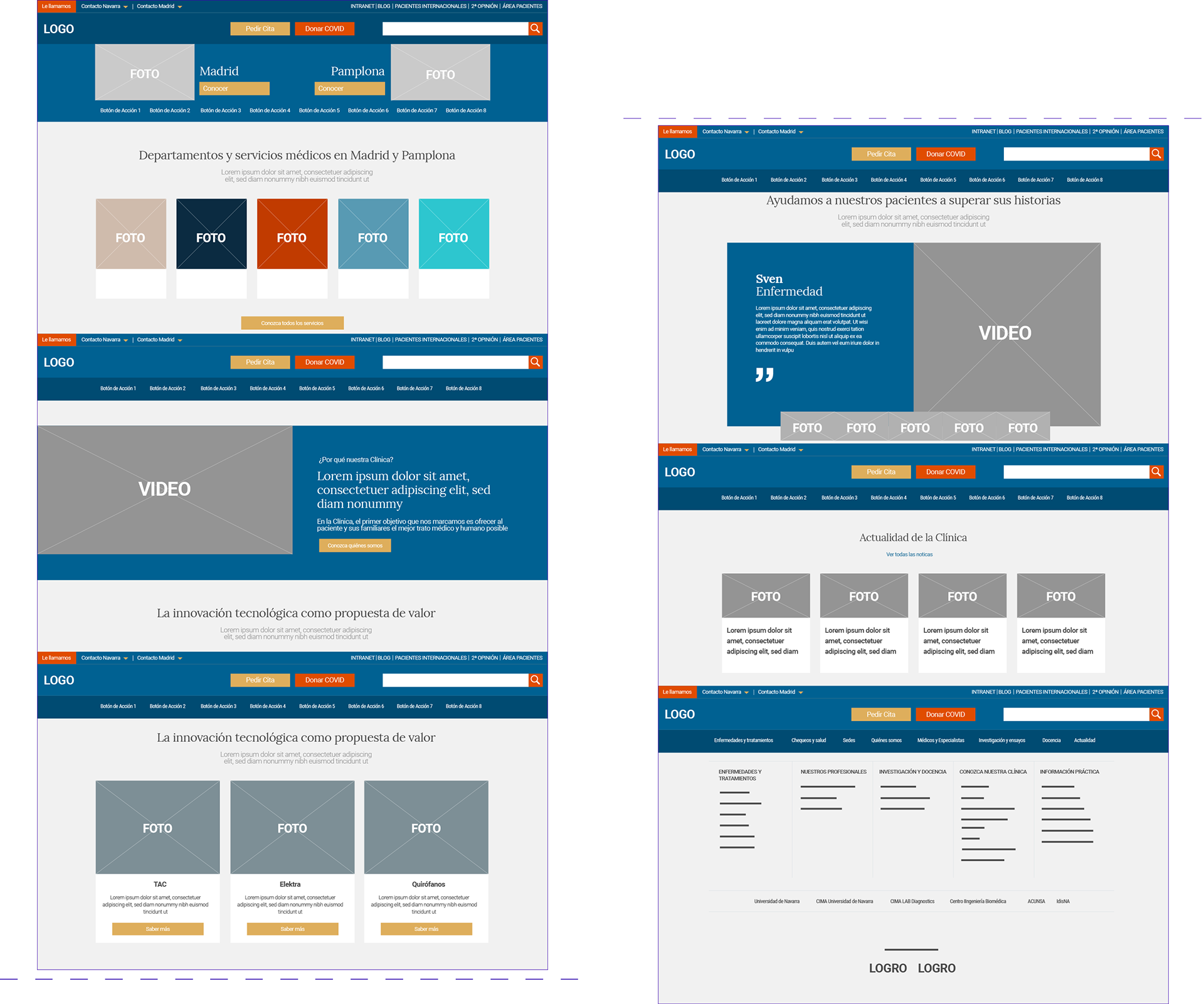
Current Home Page Wireframe
The main problem of the website in general is the loads of information it provides and the way it is displayed. Its consequences are: lecture difficulties, lack of flow and too many small elements to focus on.
1. The header occupies 1/3 of the screen sight
2. An 80% is multimedia content (photos, videos)
3. An 20% is text
4. Both the header and the footer offer the same information
---
“Disorientation. It took me a while to locate where to click due to the excess load of multimedia content. It was distracting me from my objective"
Co-design, national user
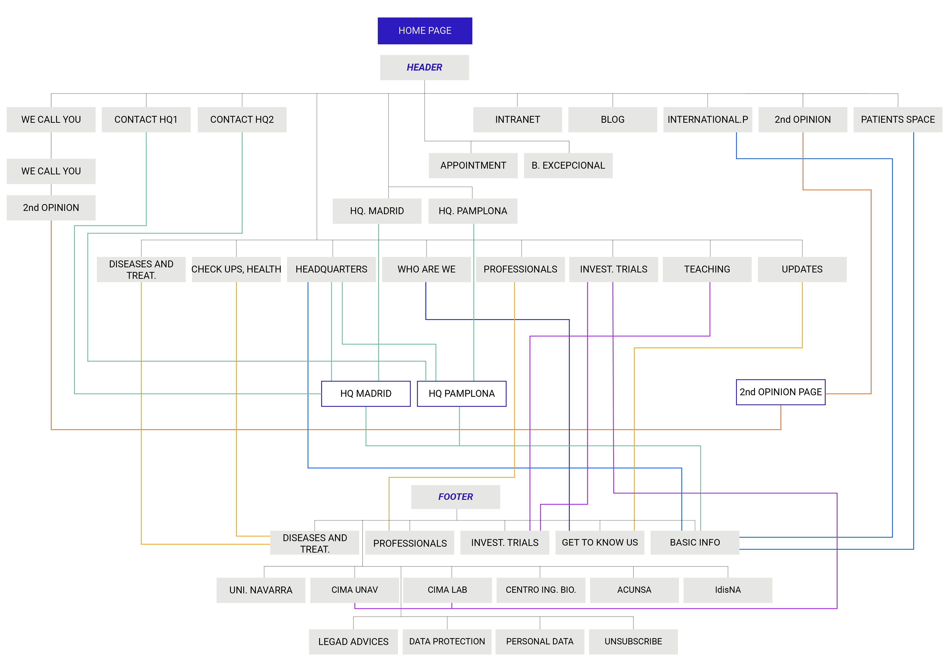
Current Landing page site-map
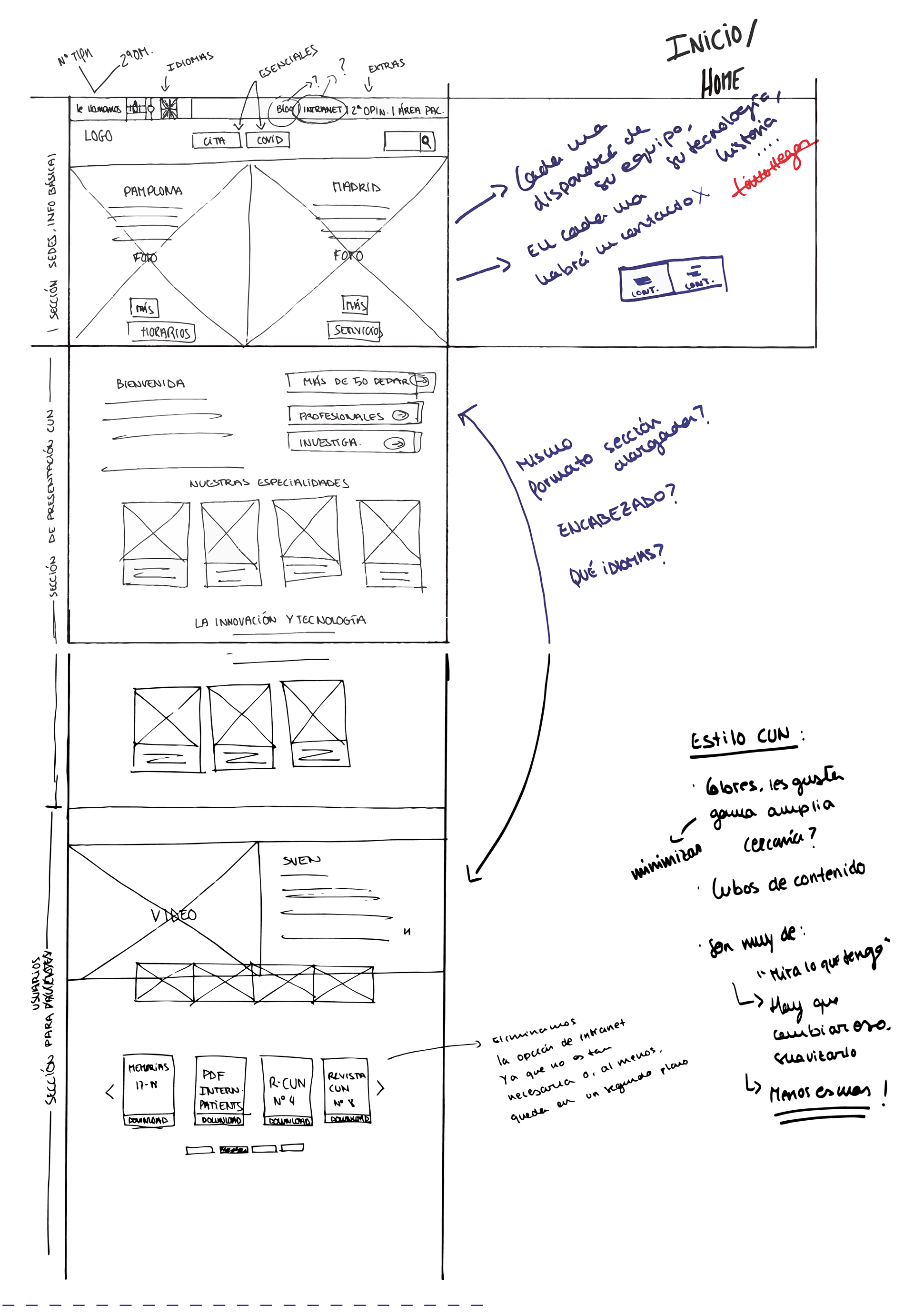
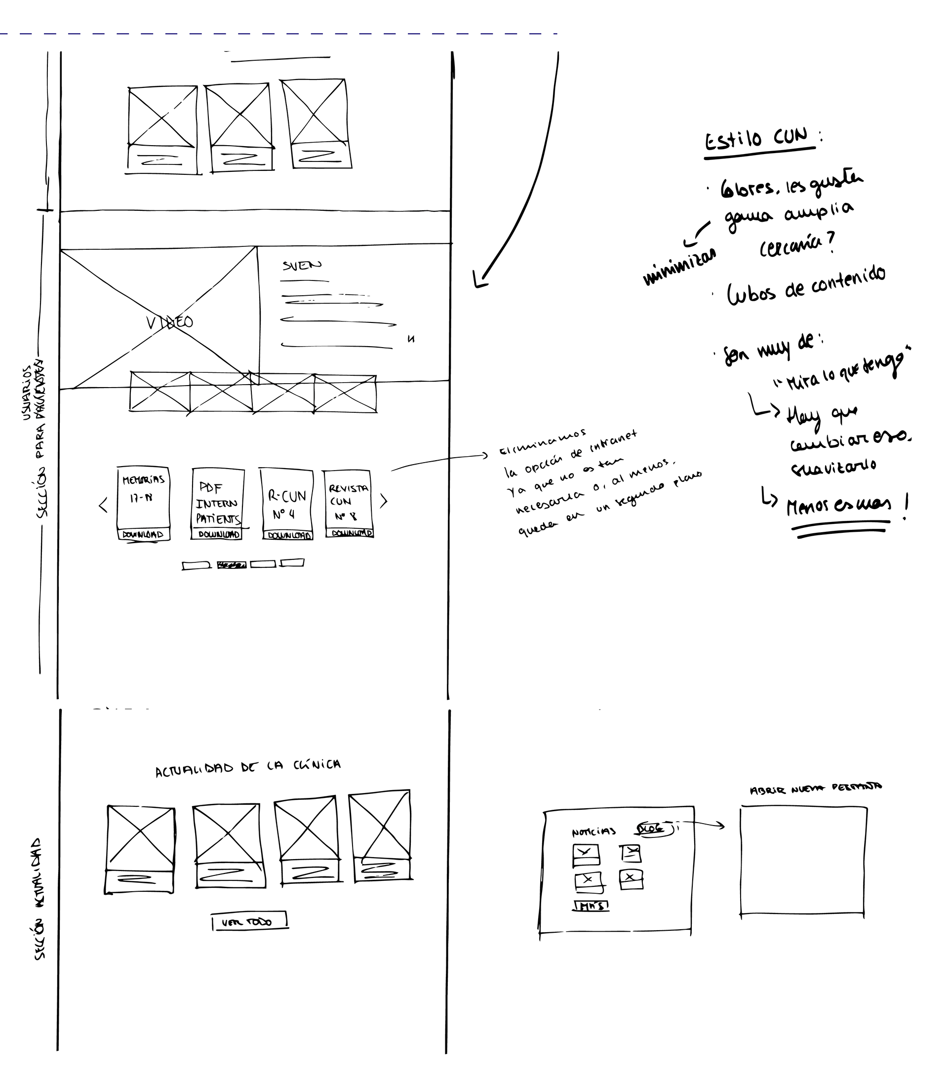
Home Page Lo-Fi ideation process

New Landing Page site-map

Fixed header adaptation when scrolling. Continuous access to the main information but it doesn't occupy as much.
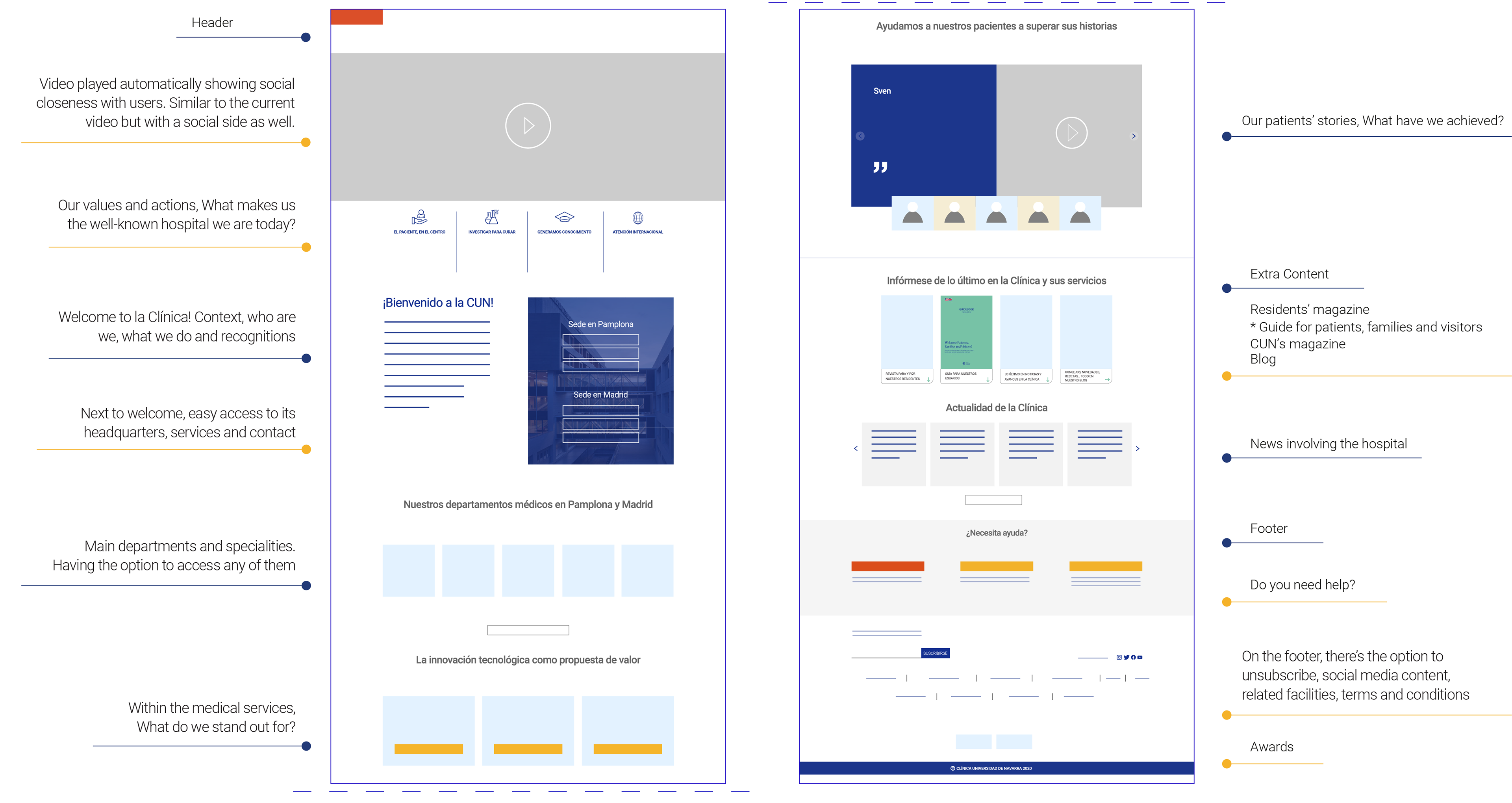
Home Page Mid-Fis
Previous to footer
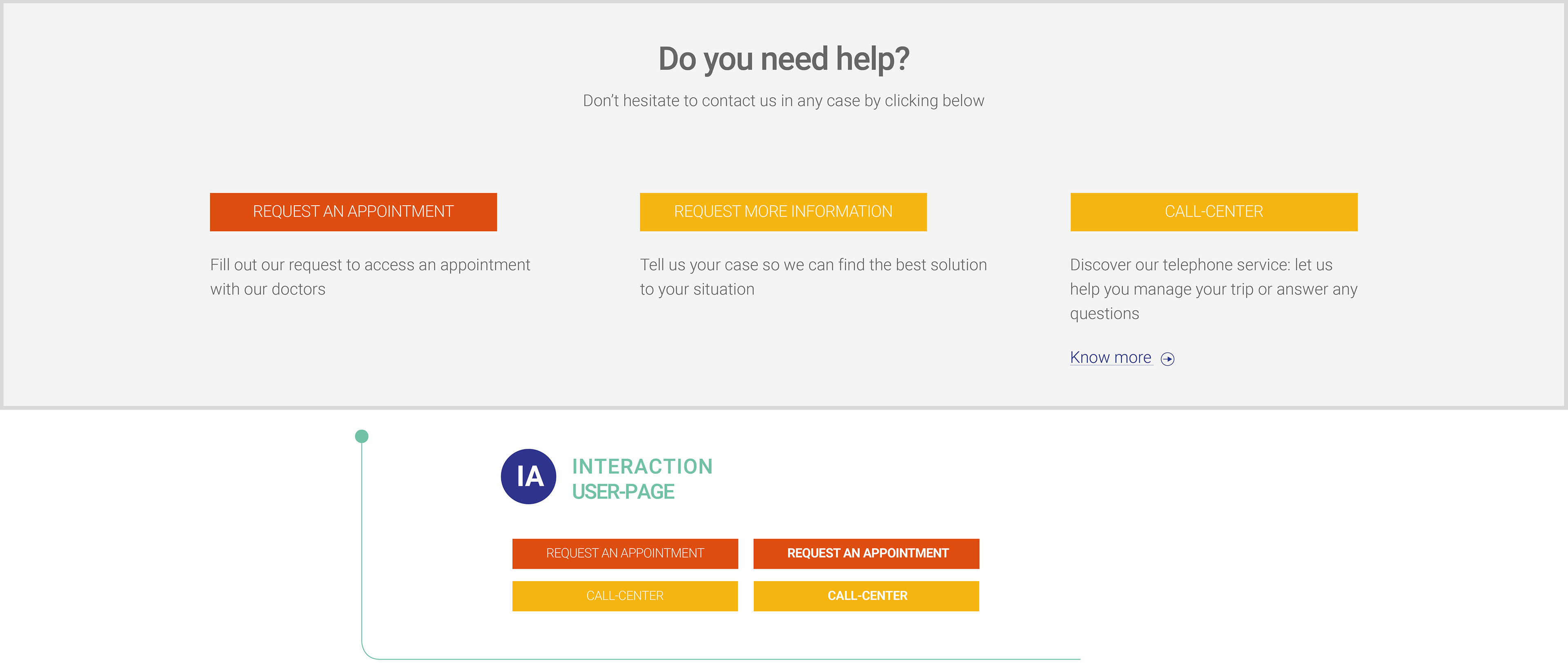
Services and Information section /
Information Architecture, wire frames and proposal
Get to know all the services provided by each of the HQs, what to expect and what to bring with you during your staying with us.
When trying to access the most mundane information, the reaction every user had during the co-design, and even myself, was to click on the 'Patient's Area'. However, that space is mainly reserved to showcase the Patients' app. All of them needed me to point out where to go.
This practical information can be found under the Headquarters' menu and then, through a selection of content such as: Hospital's Services, Prepare your visit, open hours or finances. Among others.
1. Multiple back and forths to collect that Practical Information.
2. First two language options (English and Portuguese)
3. Not accessible at first sight
4. Where's the info necessary for Families and Visitors?
Current site map
New 'Services and Information' section for patients
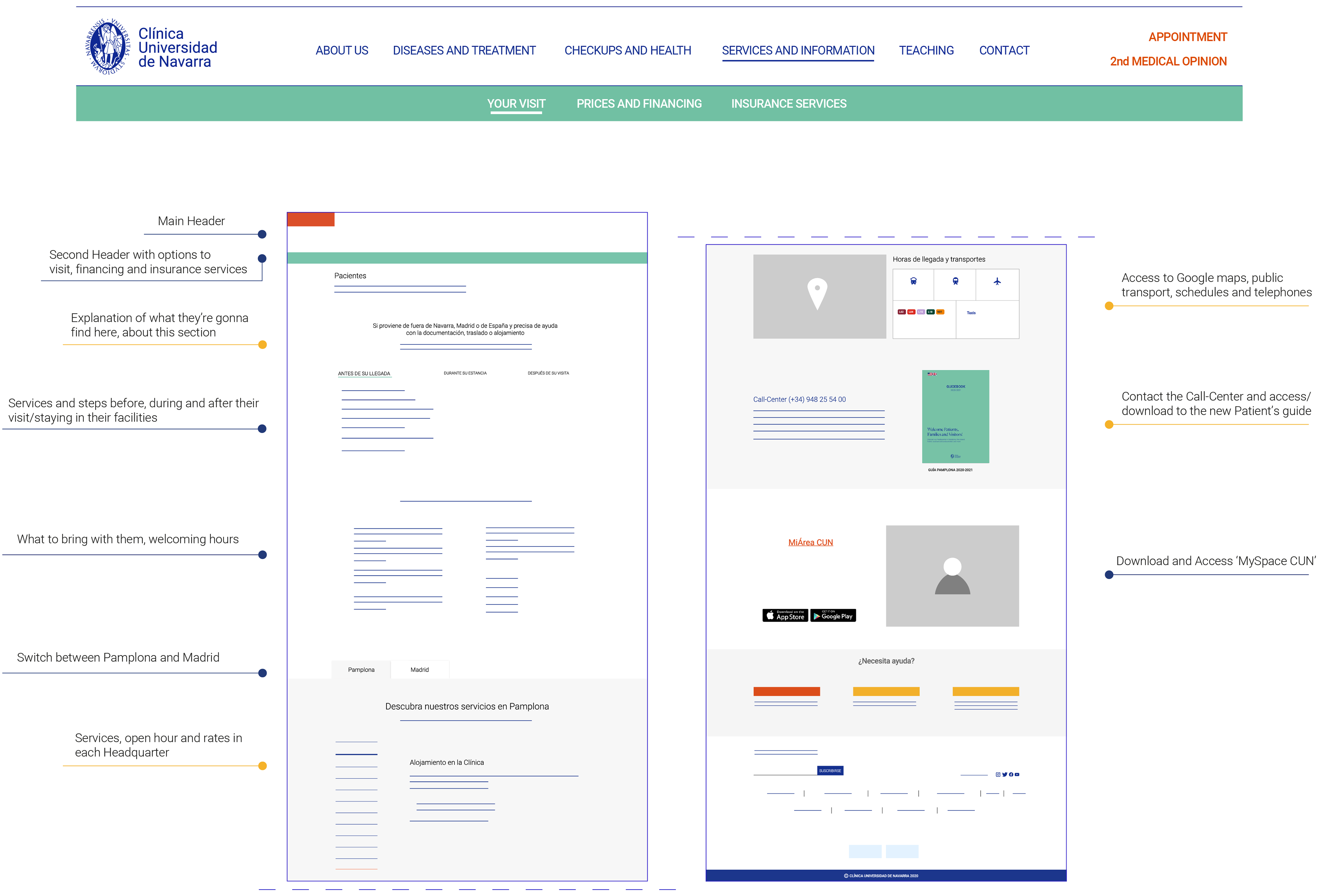
Patients' 'Services and Information' Mid-Fis
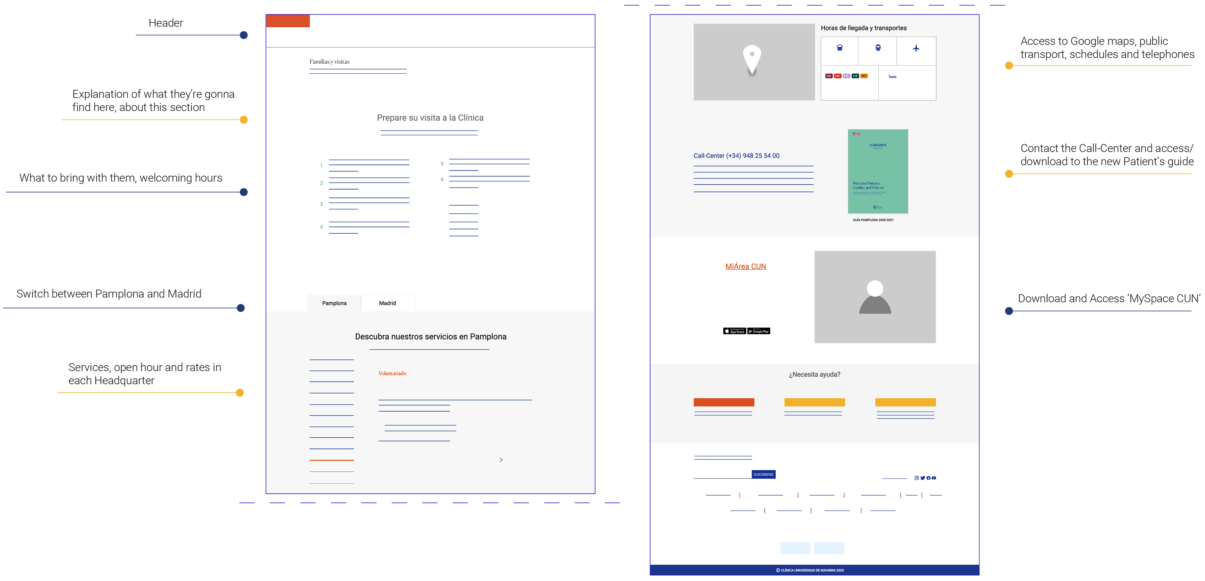
Families and Visits' 'Services and Information'. The content will be quite similar to the patients' but adapted to Visitors.
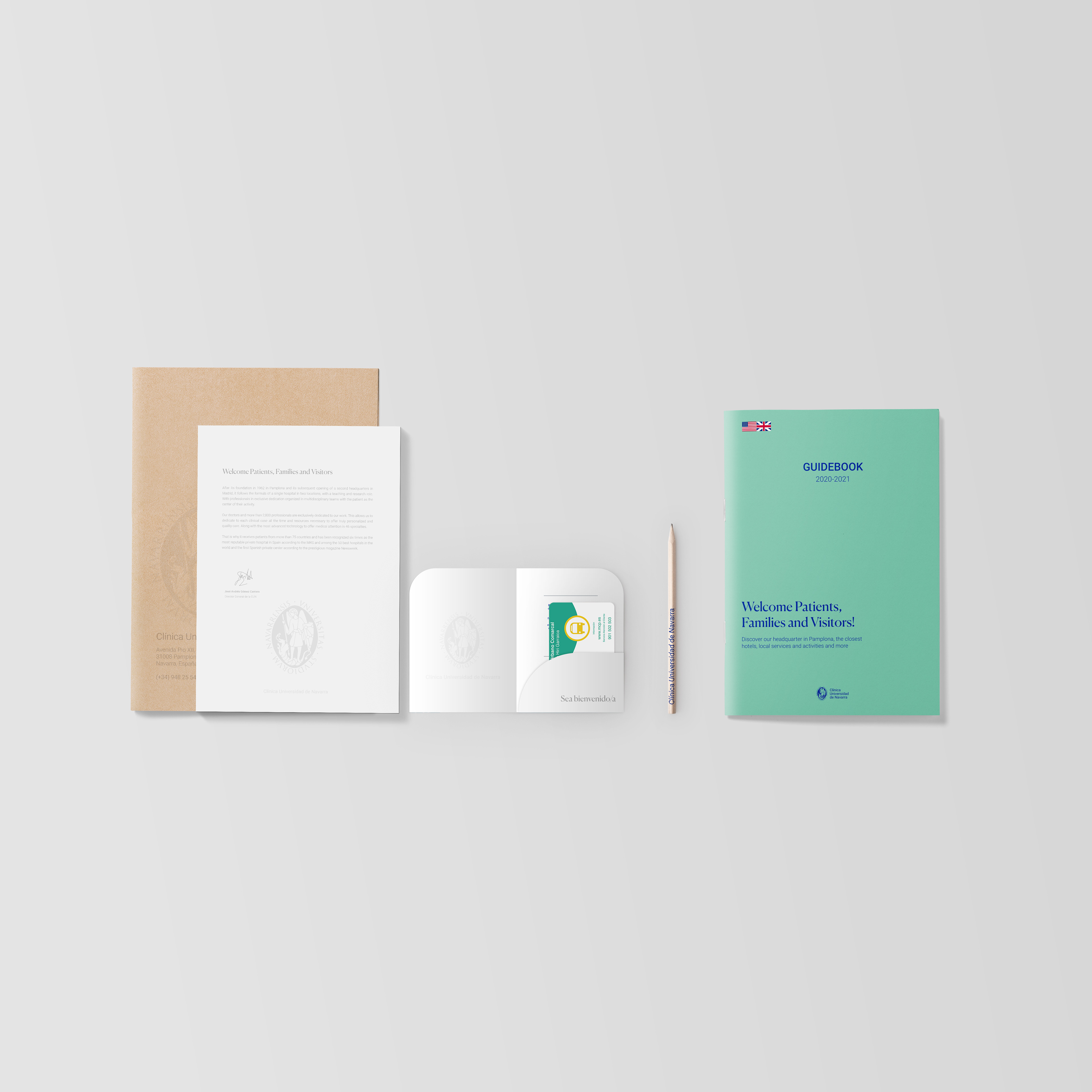
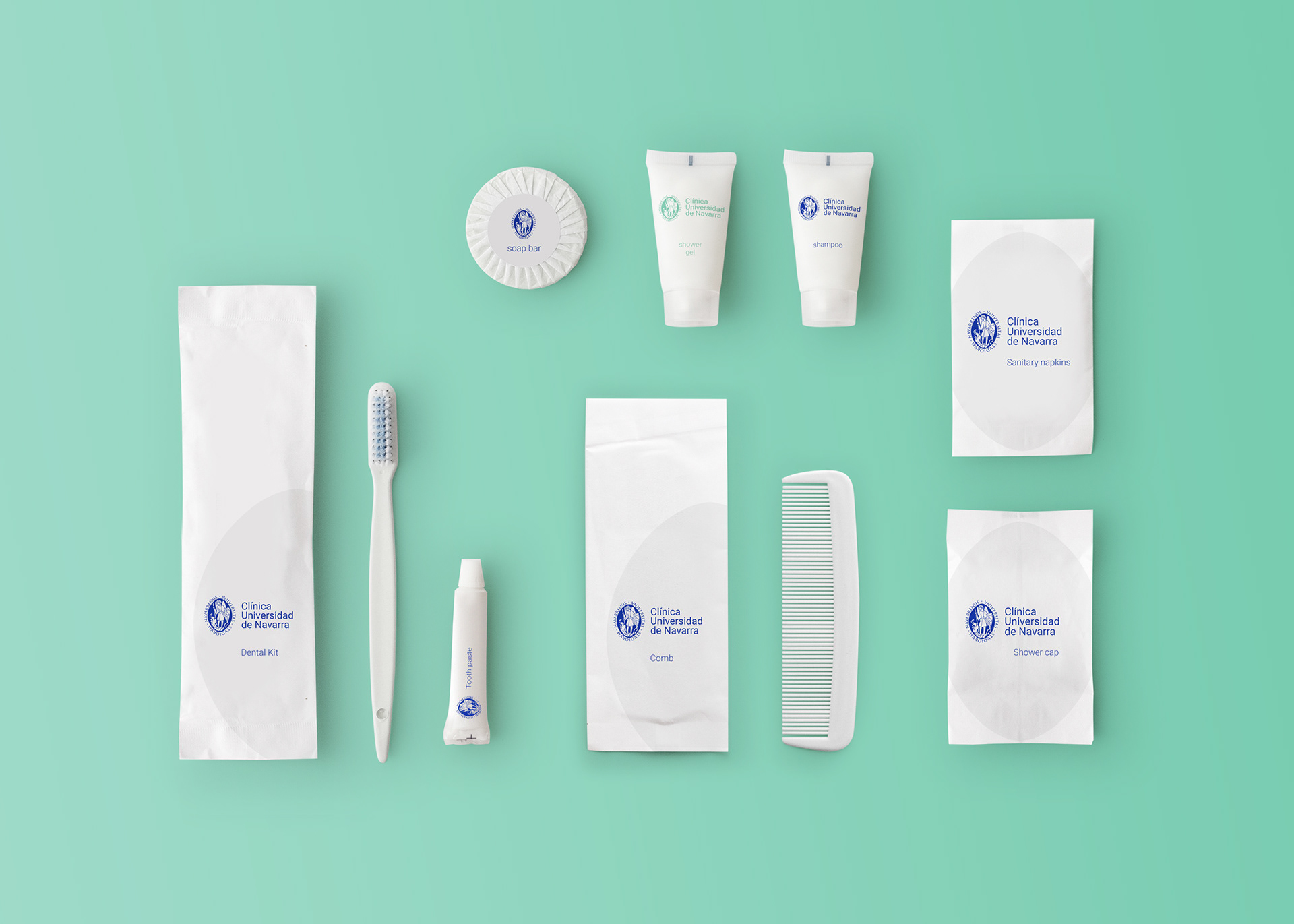
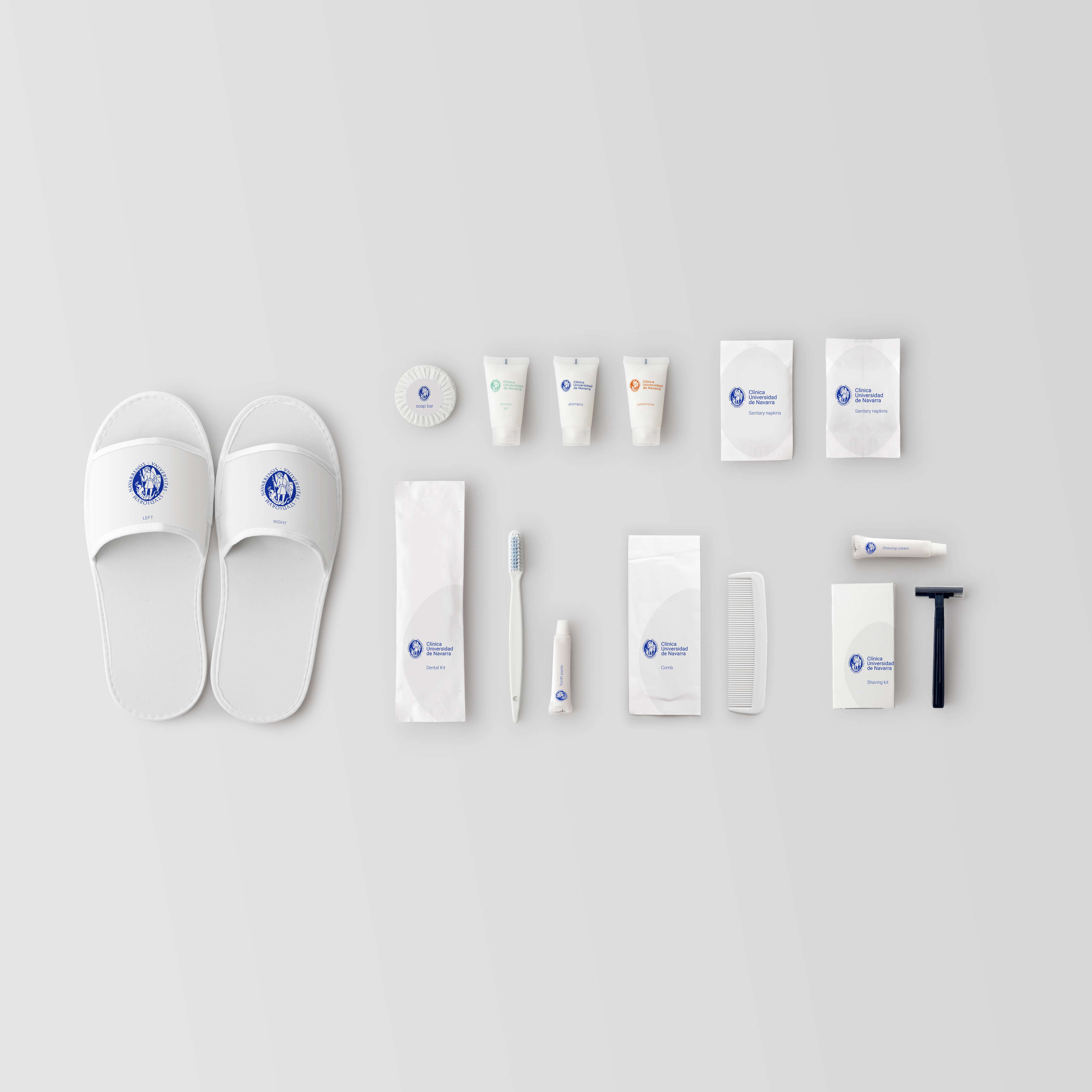
Physical User Experience Design - Guidance and Comfort
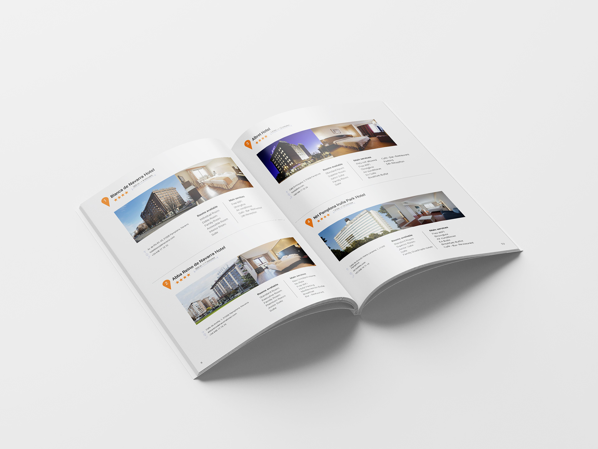
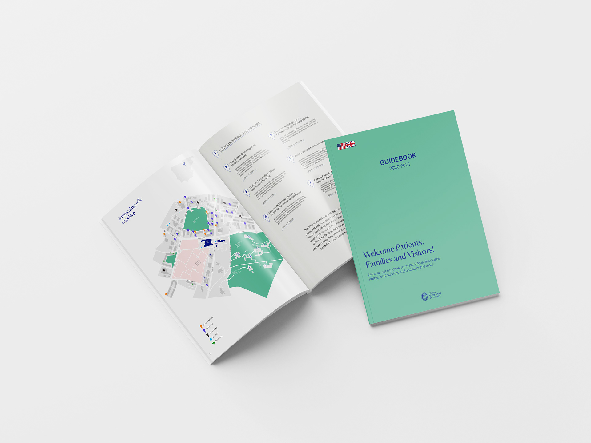
Images for the Guide designed with hotels, activities, restaurants and cafés in the city. Proposal for the documentation provided at the arrival with a public transport card, the guide printed and a folder with the important docs. And a welcoming set of basics for the incoming patients

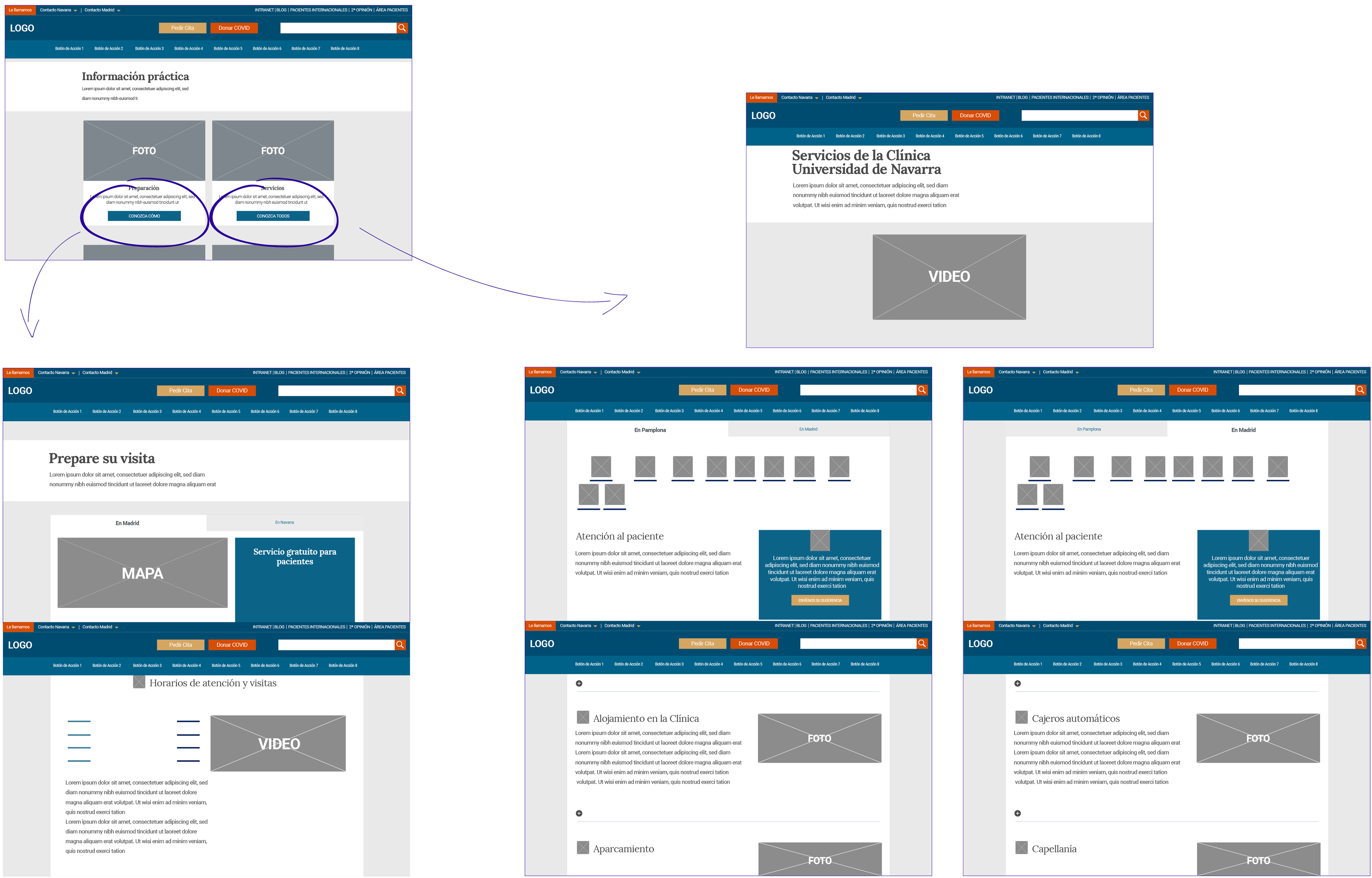
Headquarters /
Information Architecture, wire frames and proposal
Design a coherent structure for both Headquarters focusing on the main contents of information such as: Facilities, professionals, specialities and new technologies. What each of the headquarters is gonna provide and support with?
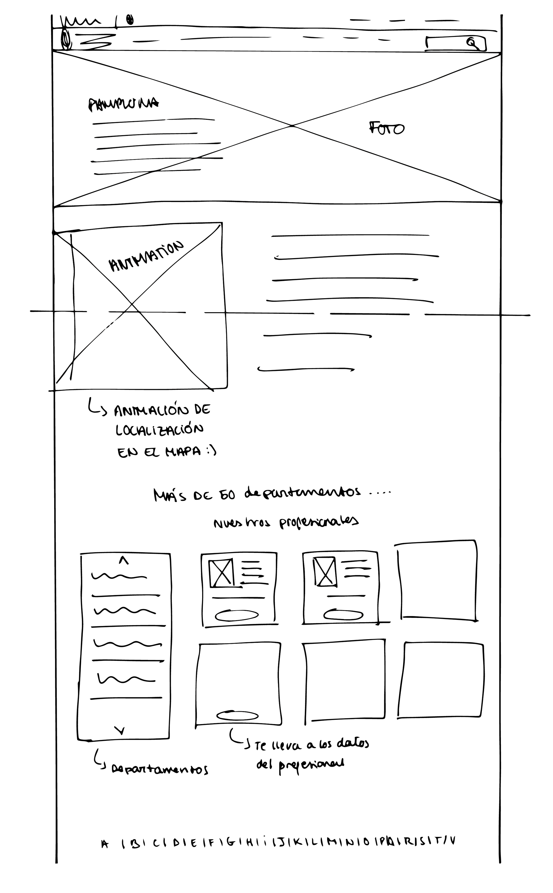
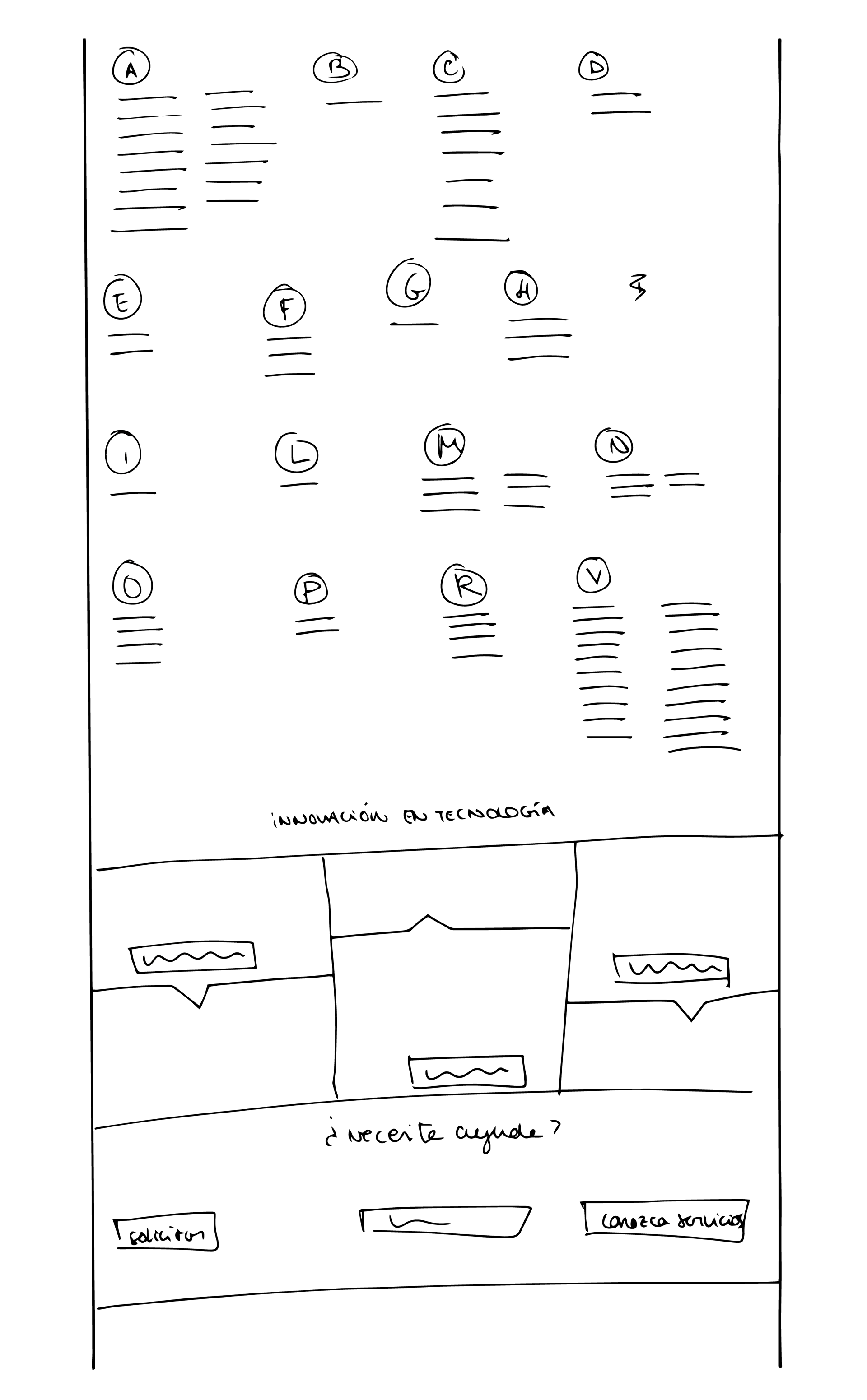
Headquarters Lo-Fi ideation process
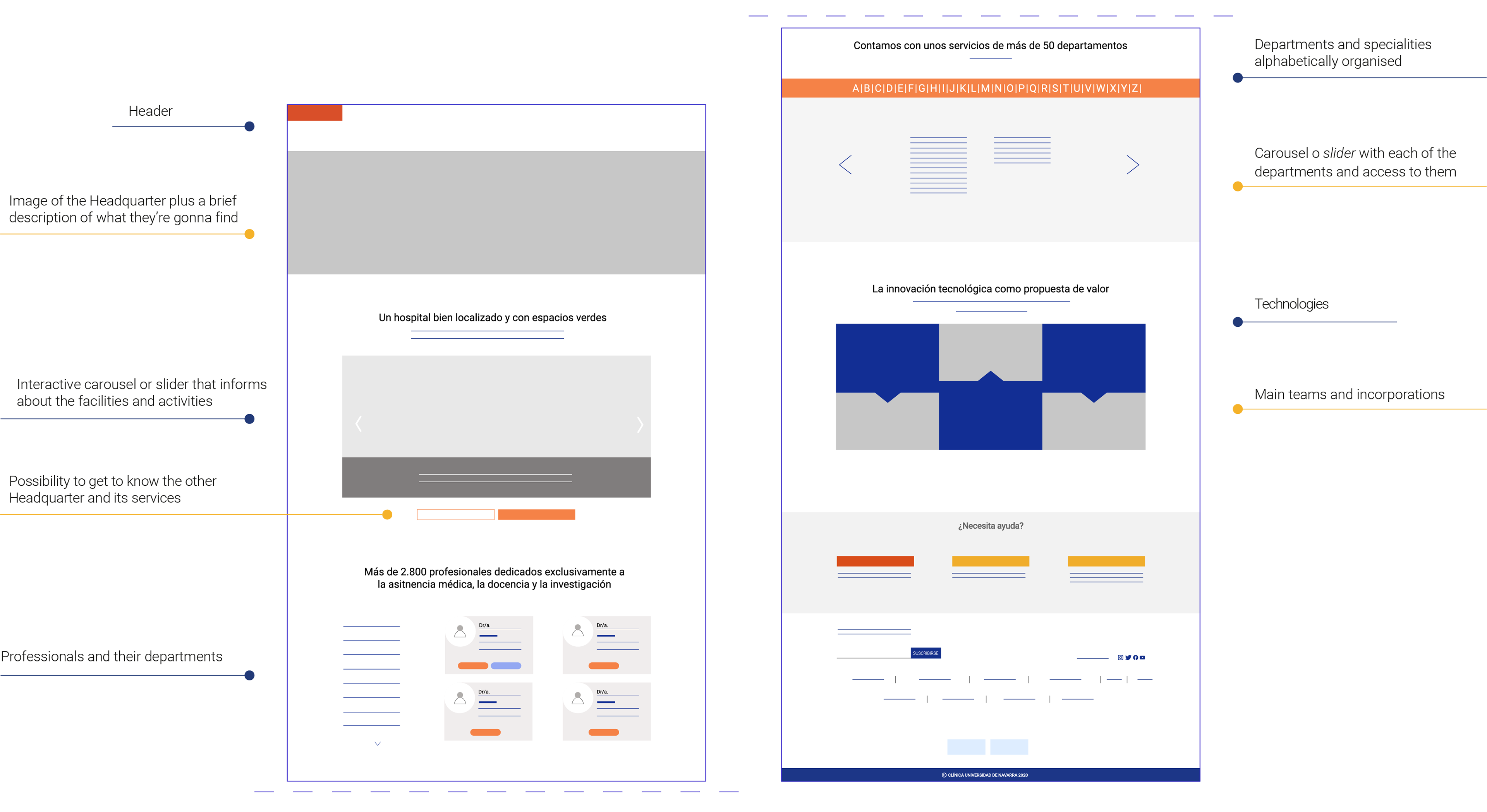
Headquarters' final Mid-Fis
Final screens designed
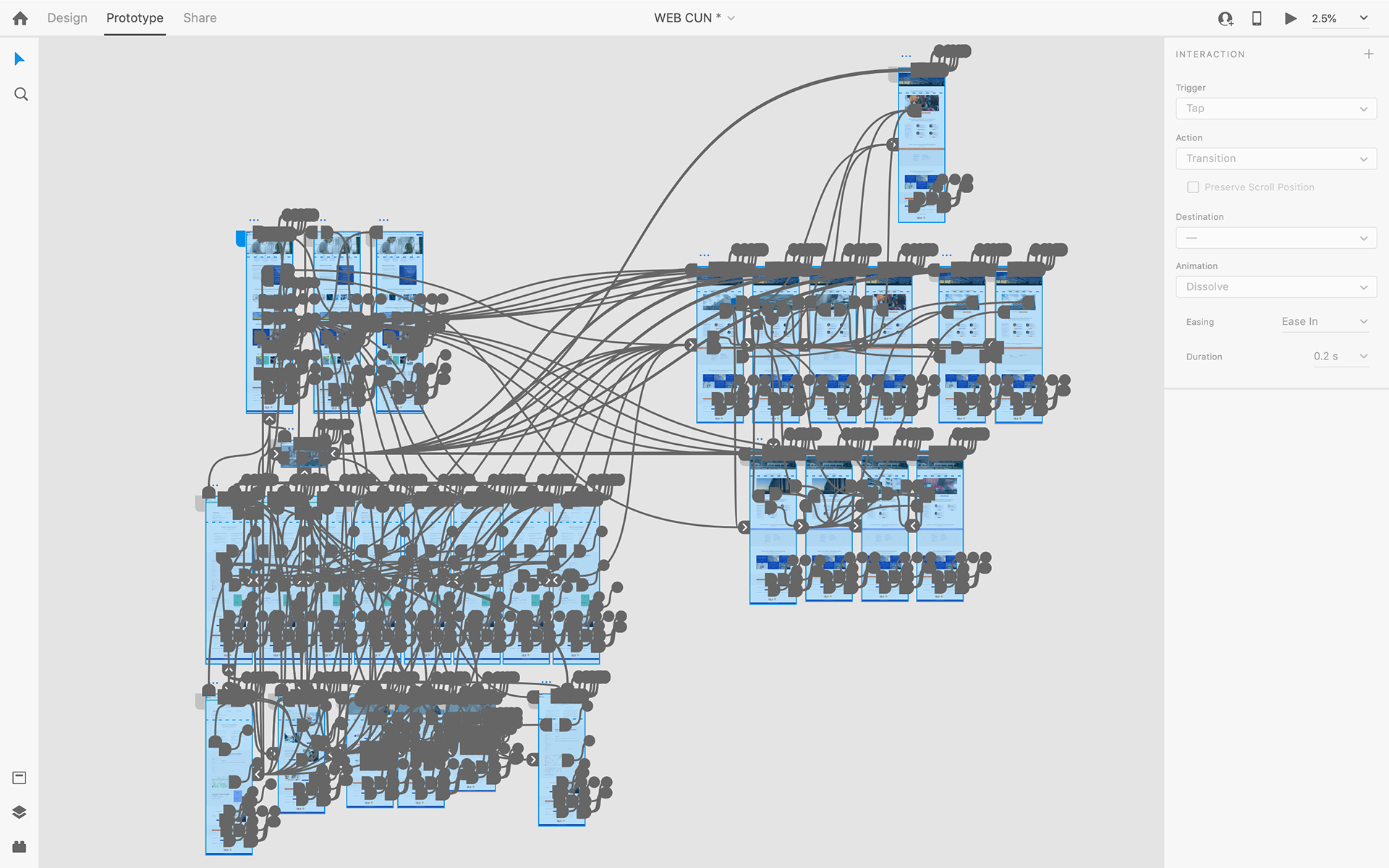
Final interactions generated