Interaction Design - UX/UI
App design - A communication channel for the ManHealth community
Client: ManHealth Organization, Northumbria University
Tools: Adobe XD, Figma, and Illustrator
Project overview
Project Scope
We were asked to develop a project together with ManHealth Organization. A non-profit community built to help and support any man that needs it, in different locations of the UK (in our case, Durham).The objective was to first, interview and talk to the managers and members from ManHealth in order to listen to their concerns and collect insights. And finally, design a service that, in our case, consists of an accessible app for all of them, with access to all their resources, communication, forum, and events, and second, some possible improvements in the internal organization of ManHealth.
The process
Interviews
During the first interviews, we asked the members and Paul (the director/manager) questions related to the services they offer, how they found the organization, and asked them to talk a bit about how the communication is going among them or what they expect from us. These are some of the main ideas extracted from our notes during the sessions.

Highlights from the notes taking during the interviews
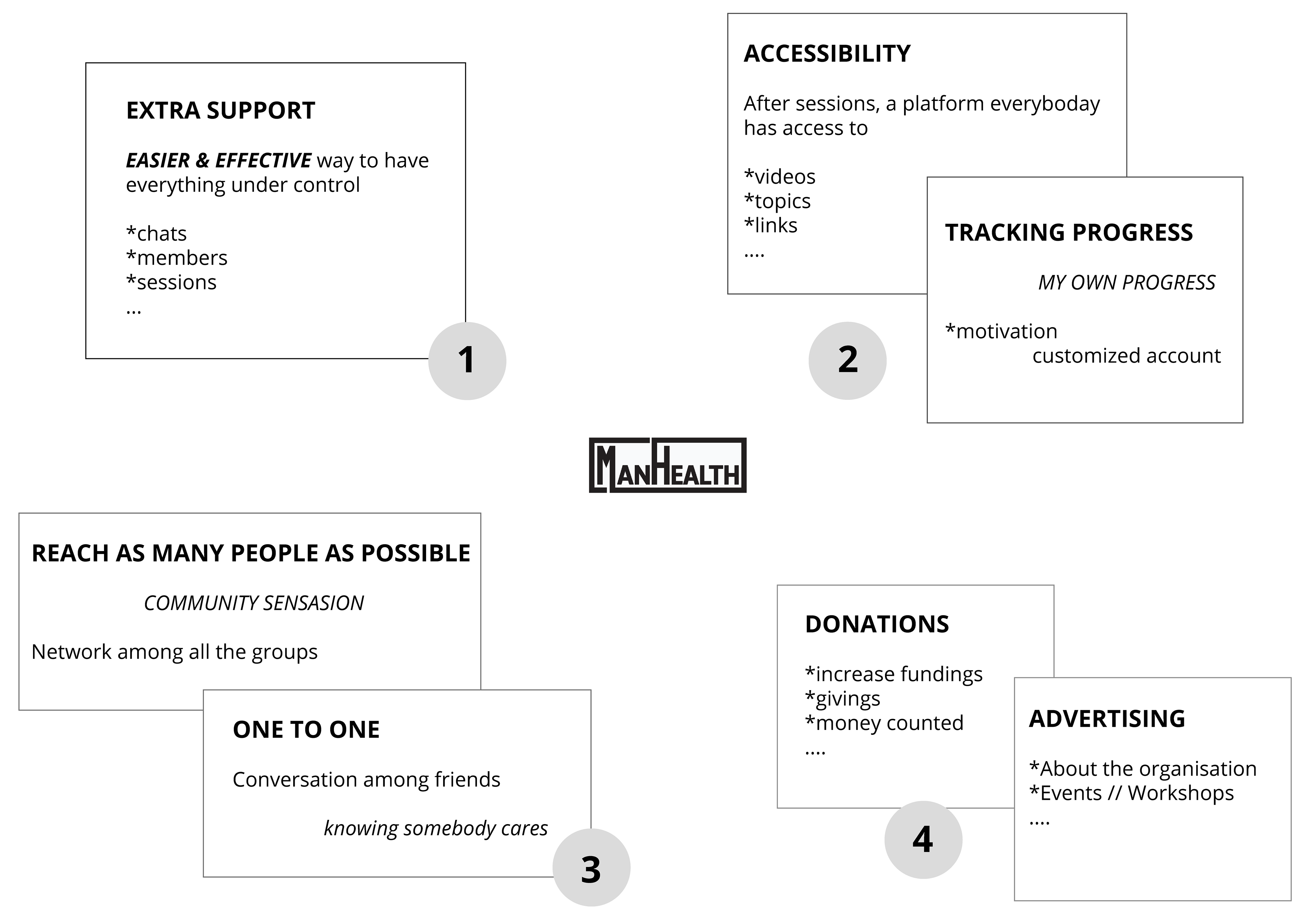
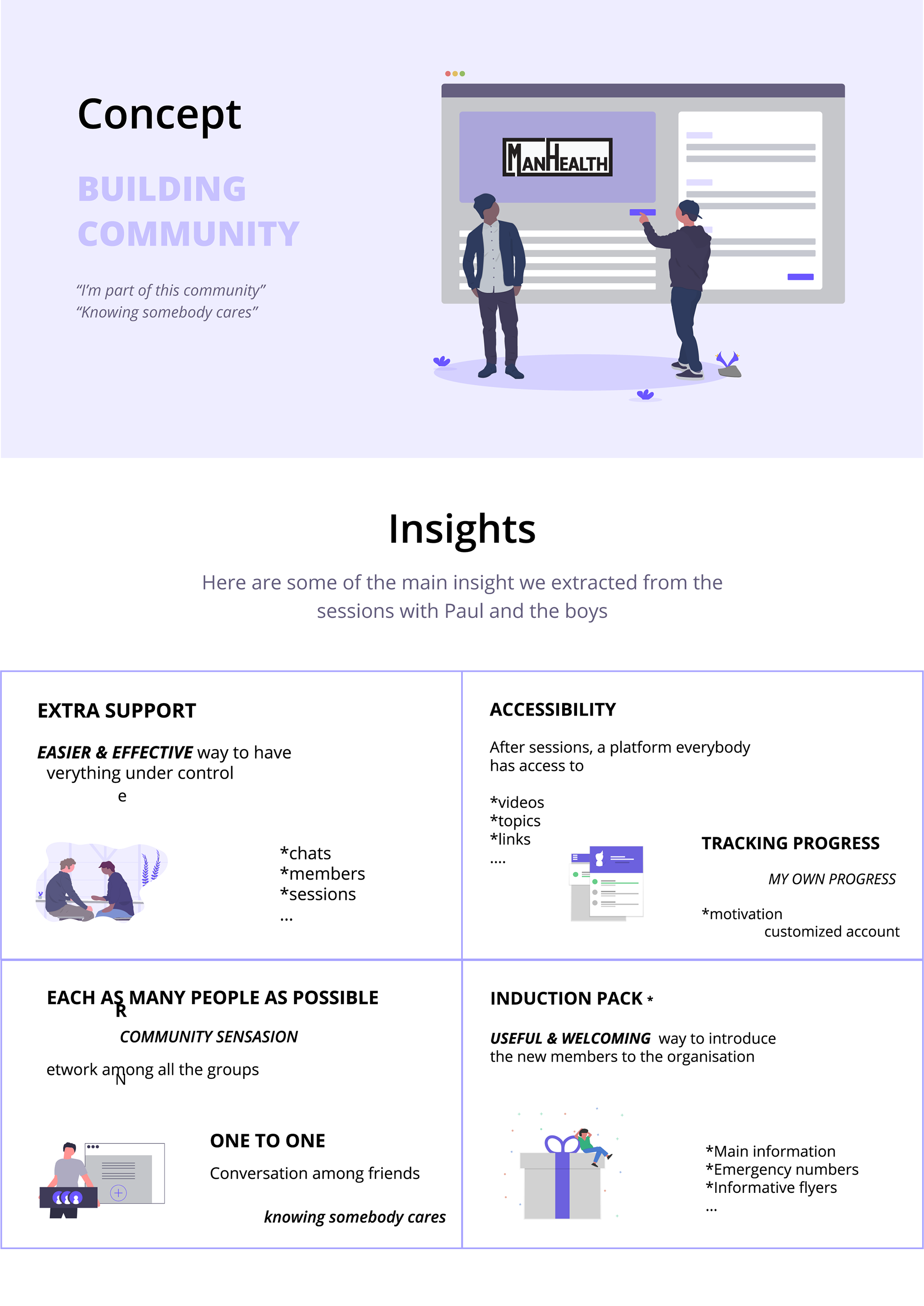
Insights
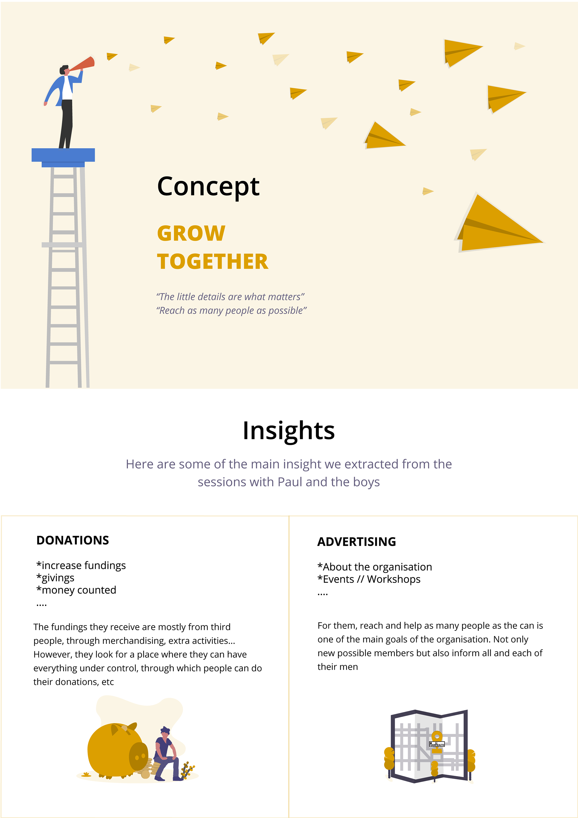
From the interviews, we concluded that in order to improve the general organization of ManHealth, we had to start by making Paul’s job more efficient and easier. That would lead to better accessibility for the guys to the different resources of the organization. Therefore, the communication among them will improve so they will reach new members, and finally, the name of ManHealth will be spread to other cities, people, possible sponsors, or donators.
Final insights
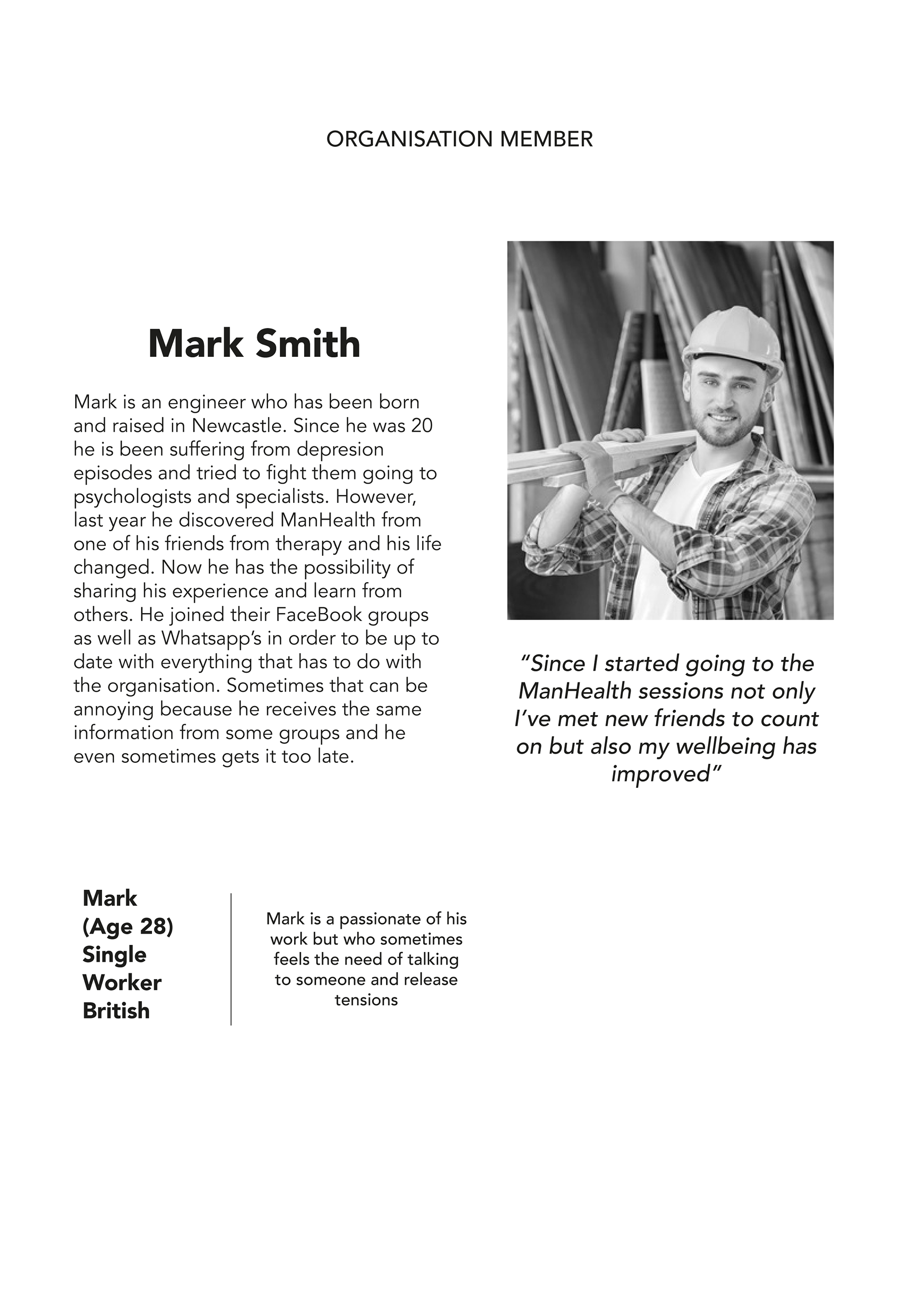
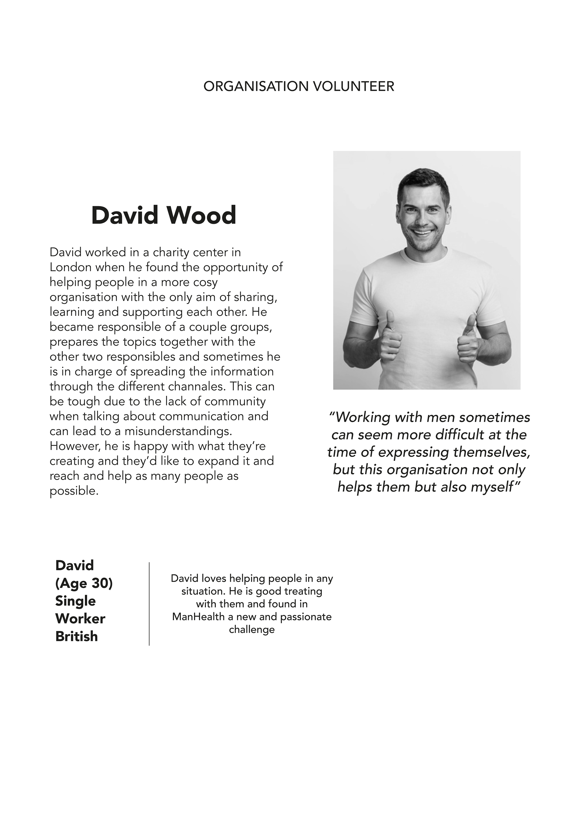
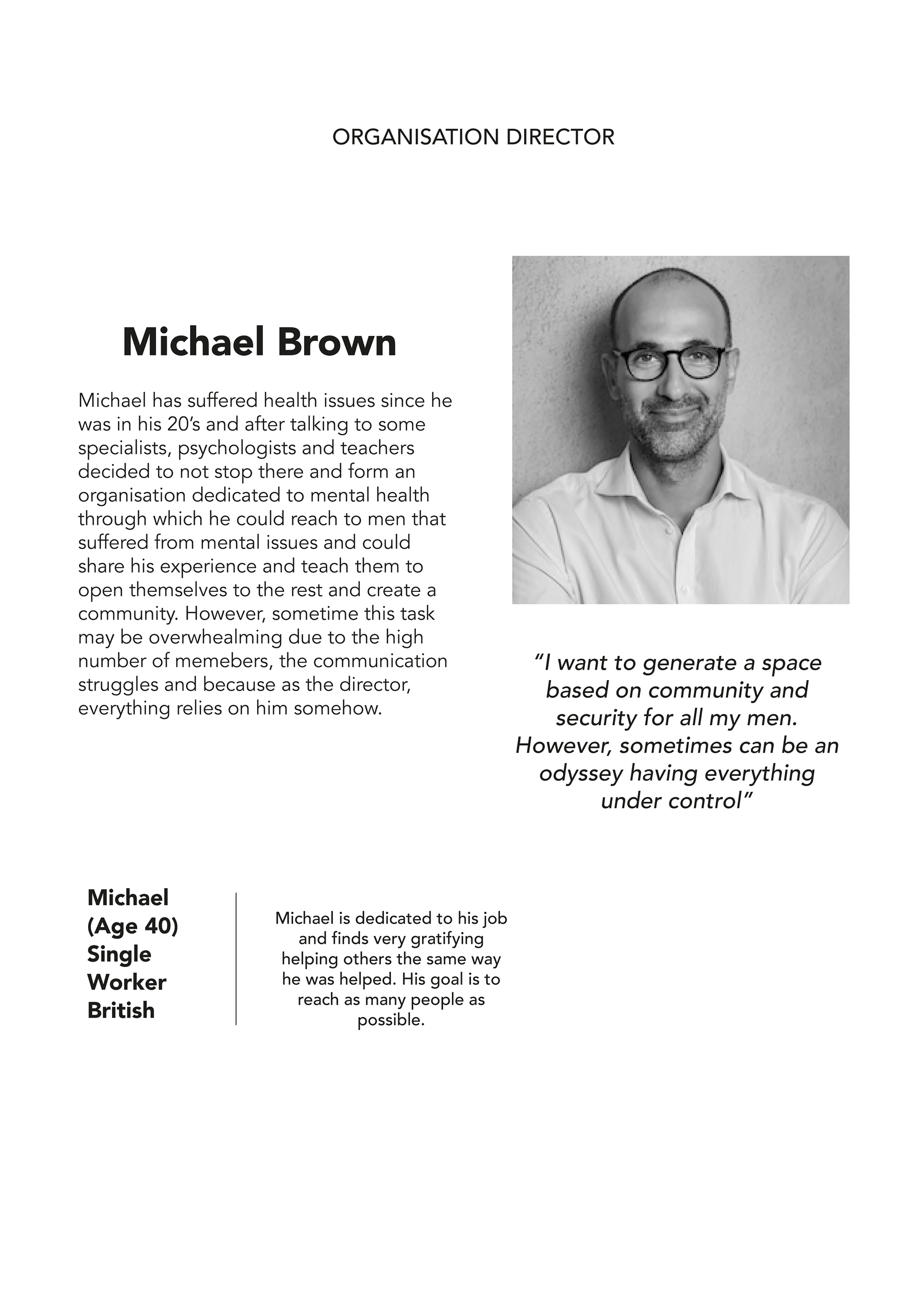
Crafting Personas
Final concepts
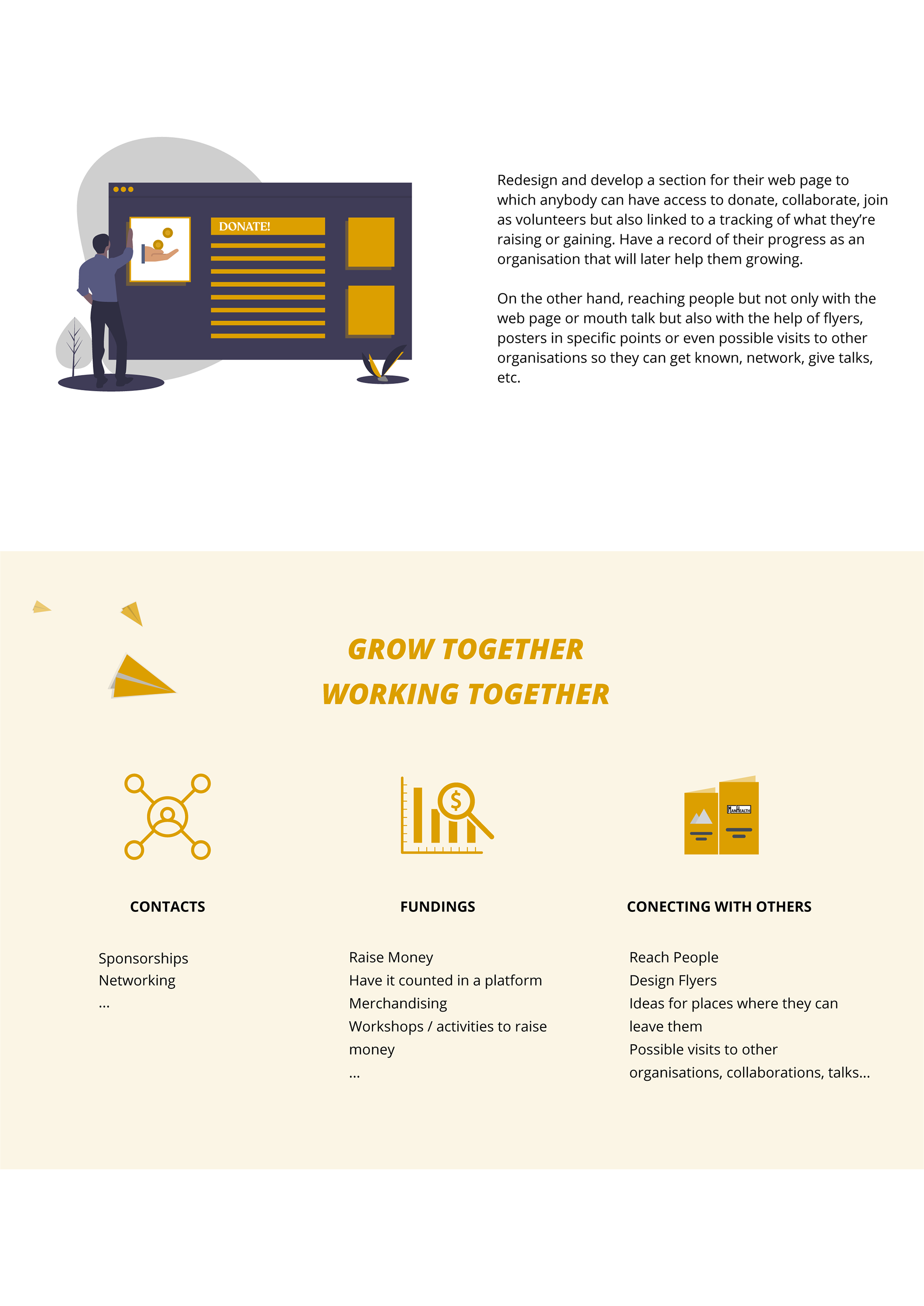
A proposal to Build and Grow as a Community
The two concepts behind our proposals consisted of the objective of making ManHealth grow as a unified community that counts with easy access to any resource shared, support needed, or another mate.

Outcome
Lo-Fi Wireframes
First sketches for the final app
This is the mapping process we followed in order to understand what is the most efficient wireframing way for our users to navigate through the app or how can we make it more visual and effective to create first sight impacts. To summarise, how could we make it accessible. In order to to do that, we took into consideration several apps such as Airbnb, Medium, WhatsApp, Endel, and Zero. We will show the references across the following slides.

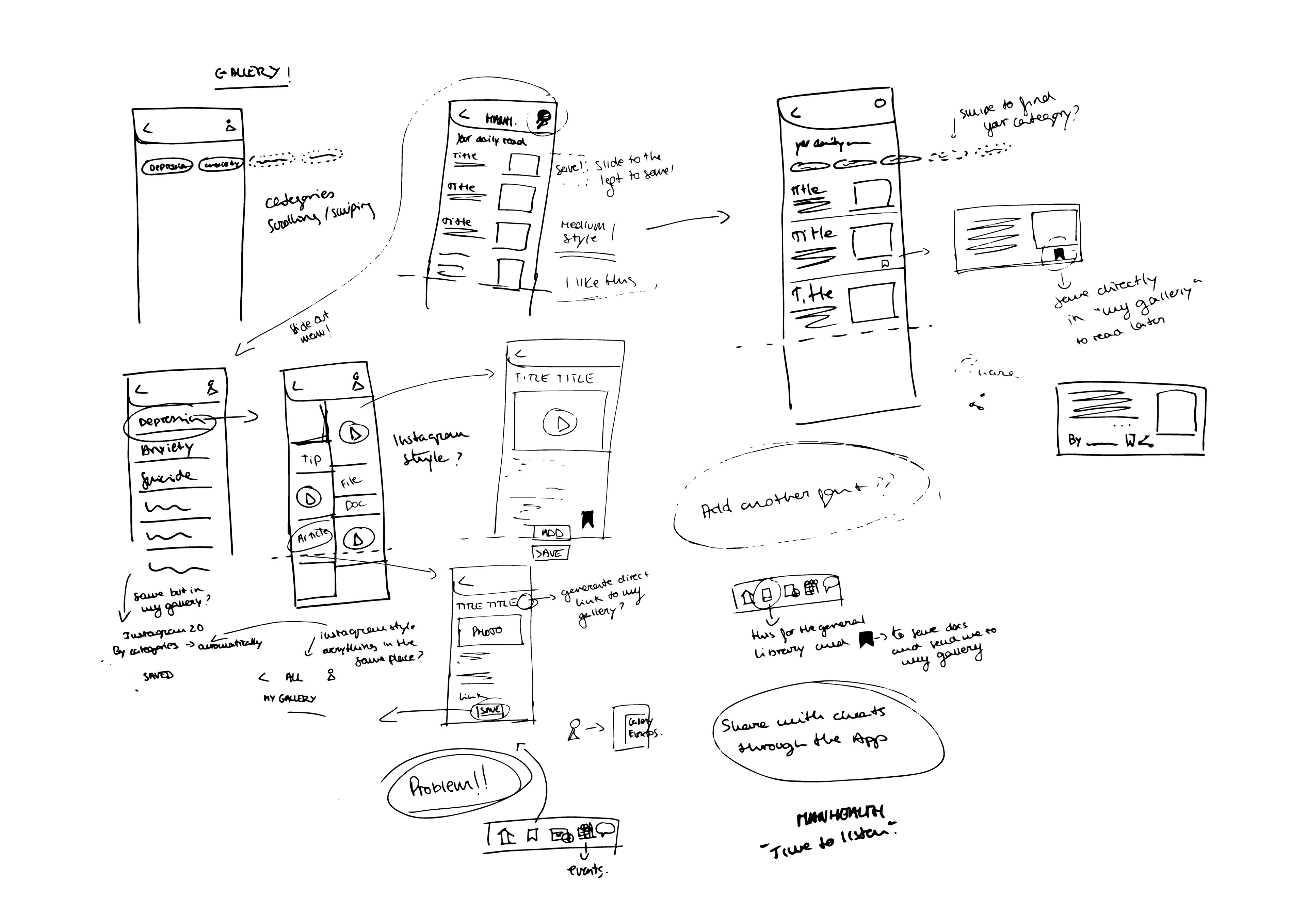
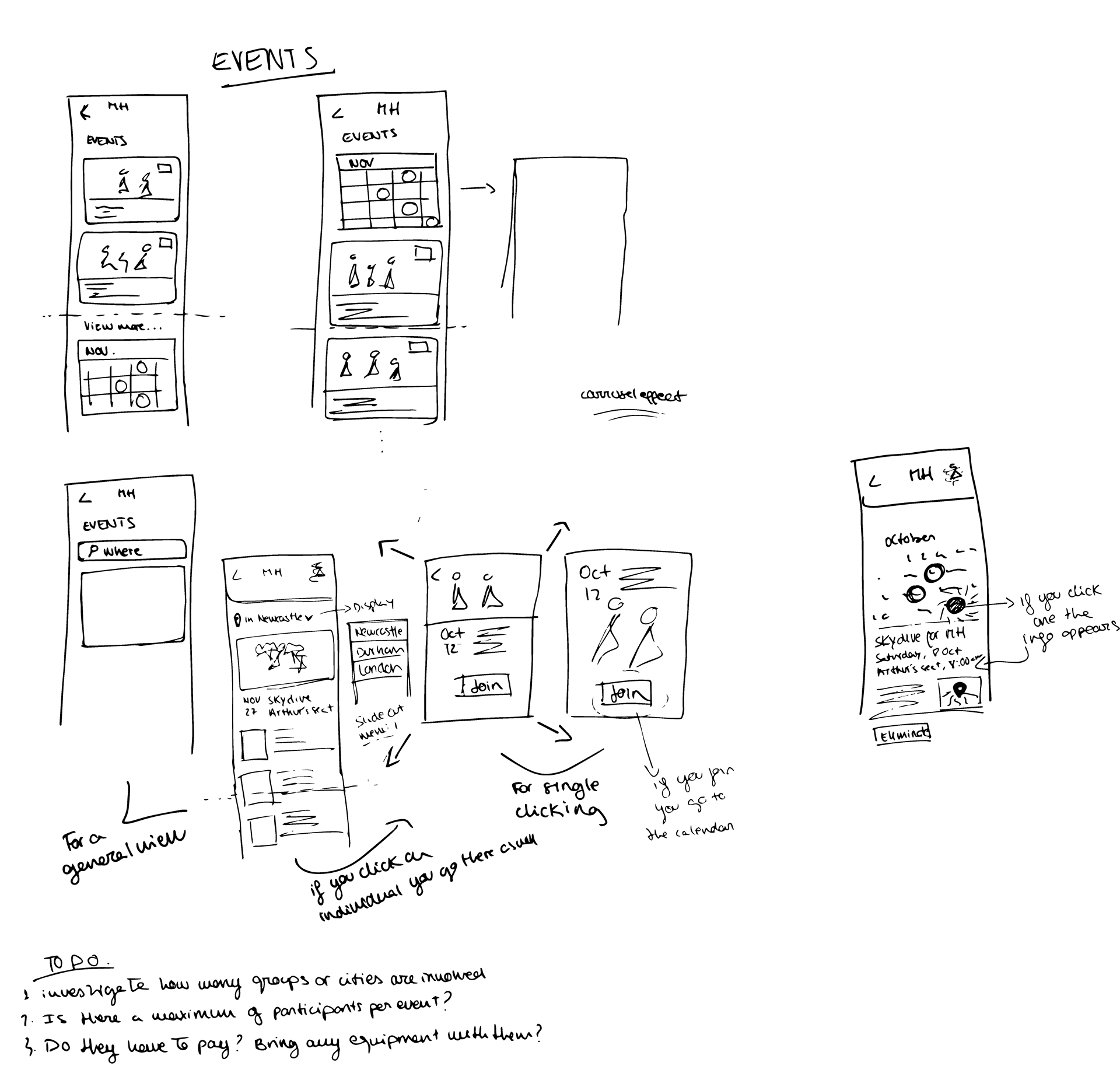
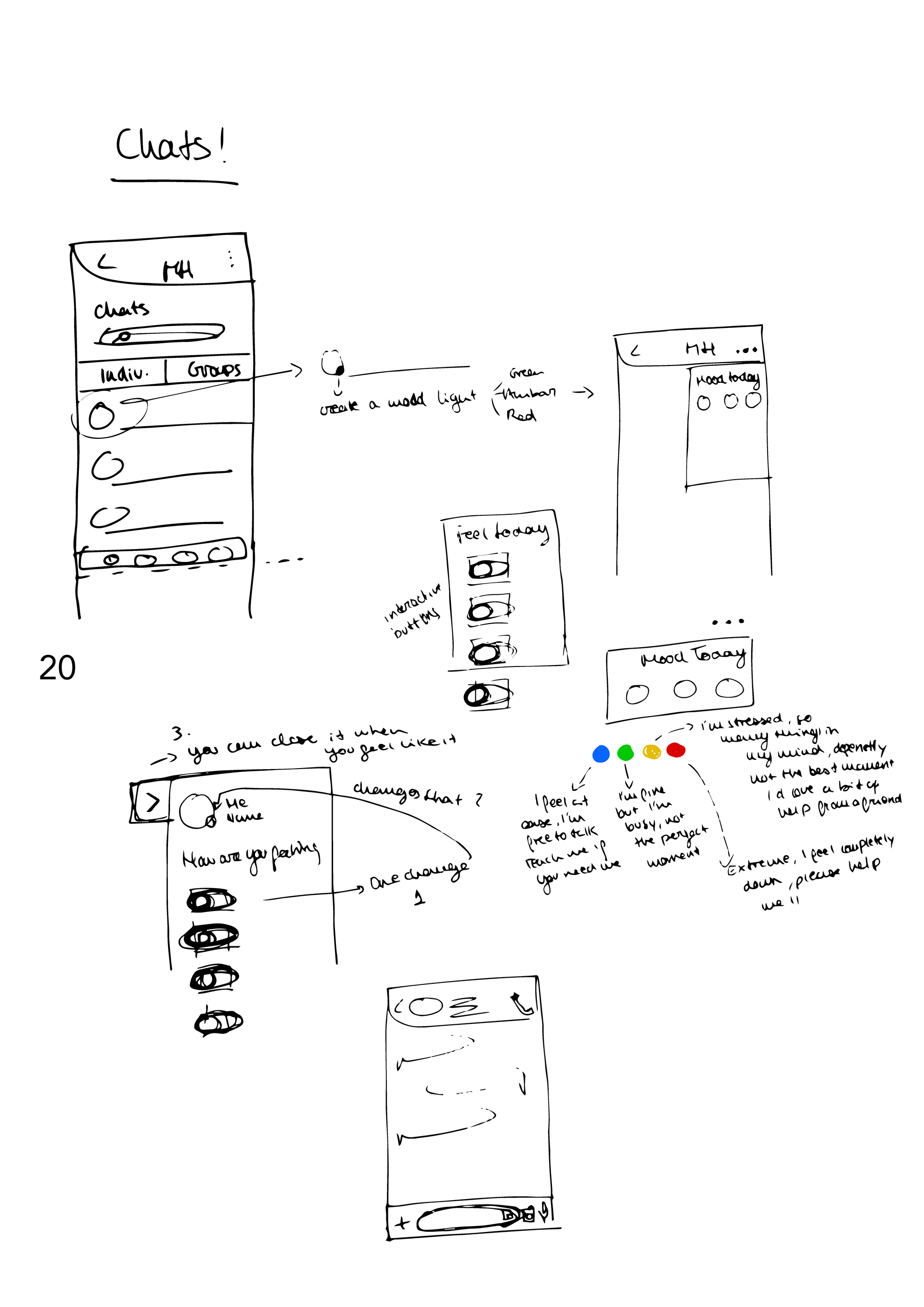
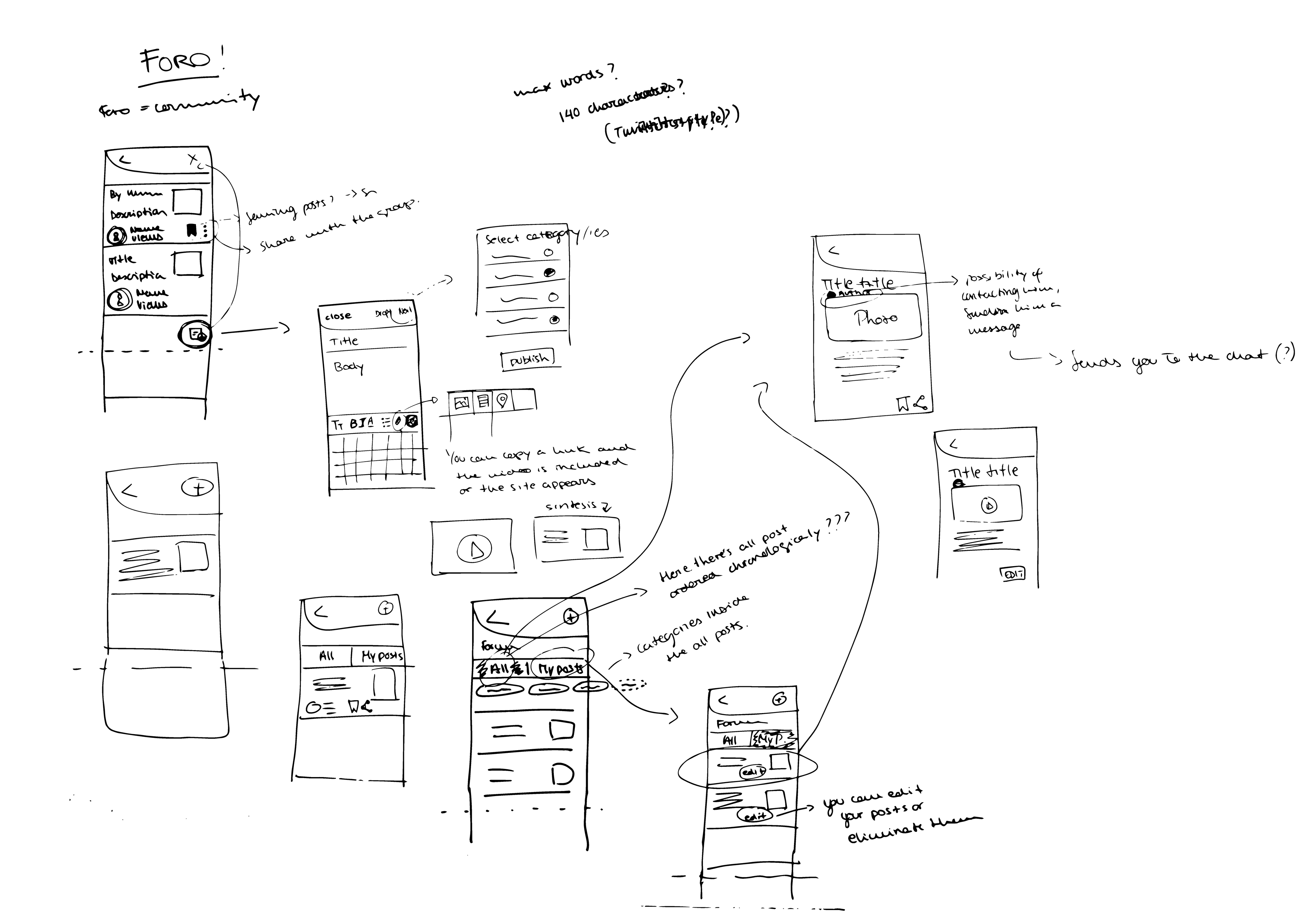
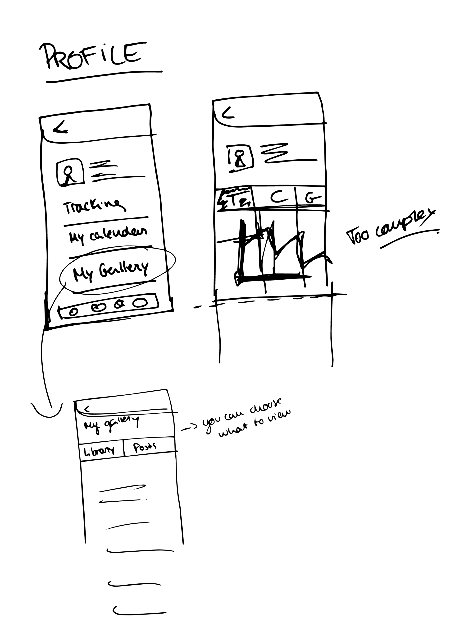
Lo-Fi wireframe of some of the app screens
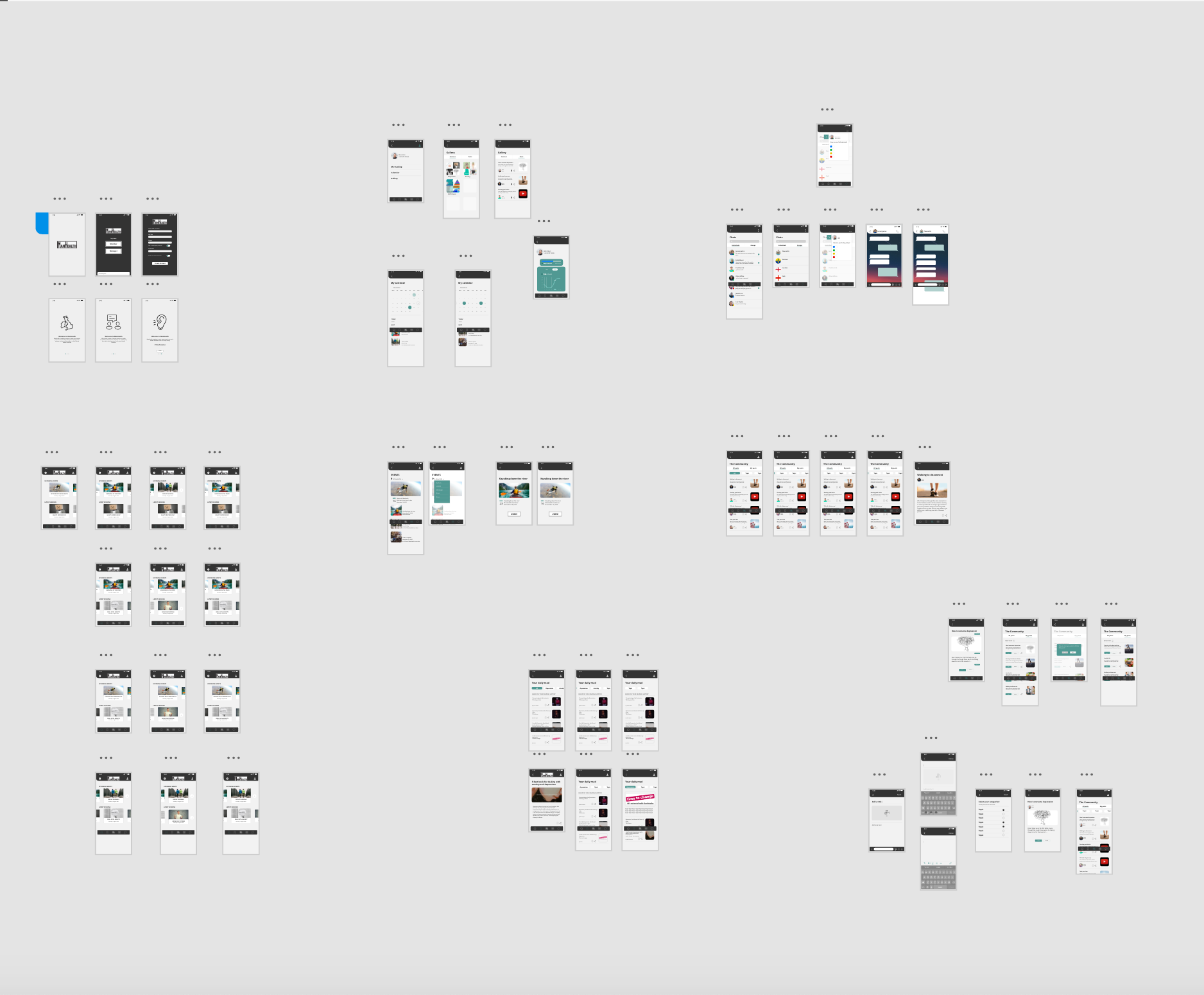
Final Hi-Fi Wireframes designed with Adobe XD & Illustrator
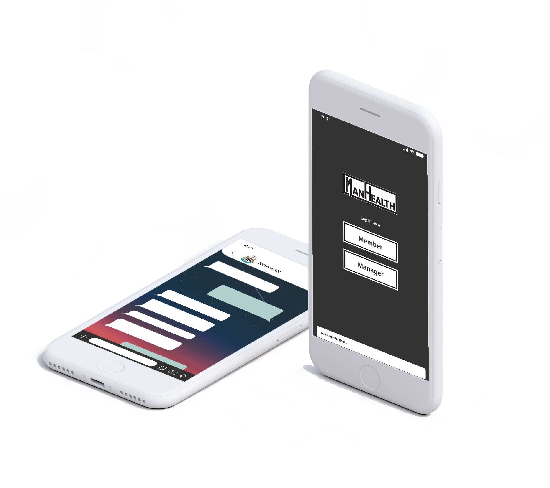
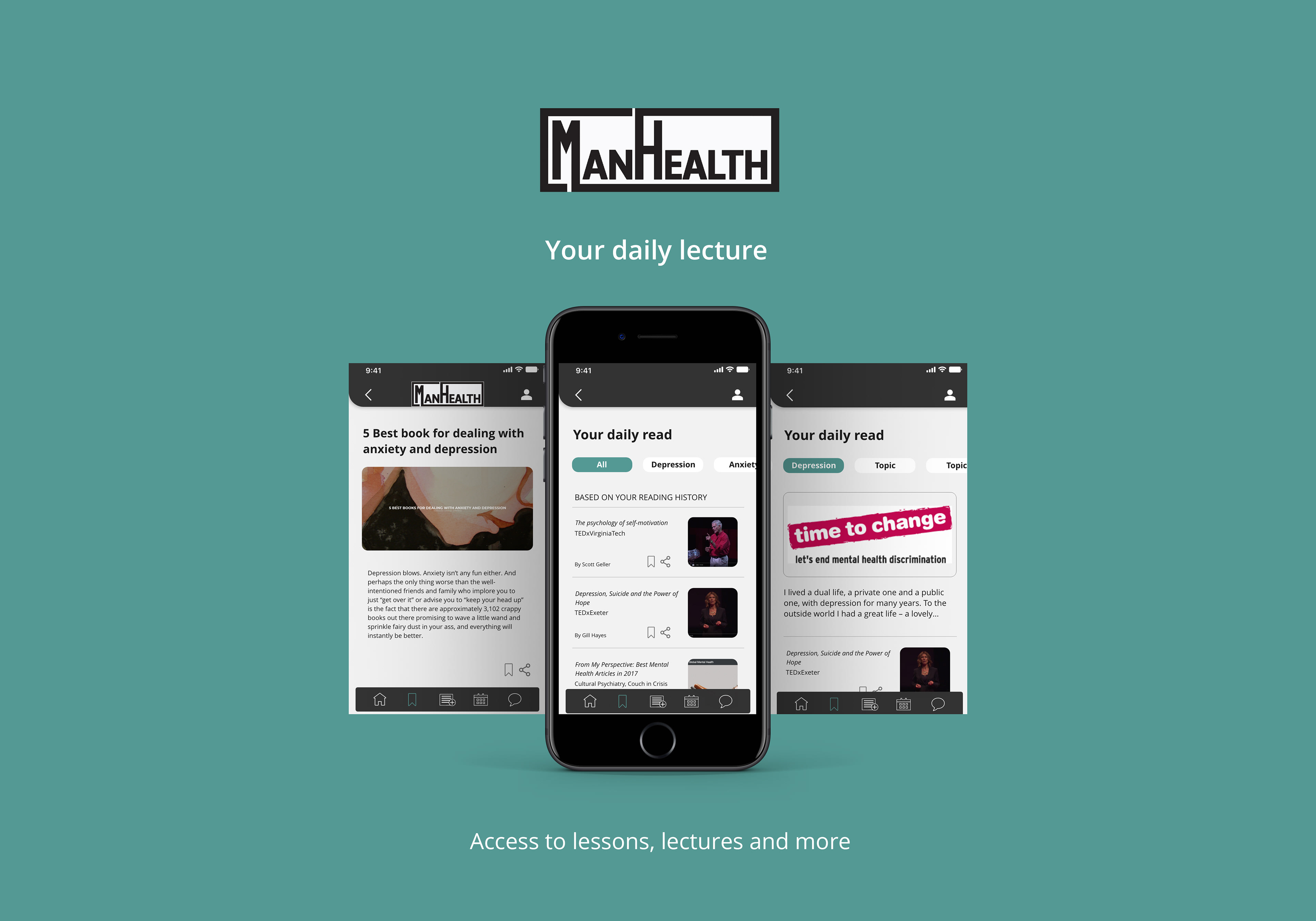
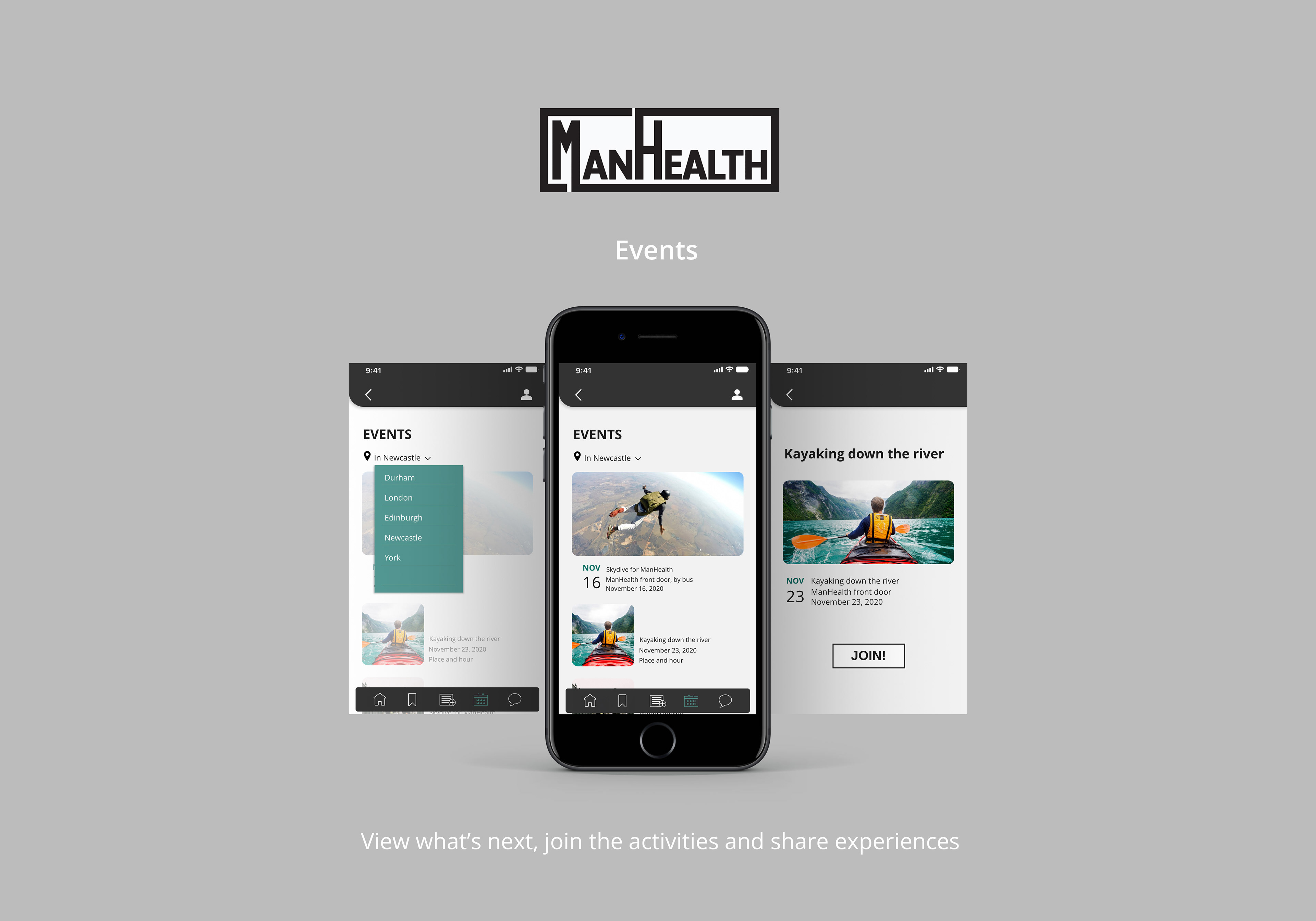
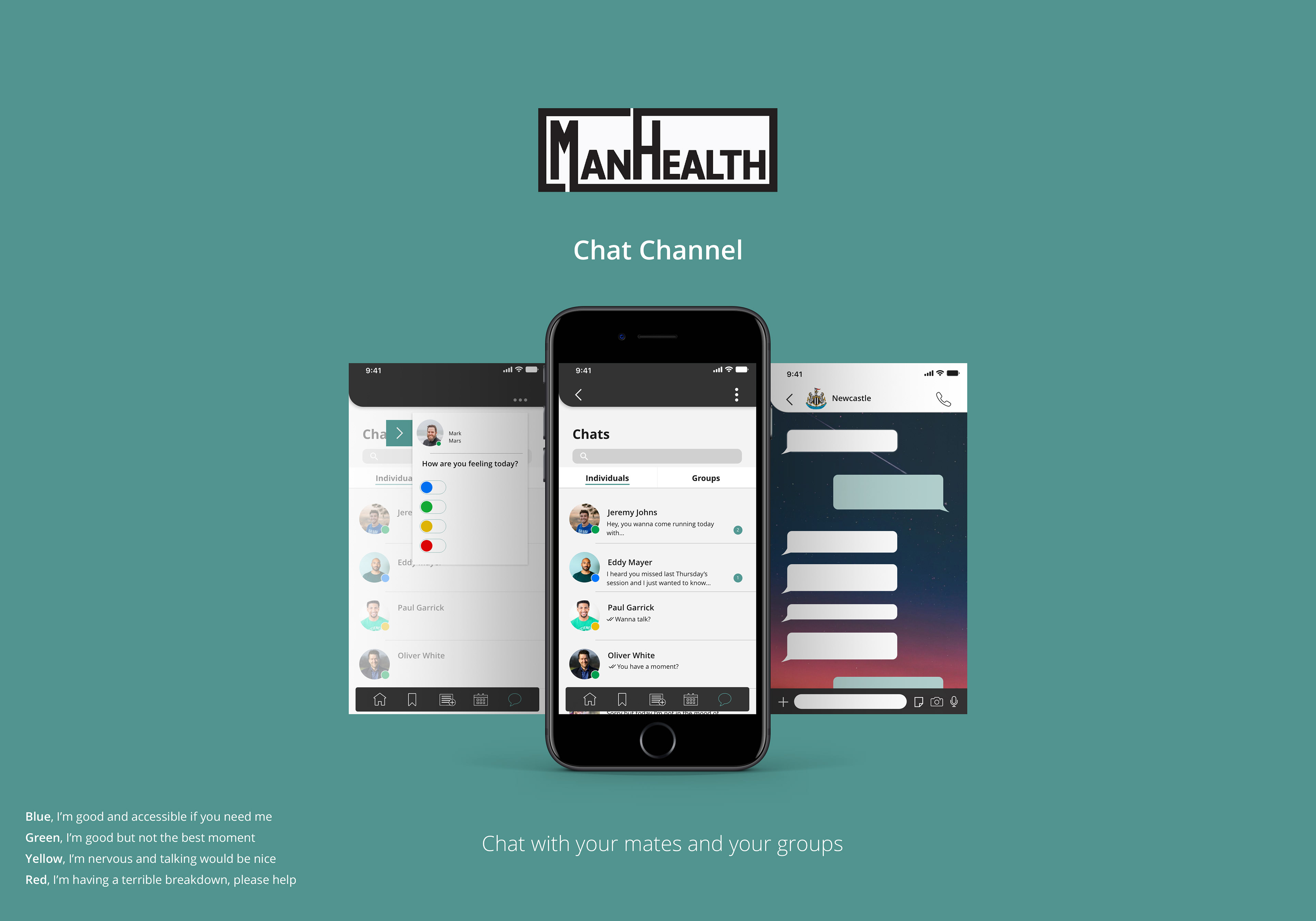
Final ManHealth App Design
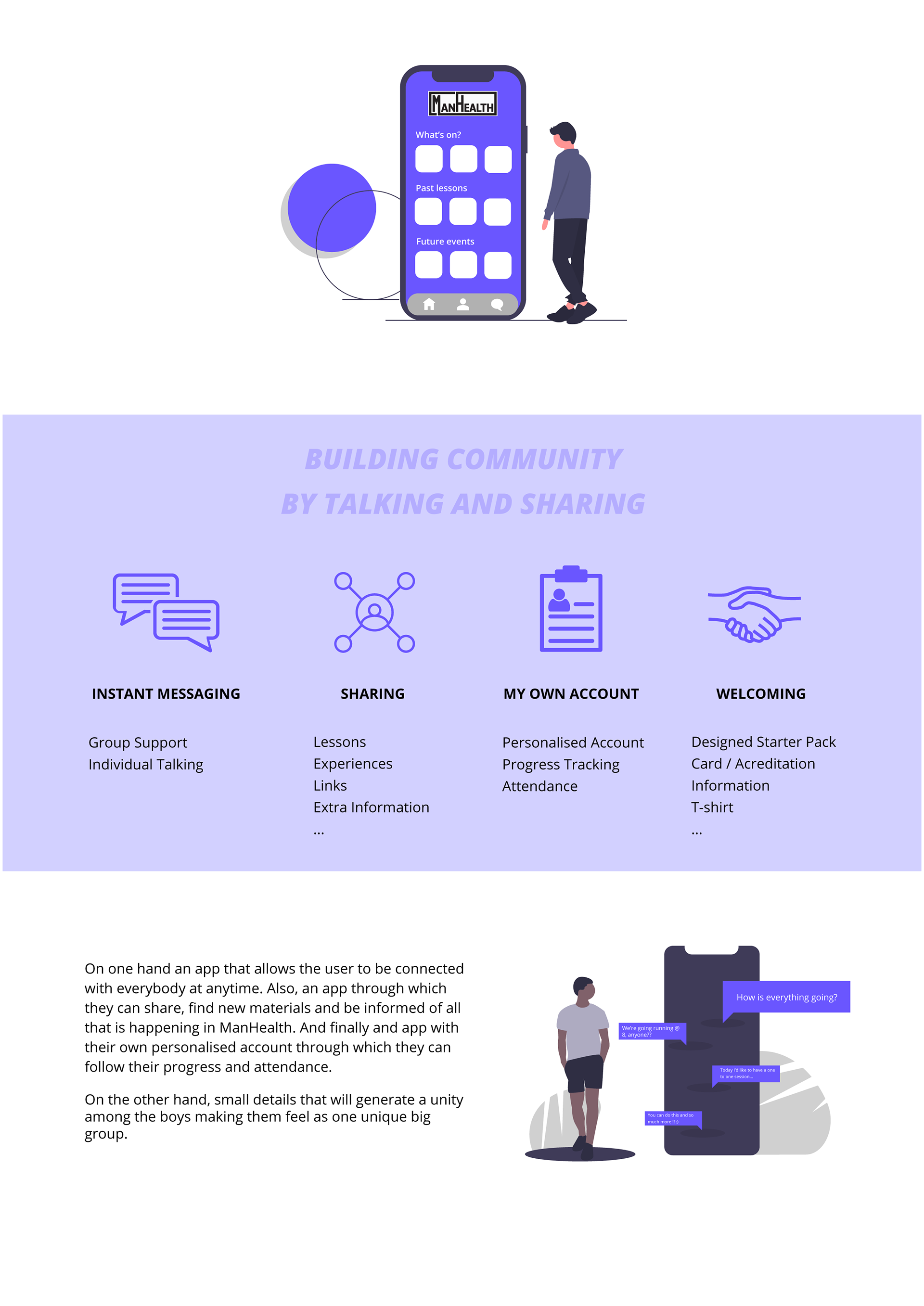
A platform suitable for all men in the organization through which they can join future events, access the latest resources, share with the community, chat, create the main gallery or track their own progress.
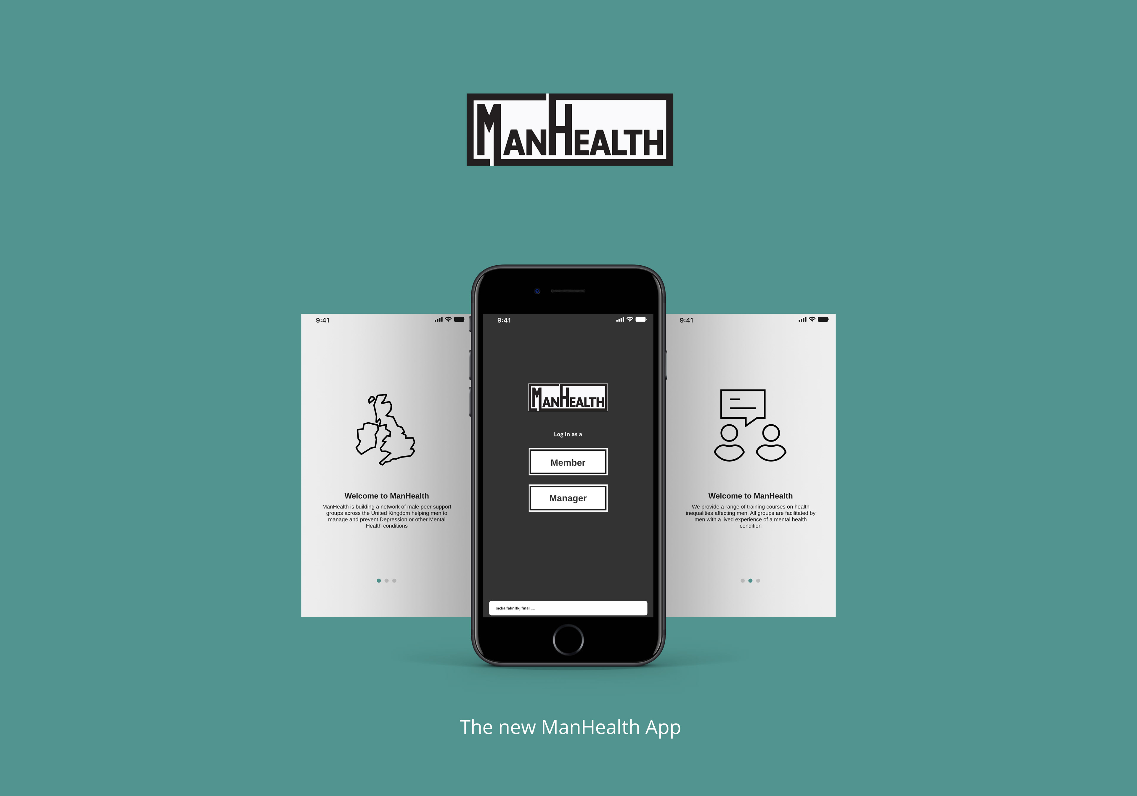

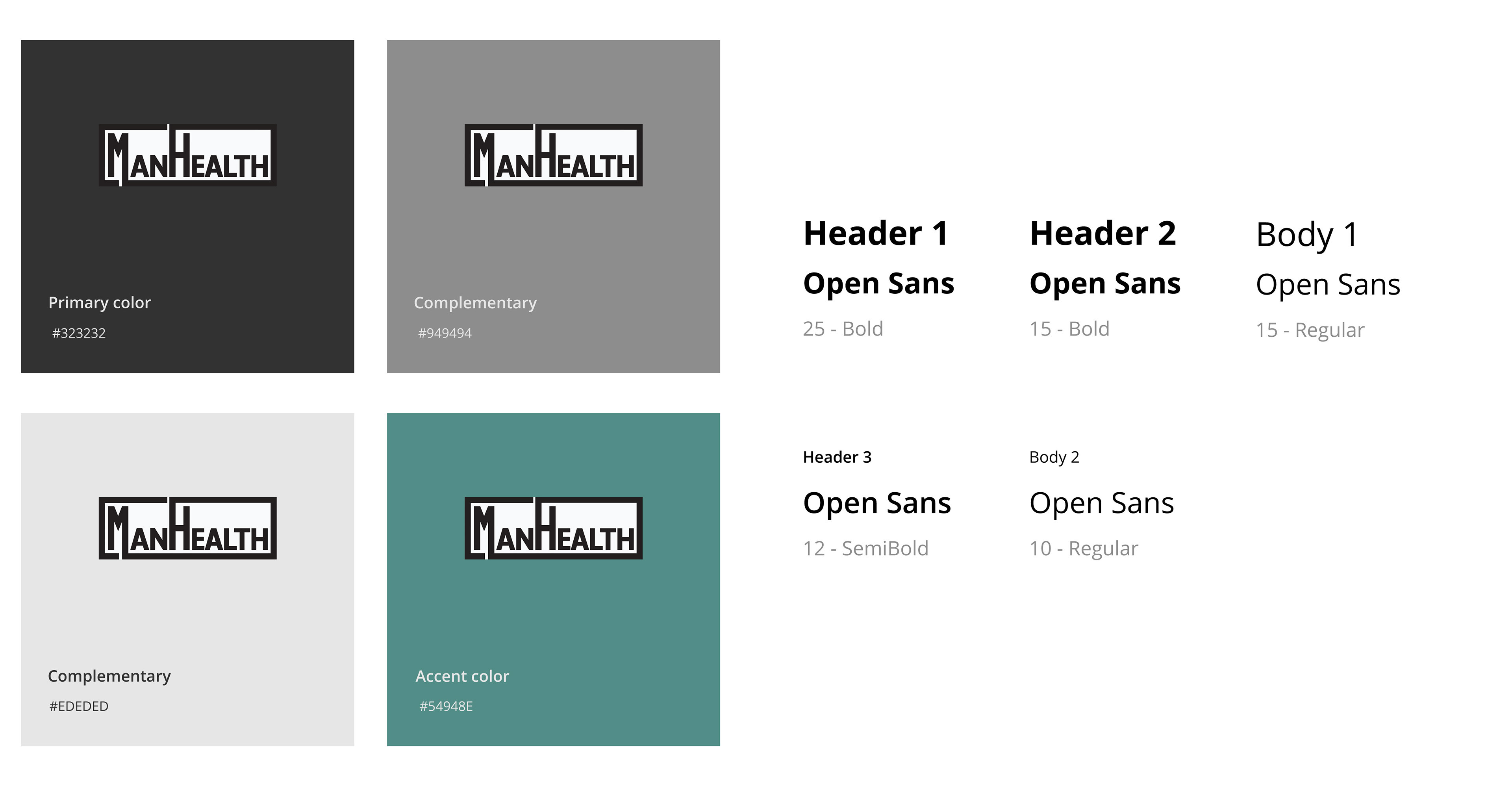
Branding and Aesthetics
First, the colors of the web page were taken in order to follow the aesthetics they are already using in order to understand their style and see how it could be used. We decided that the best we could do was to stick to those colors in order not to change what they are used to. However, a third color was added to make some features more visual and to have the opportunity to play with it and give more character to the app.
We opted for a neutral and colder color to provide a cozy and calm feeling when navigating.
(We didn't design the logo)
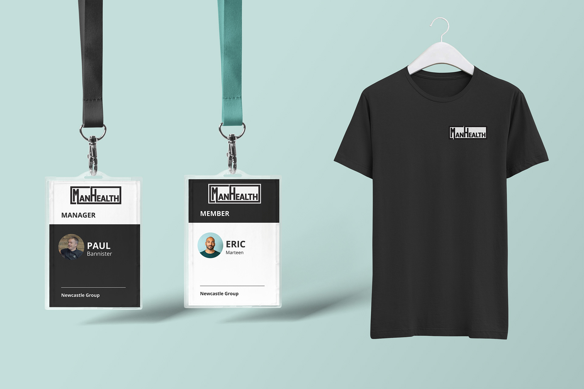
Welcoming pack
Building the community
Apart from the development of an app, we believe that the experience starts from the very first time the guys enter the organization. For them, feeling welcome and part of a community is very important in order to open to the rest and feel comfortable. That is why we suggest including a 'Welcome Pack' like a T-shirt or ManHealth ‘s IDs in order to say ’Now you are part of the community and we are here if you need us.
User testing
In order to know if we had accomplished our objectives, we carried out user testing that consisted of providing a link to possible users together with an explanation of the project and a final survey that would gather the final results.

1. What we extracted from it is that the experience and accessibility work pretty well at first sight and the visuals make it understandable.
2. However, according to the last comments, we should improve how the information is given and the main menu order.
3. The last question corresponds to the Welcome Pack. All of them confirmed that it would create a warm first impression if given together with the rest of the documents.
Takeaways
1. Learned the foundations of Interaction Design & UX/UI
2. New programs such as Adobe XD and Figma
3. First time working for a small non-profit organization. The impact that design can have on their lives and the correct performance of their mission.