Branding proposal for the new Santo Domingo Market's image
Client - Santo Domingo's Market
Tools - Illustrator, Photoshop
I was in charge of the new look and feel of the market, logo, and extra graphic concepts

How it started
We were looking for fresh, sustainable, and social branding. Generate the new traditional.
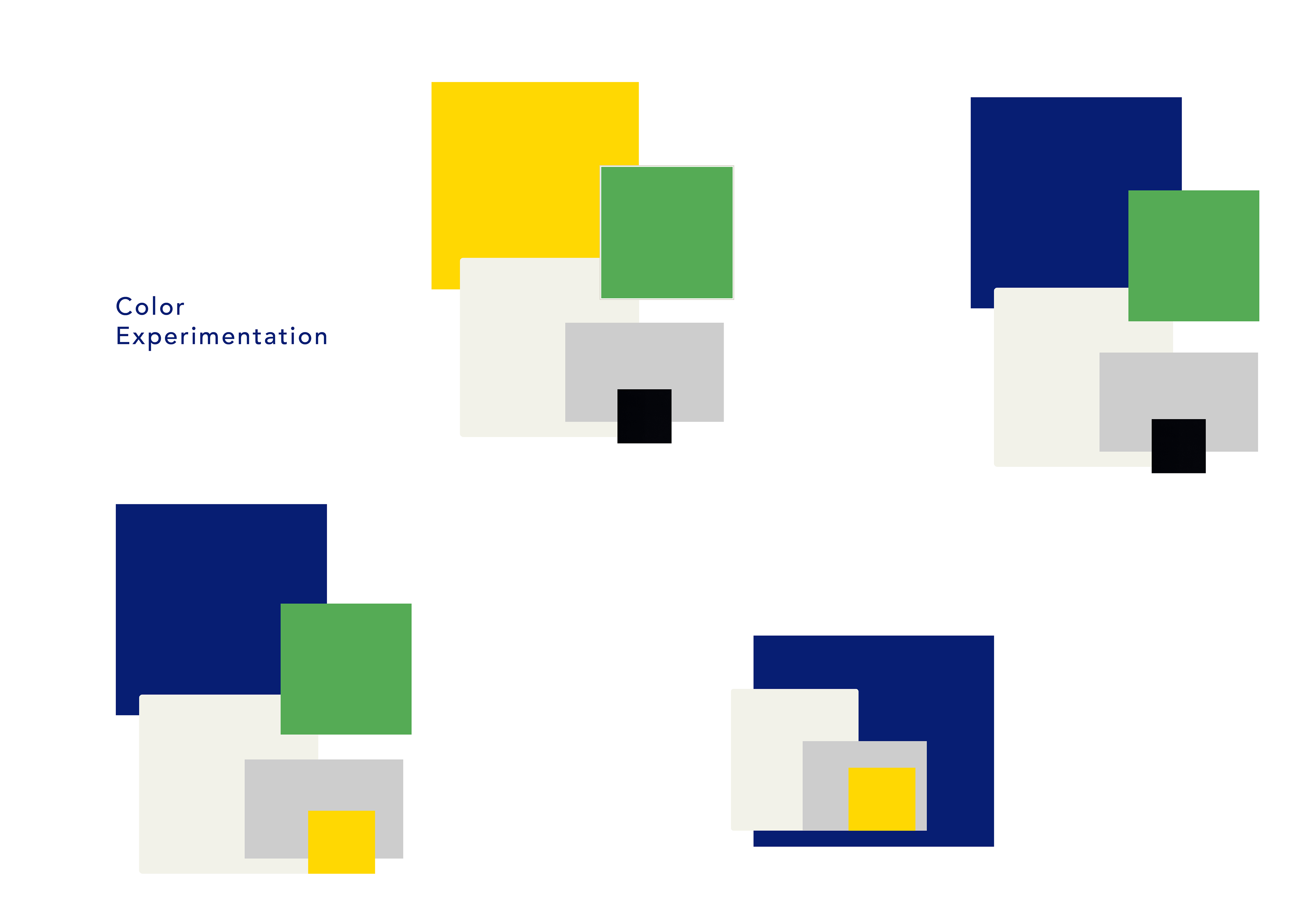
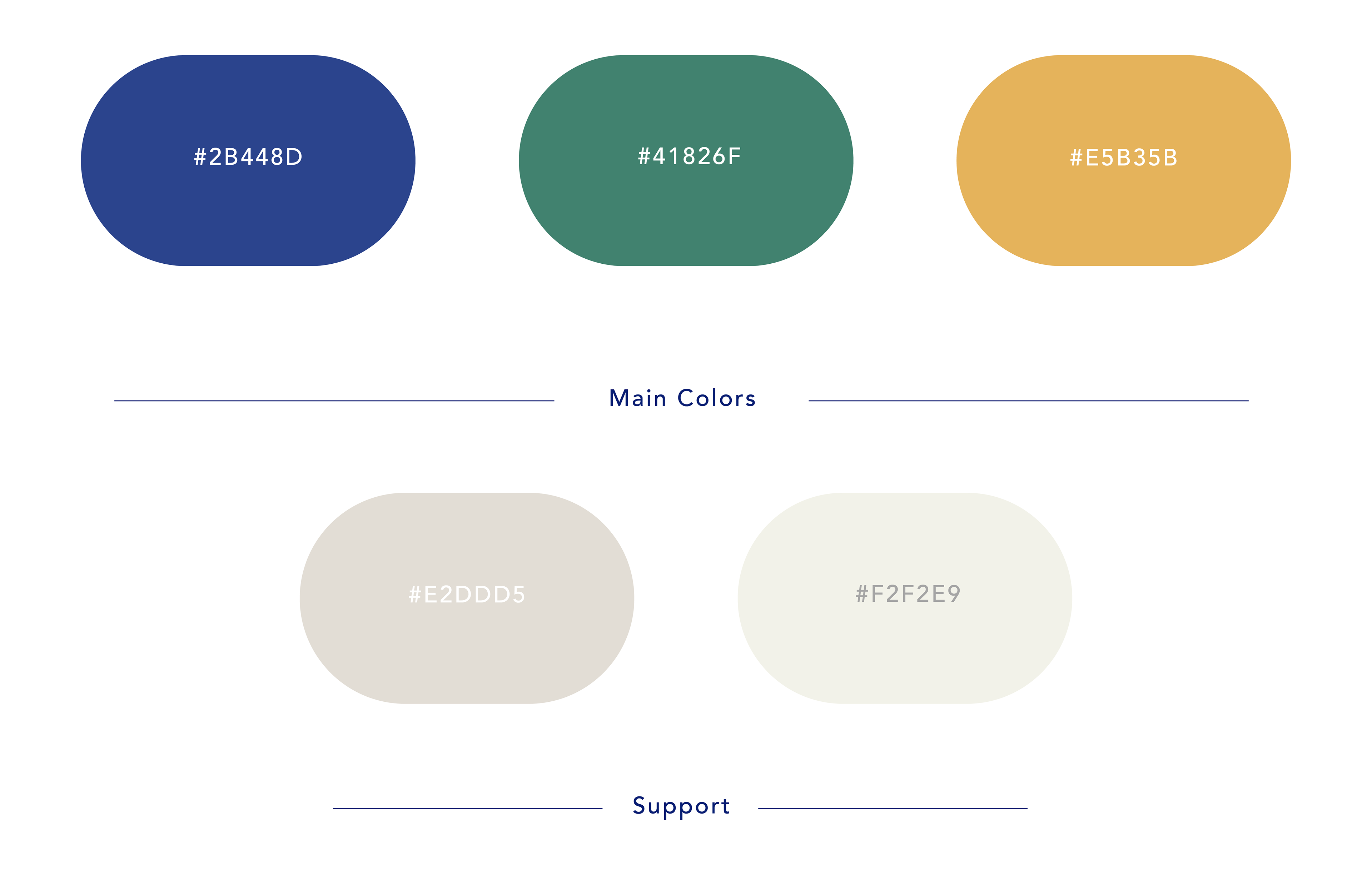
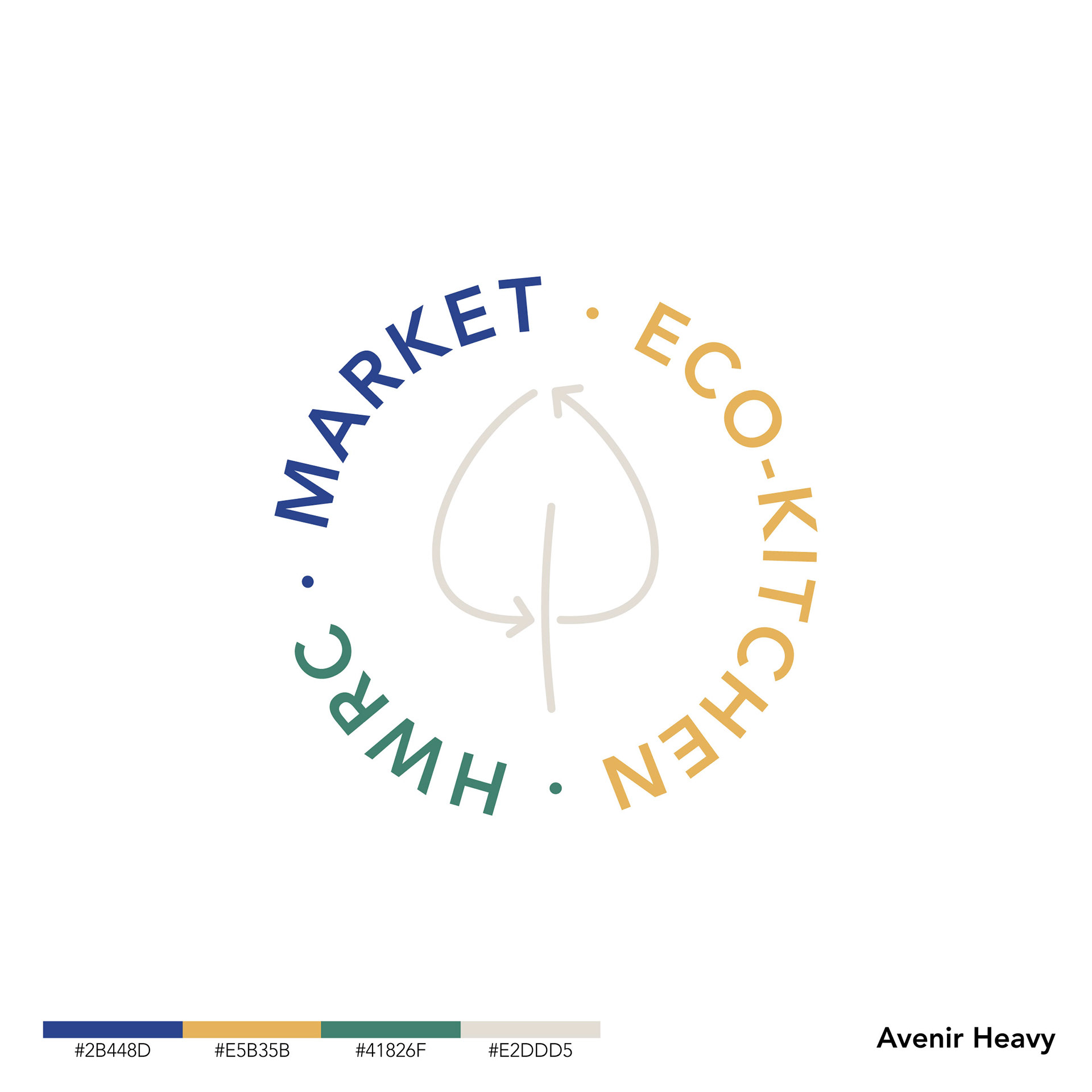
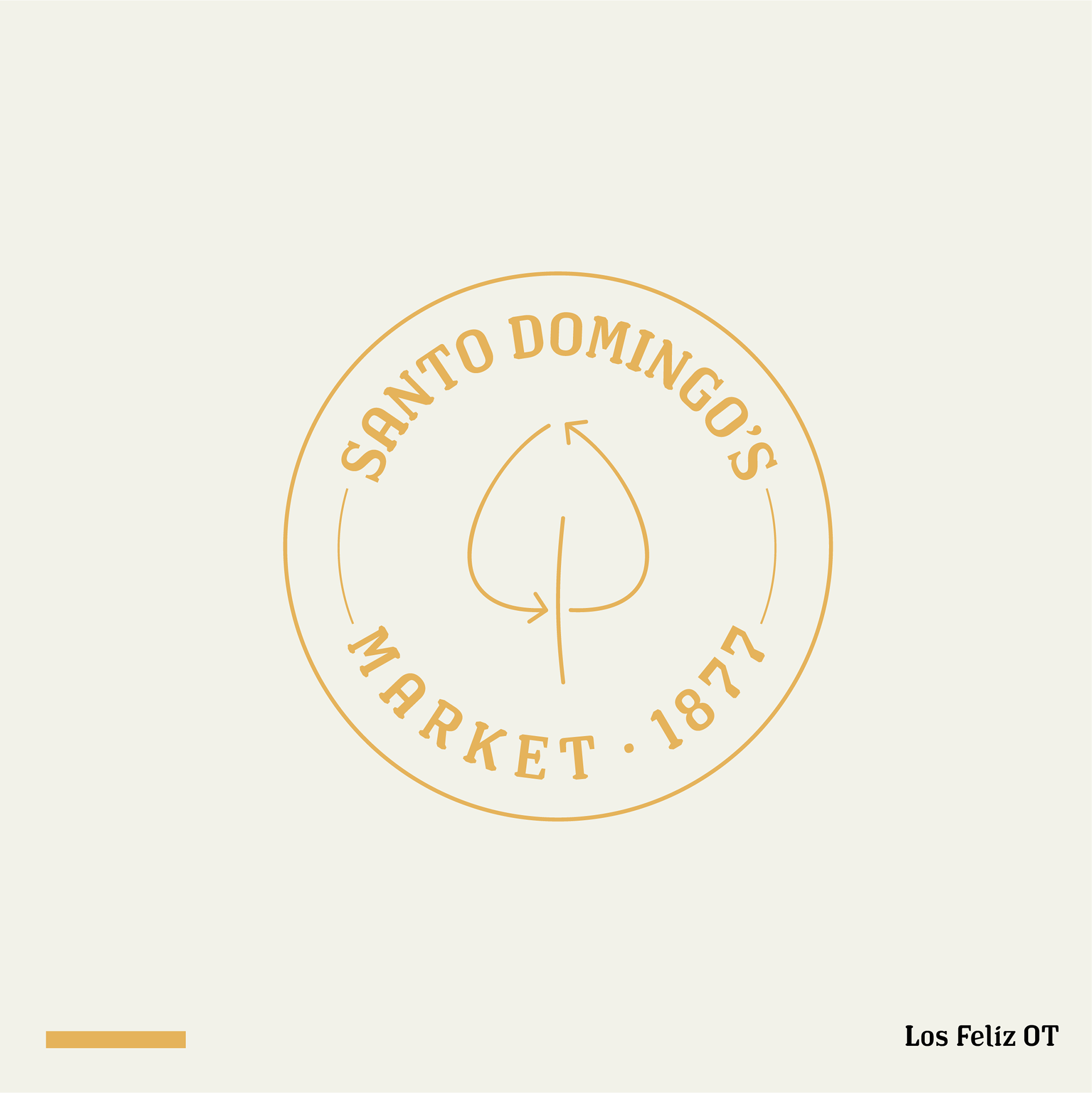
First color approaches
First logos
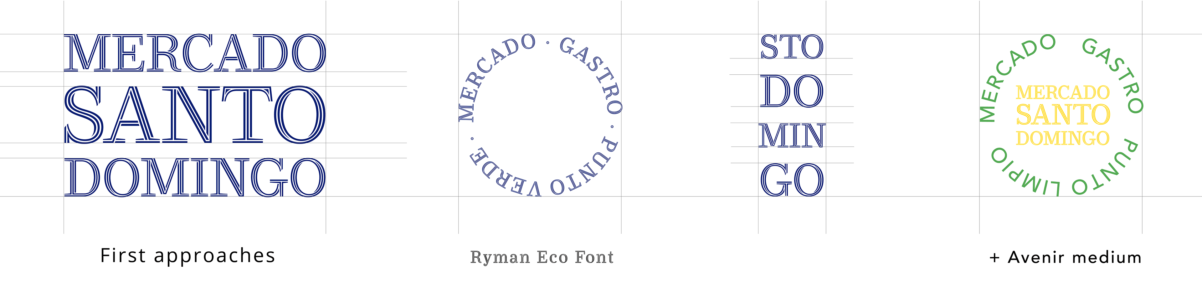
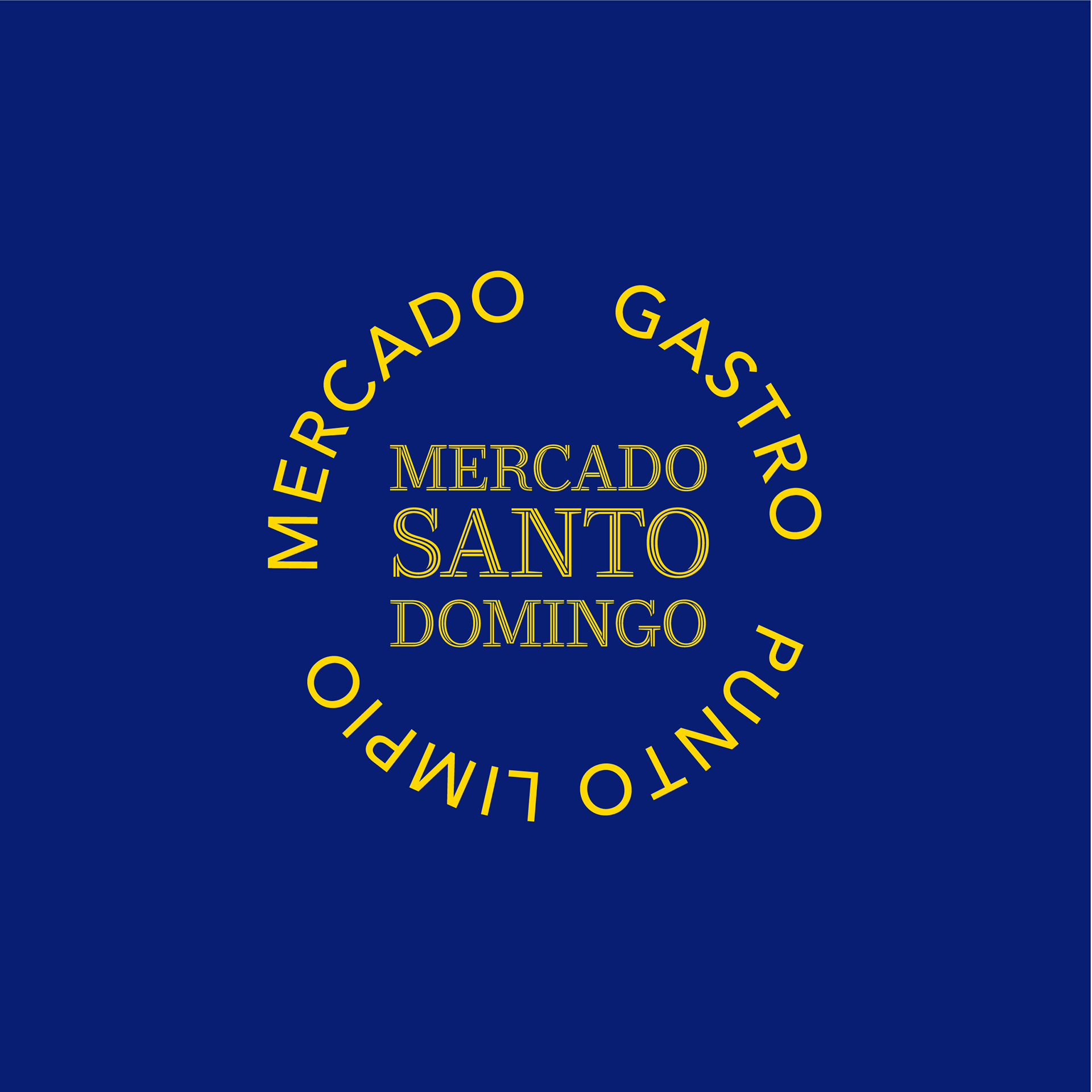

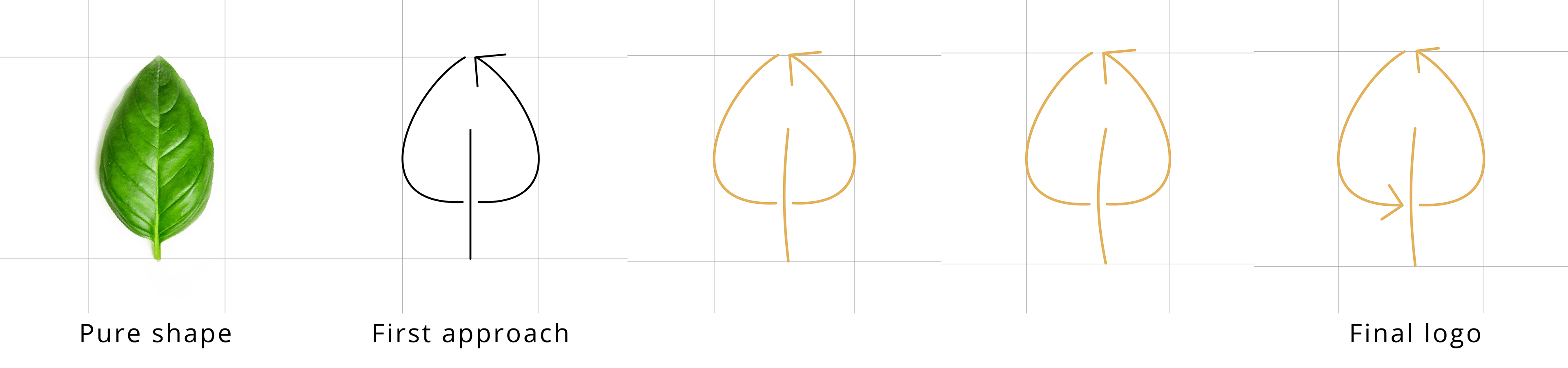
Transformation
We liked the idea of a round logo, the leaf worked, the color hues were adapted and the main font changed.
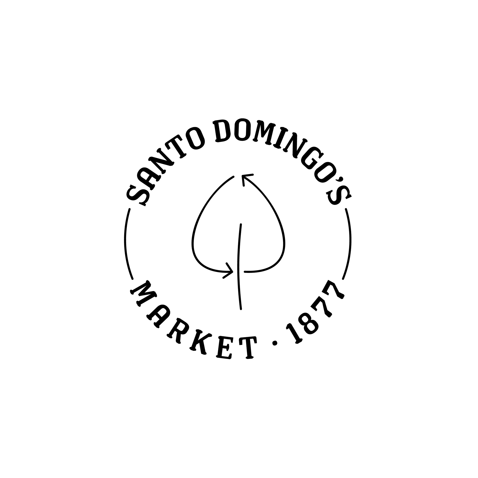
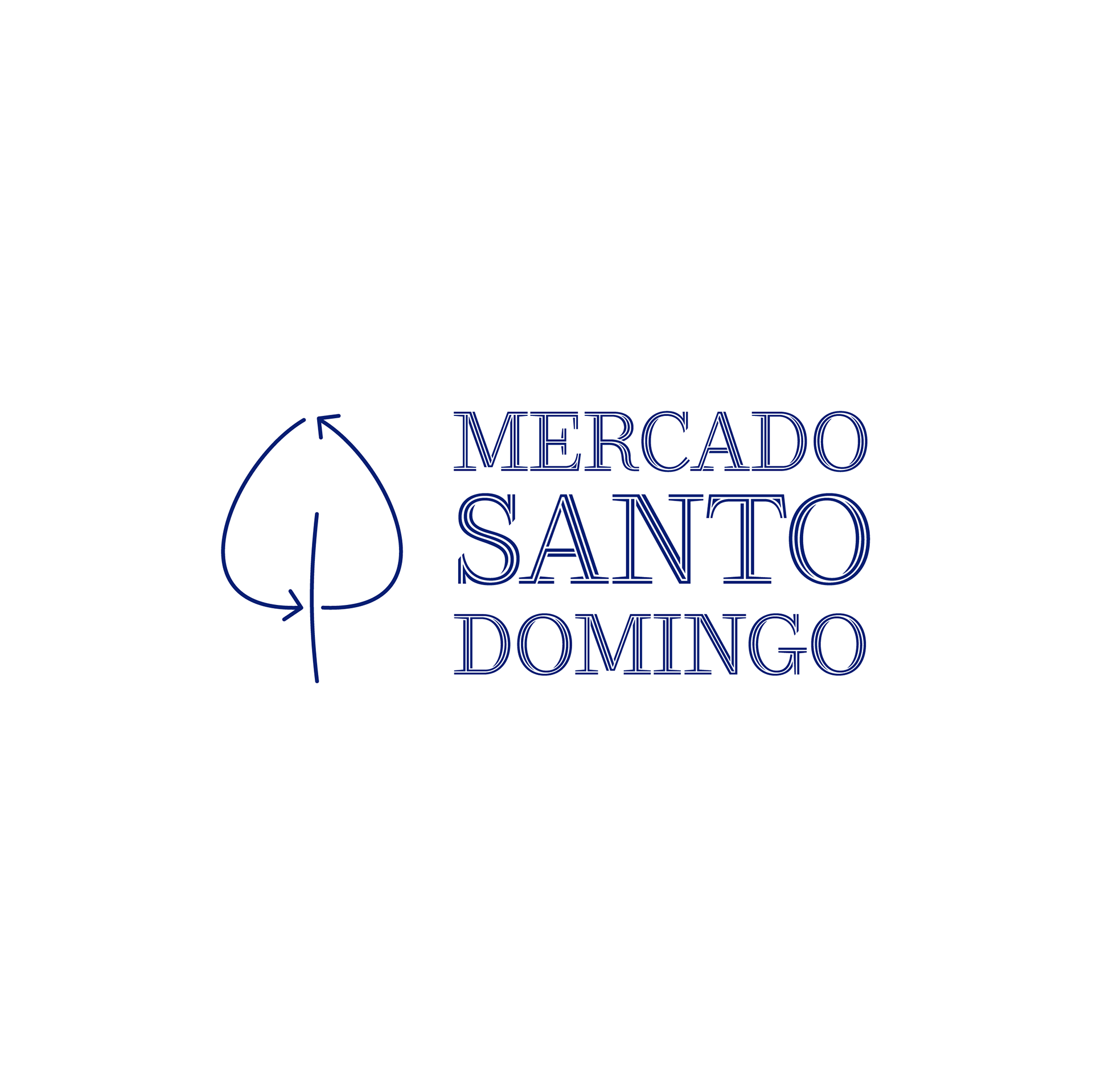
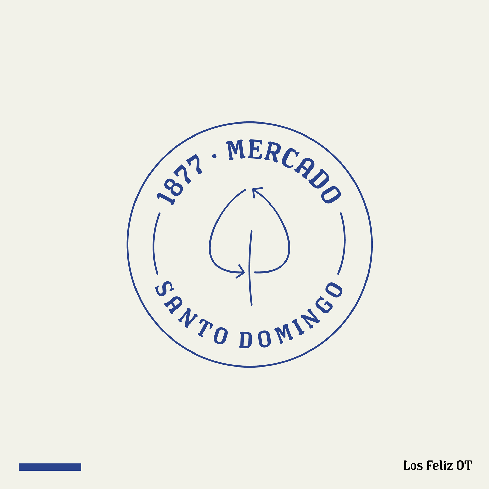
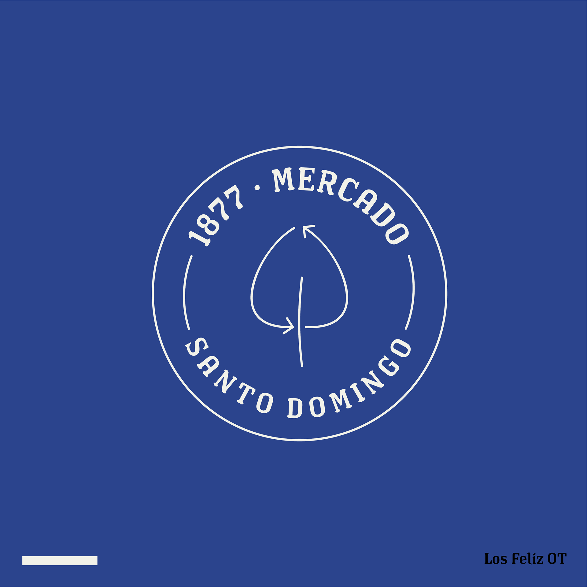
Final logos
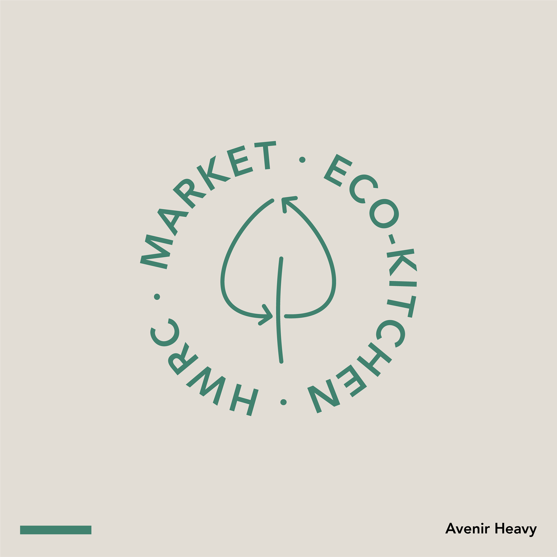
The new and renovated image of the market
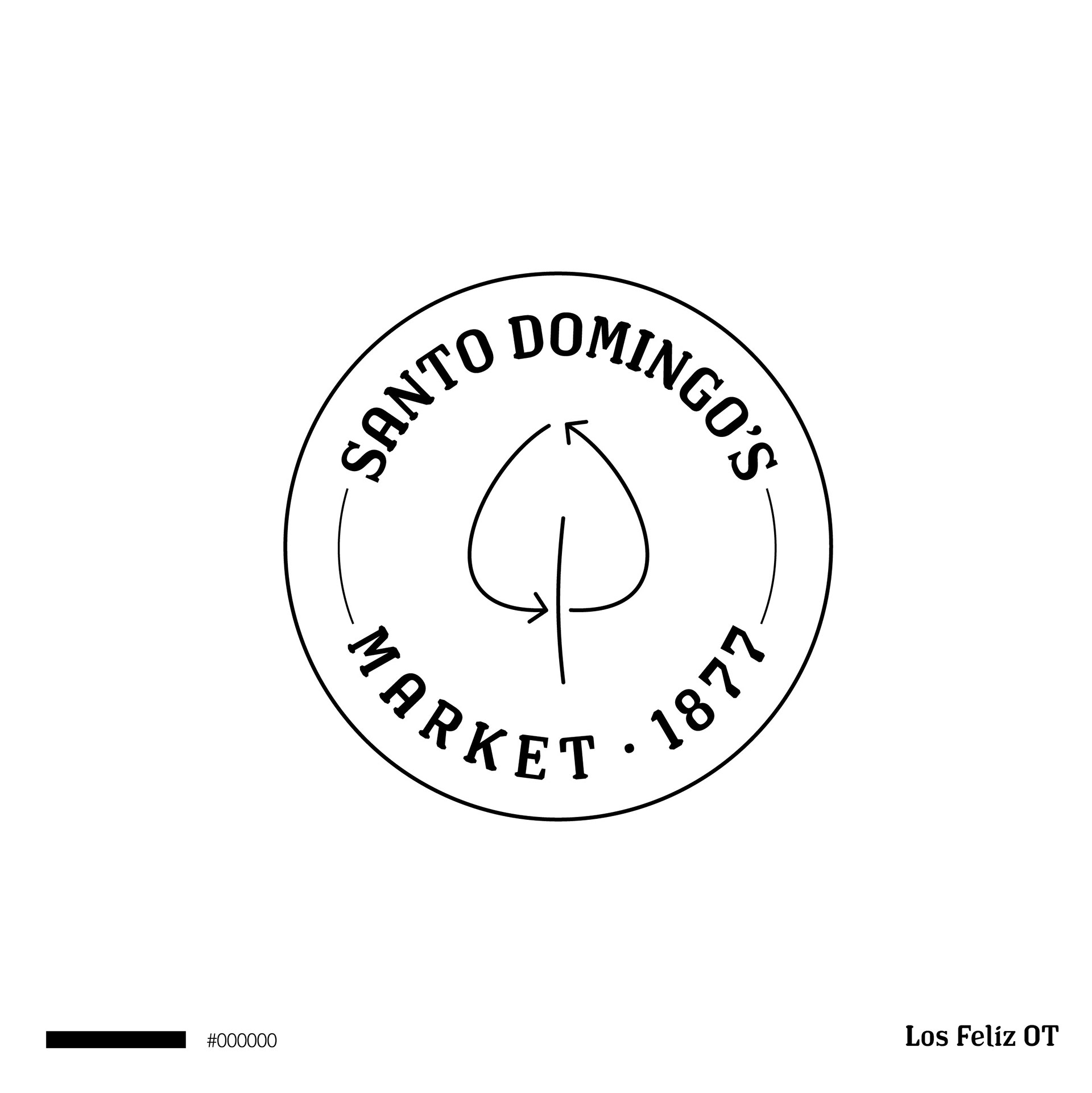
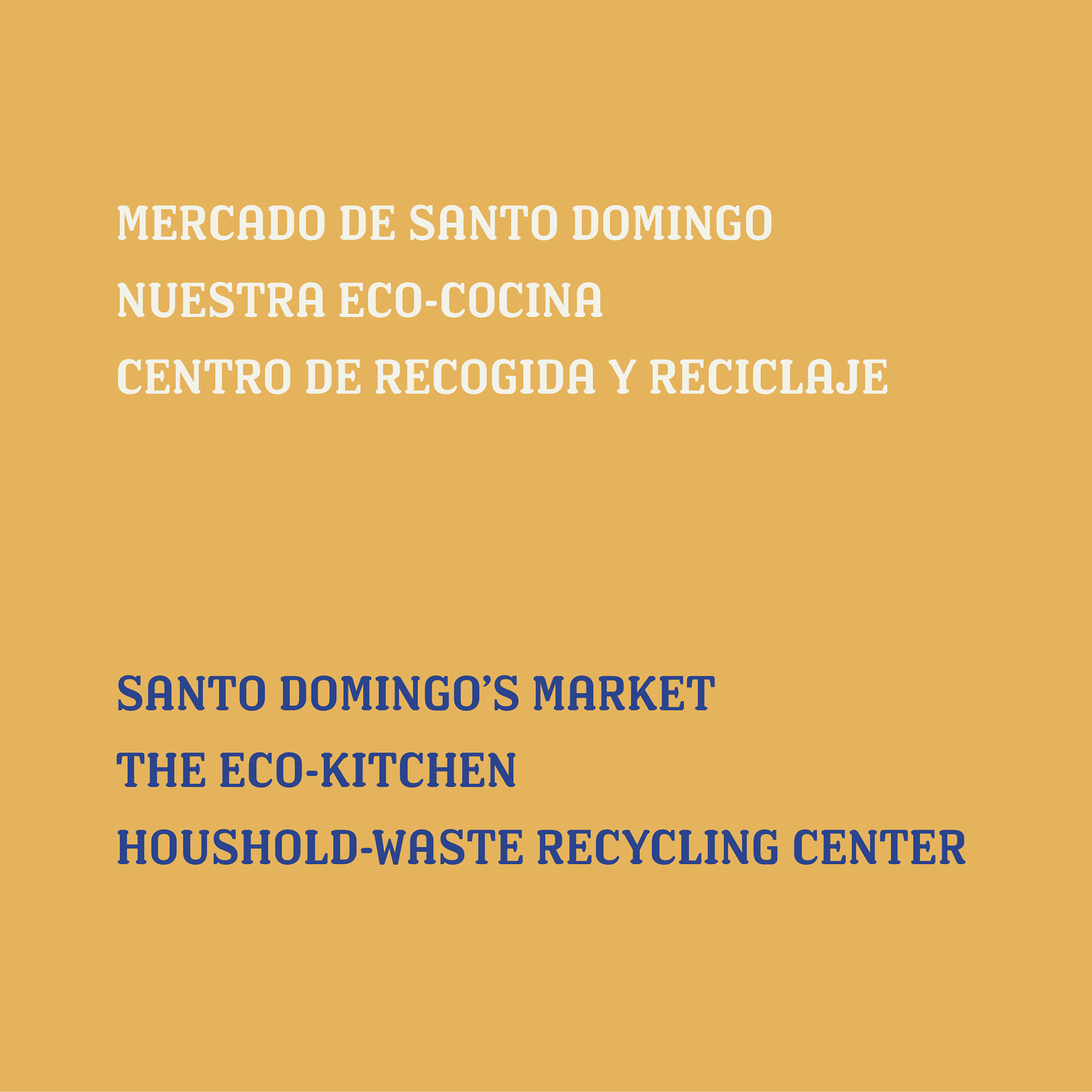
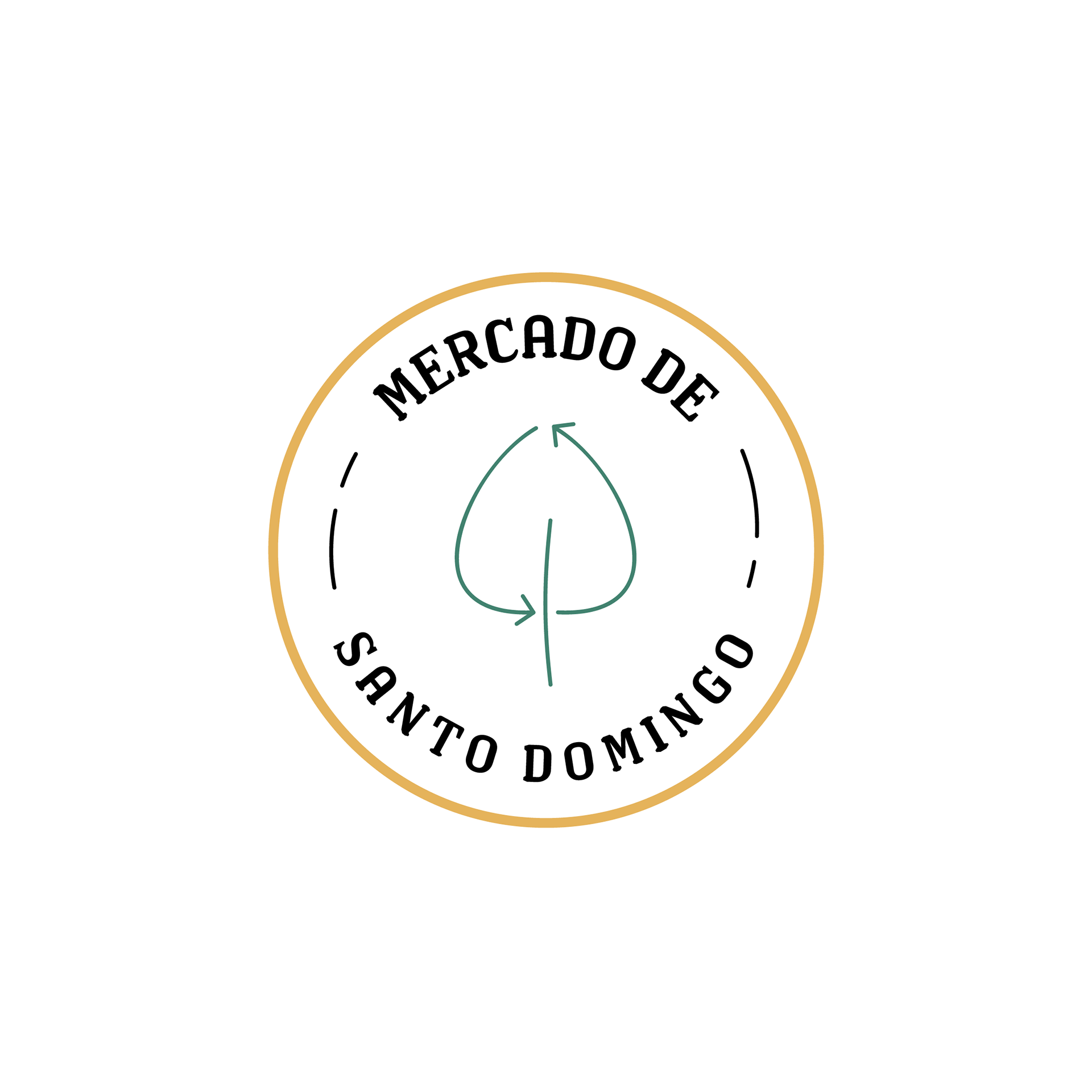
Primary logo (English version)

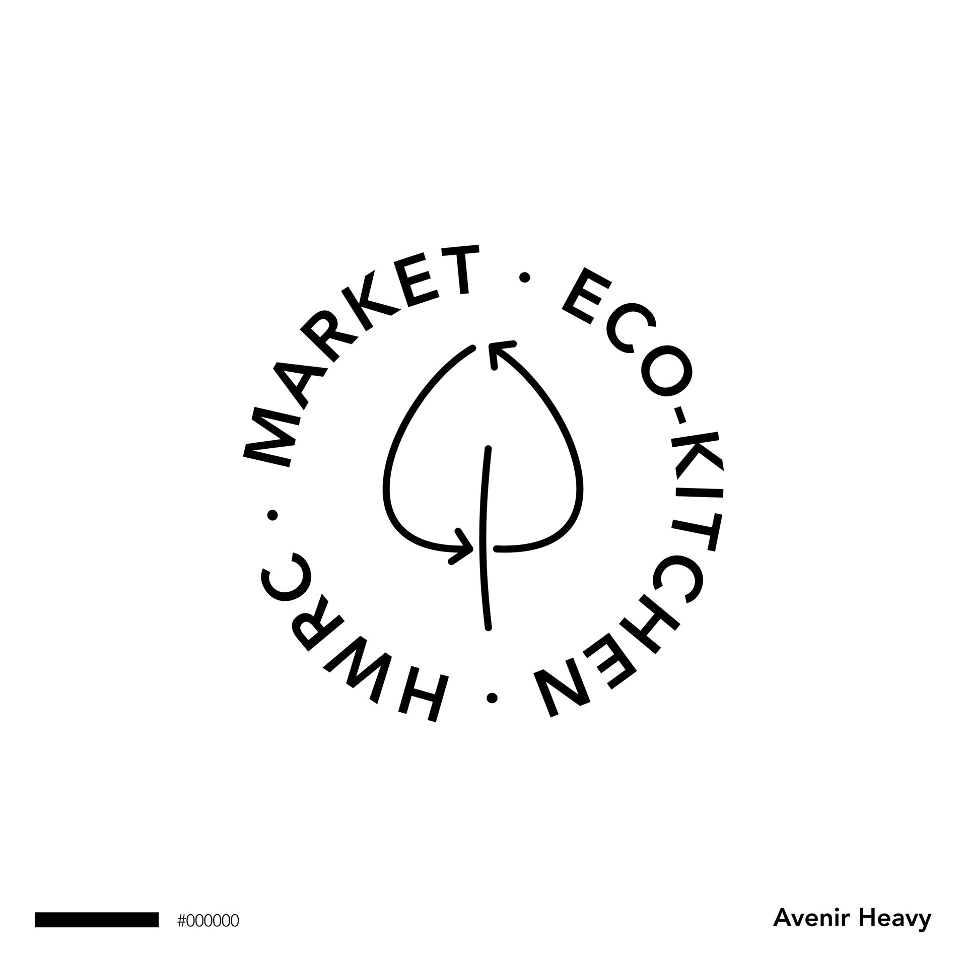
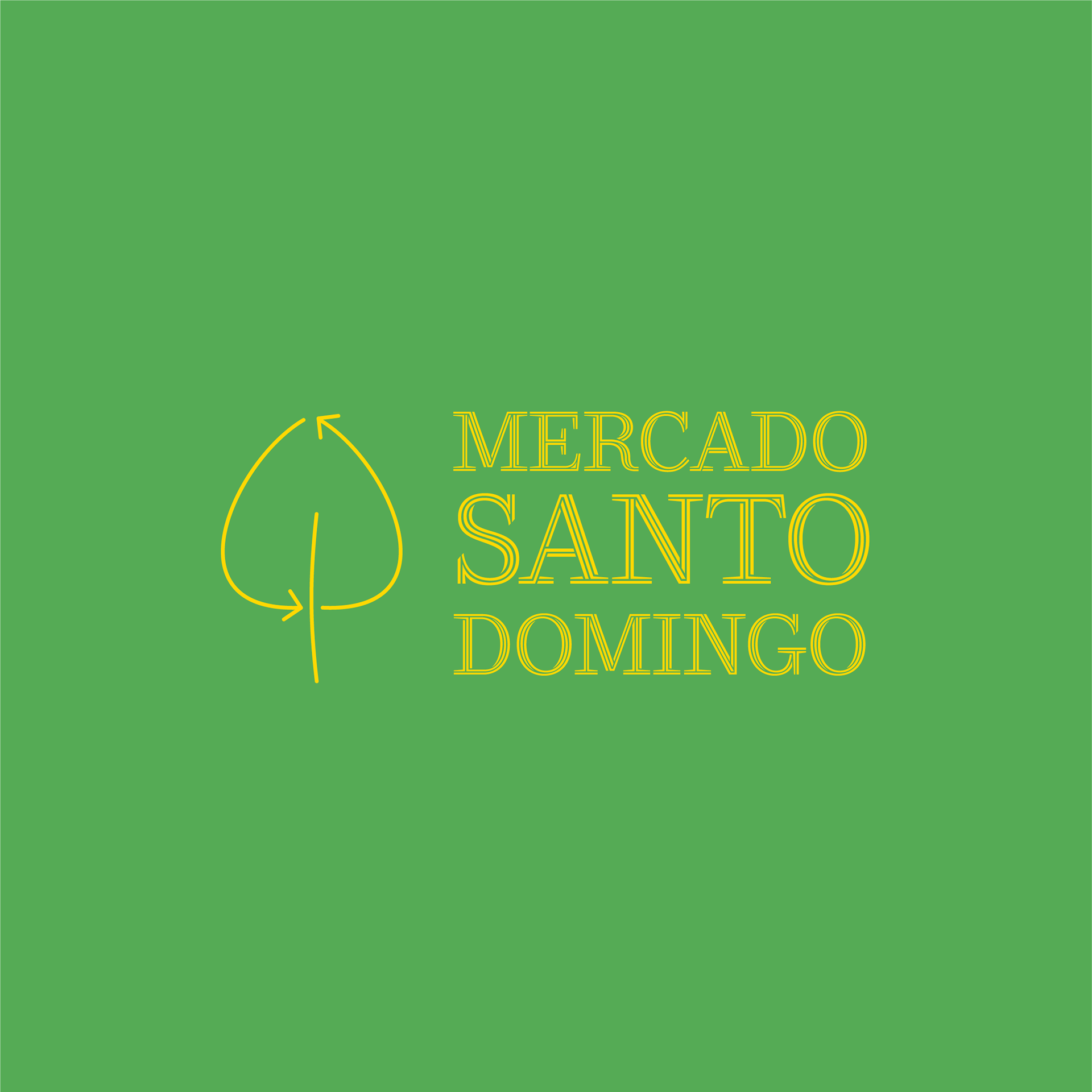
Secondary Logo (English version)

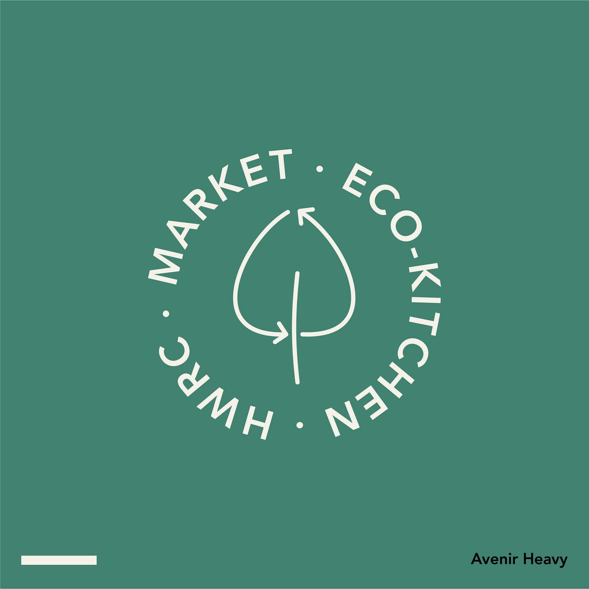
Redesign of the new image of the Market itself but also for the new Zero Waste approach.
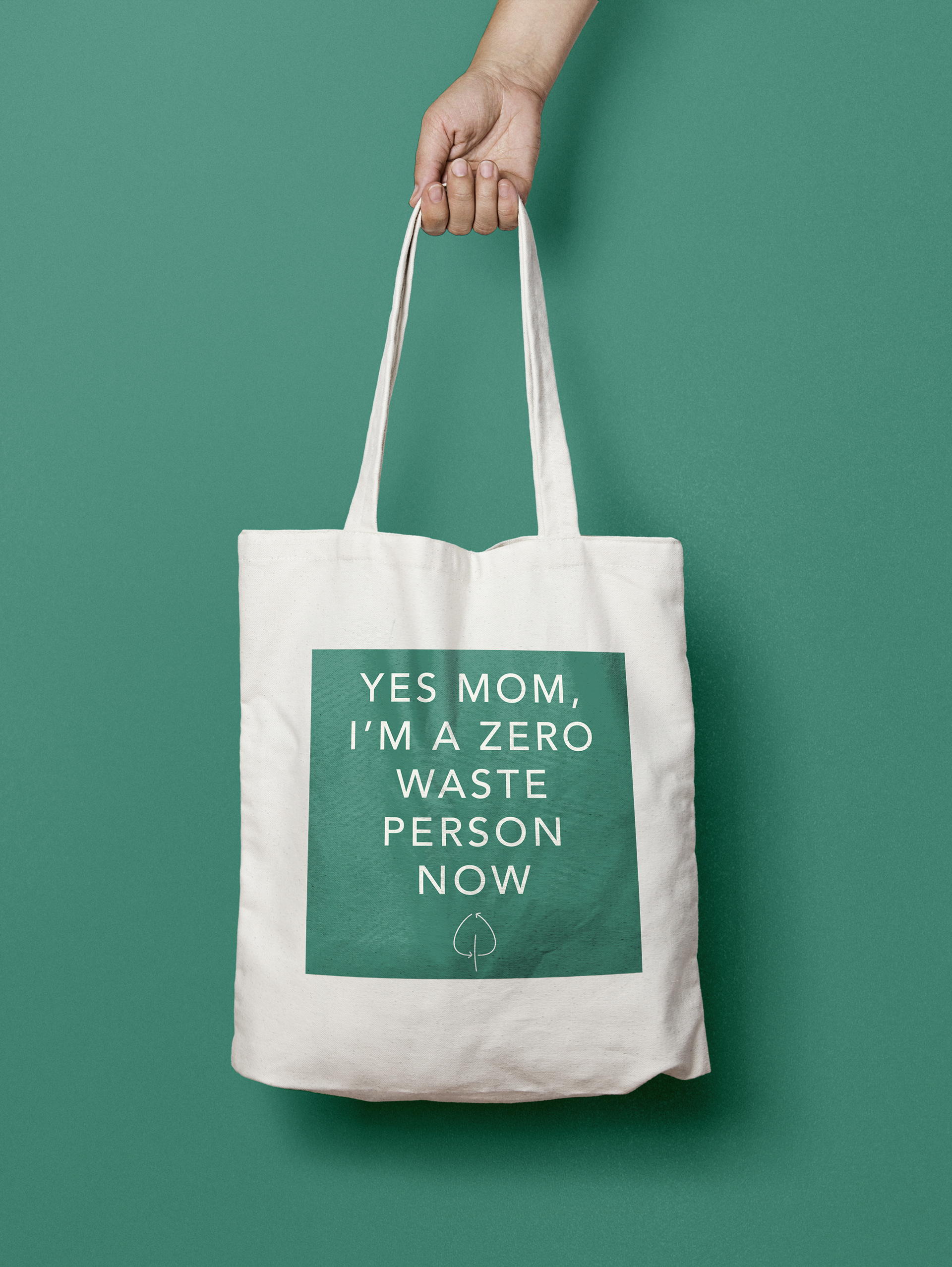
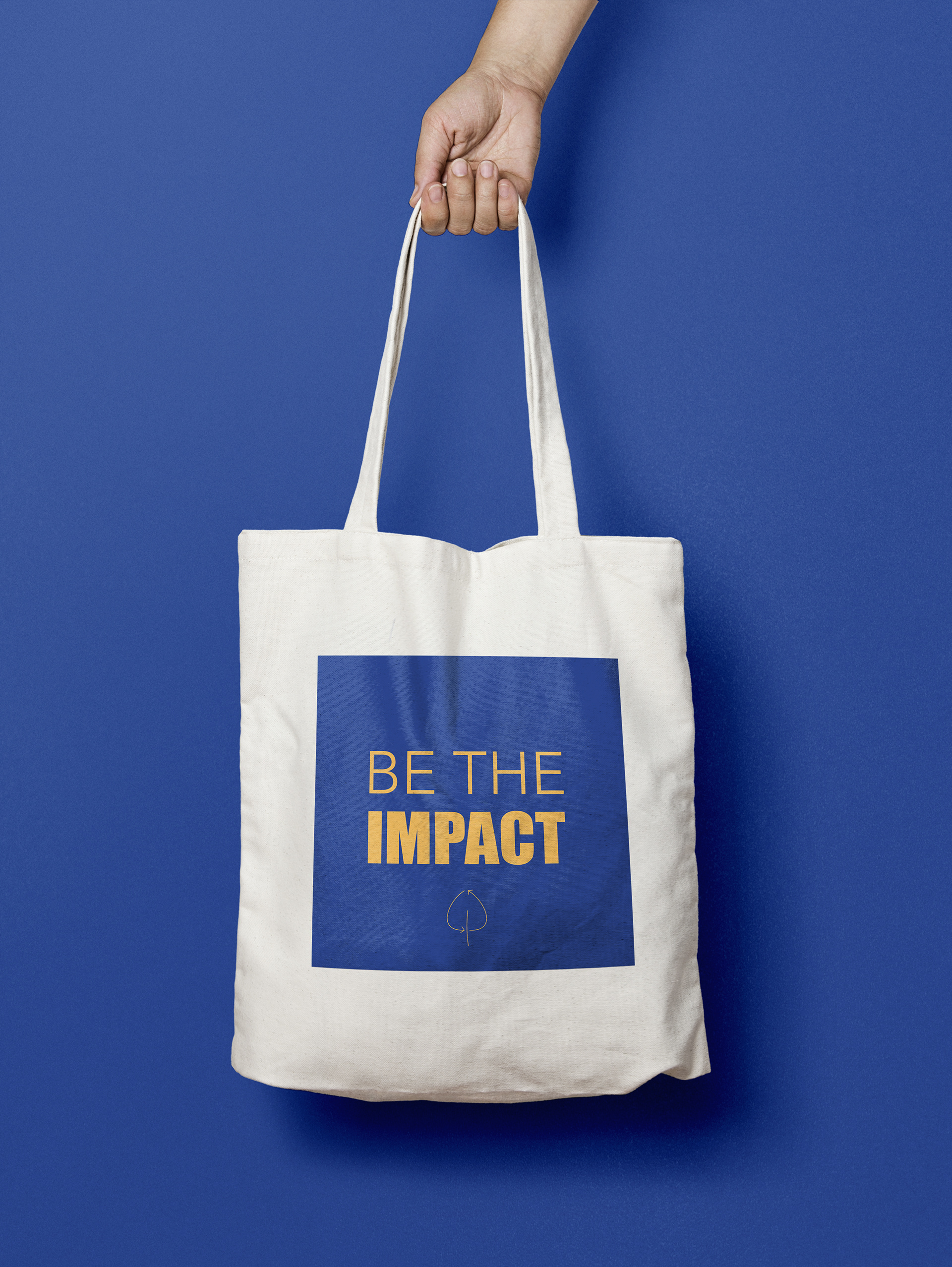
In addition, we designed three possible totes bags that could be sold in the same market in order to spread the concept of Sustainability and even to promote the market itself.